my wiki project…please have a look and provide feedback
i kept it very simple and minimal but at the same time mobile responsive
my wiki project…please have a look and provide feedback
i kept it very simple and minimal but at the same time mobile responsive
Project Link - https://codepen.io/galexynye/full/Vrjowv/
went for an 80s vibe
i would suggest adding a slight blur for making it easier to read.
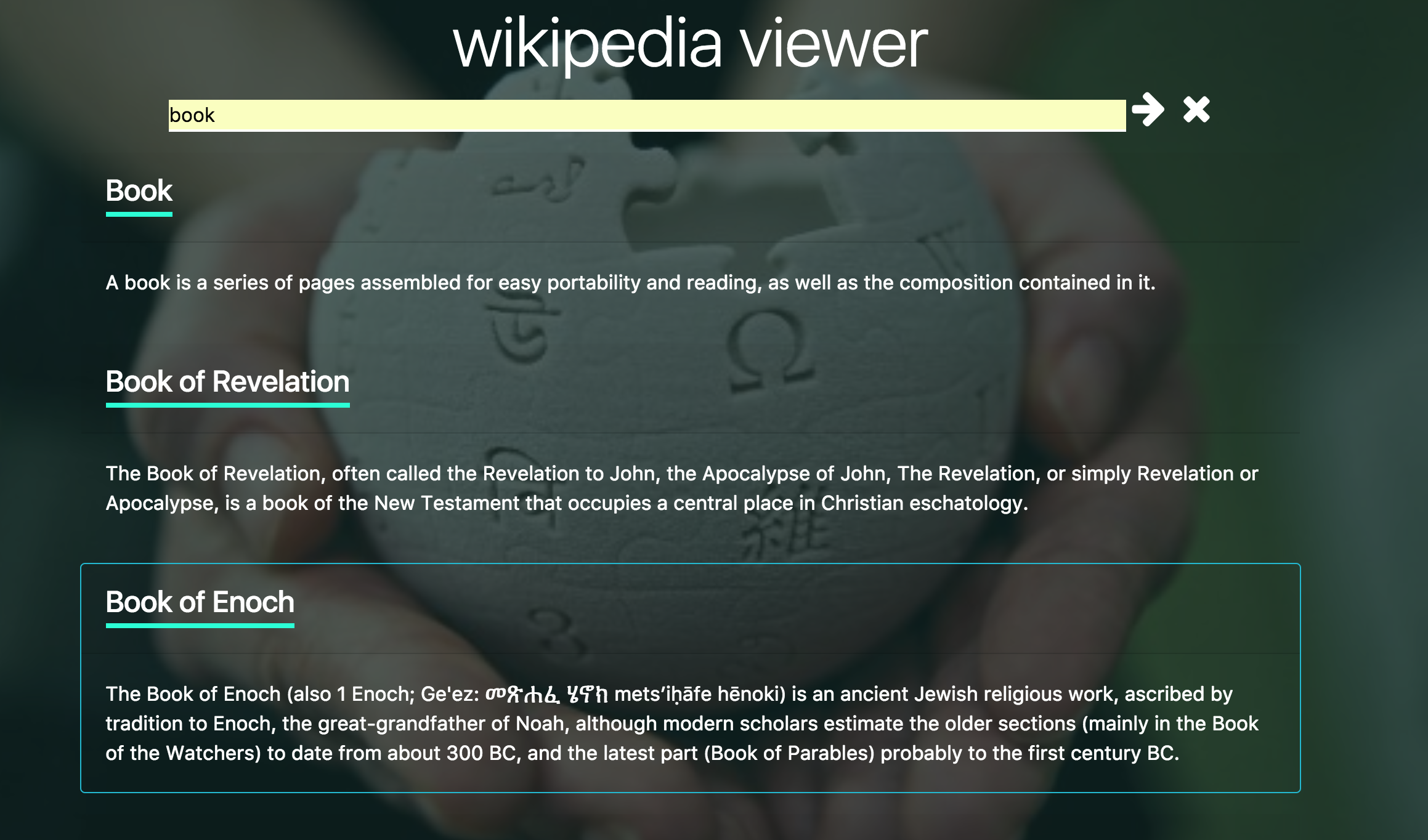
My Wiki viewer, would appreciate your feedback, TIA.
Certainly nice. Well made, colors look great. I wish you changed the color of the title and make it match. You can do:
a {
color: black;
}

a:hover {
color: black;
}
This is so It blends in better. I also suggest making the desc also be a link to the article, since how often will my mouse touch the title? 
I also suggest making a background to your boxes. Like background-color: white;. This just makes it look better over all.
You could also add radius: 20px; to your borders to add a curve (can be any pixel amount);
This is well made, you should be proud. I like the auto complete.
thank you for your input. I will update with these changes. 
I really love the 8bit 80s look (and I ain’t even from the 80s!). Great simple design and it’s clever how the “rainbow” expands into text content, I wasn’t expecting that but it was pretty nifty. I was surprised that “random article” opened a new tab, I would suggest giving some indication to the user that it will open a new page, maybe with an icon or something.


Would you mind checking mine out? Let's discuss your "Wikipedia Viewer"
Very excellent background. I’m currently not getting any results when searching. https://www.dropbox.com/s/f4hn0kakyrfamx1/Screenshot%202017-11-22%2016.59.57.png?dl=1
Would you mind checking mine out? Let's discuss your "Wikipedia Viewer"
THe “get random article” button looks a bit like a search bar, so I clicked on it without much thought at first. Might make sense to make the search button look more like a text feild.
Very awesome page ! I love how the page scrolls after you search and puts the focus on your search results. Nice work.
Would you mind checking mine out? Let's discuss your "Wikipedia Viewer"
The search is very fast and responsive, I like the animation how the content slides in from the side a bit.
Amazing, just amazing. 
The only thing i have is that:
Sometimes i don’t get a image, and just filler. Like 70% is filler. Is their anyway you can track the most popular searches and input better filler images? Its not that big of a deal however.
I wish the main text (at the top, tan) Wikipedia Knowledge Hole was a different color. Its too light and slightly hard to read.
That is really all, really nice work. Love the random article, you took it too a whole other level of cool.
Thanks …I will definitely make d chng tht u mention
It looks nice. It works well too. i suggest making that title slight bigger. Also the names of the articles being under-lined.
Thanks for the feedback!! Great idea with the random button
Thanks for the critique @John-freeCodeCamp I really appreciate it! Yeah, I never figured out a reliable way to get an image for every single article, so there are a lot of placeholder images. I’ll make the font color darker that is great feedback! Thanks again, have a great day.
Feedback would be appreciated.
Very nice and well built.
I like how the text pops up when you hover over it, and how the search bar moves upon search. Very thought through and creative while having simple (readable) code.
I would suggest adding some fonts. Don’t over due it, just some basic fonts for the desc or something.
Toss my hat in the ring…