Here it is my Markdown Previewer.
Although i’m interested in how project looks like i.e “beauty”(sic), i’m more interested in a experienced opinion if my implementation of React is correct. Does it represents what is React all about?
This is really good, but it isn’t actually responsive.
try using flex box to stack everything on top of each other on smaller screen,s

What’s that resolution? Sub 300px? I didn’t count on that much low res … Here’s a solution without complete overhaul of css:

I used http://quirktools.com/screenfly/
You should make the boxes go up and down instead of being squashed on lower screen sizes.


iPhone 6/7:

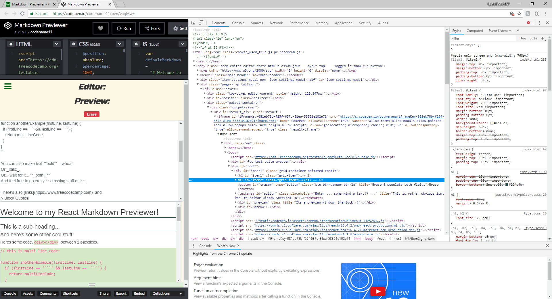
I know what are you saying, but i used grid here. There’s two columns with three rows, only button takes two columns, rest is one column each. One field and one headline below another, but what with the button? Button erases and populates both fields at the same time. Question is: Where to put button? On top, you can’t see it when you’re at bottom since both field are long, same thing at if i put it at bottom.
just use flexbox to put the two boxes in a row, then on smaller screens put it in a column
Ok, done. Problem that now occurs that i don’t know how rearrange React components. Check new pen. Well, at least not as intended in React. I can in vanilla js and jquery in a jiff, but how to do that in React? Headline above it’s appropriate field and button on top of it all(or below, it makes no difference for button). Edit: Maybe i can use key … just need to find how to implement it …
Ok. I got this for now:
componentDidMount () {
        //console.log(this.myInput.current.offsetWidth);
		this.setState({
			myWidth: this.state.myWidth=this.myInput.current.offsetWidth
		});
    }
and in container component:
if(this.state.myWidth=<768){
					{EditorHead}
					{Editor}
					{PreviewHead}
					{Preview}
					{BtnEraser}
					{Arrow}
				}
				else if(this.state.myWidth>768){
					{EditorHead}
					{PreviewHead}
					{BtnEraser}
					{Editor}
					{Preview}
					{Arrow}
				}
In componentDidMount () it gets width, now is only left is only how to inplement it since second code example doesnt work. Not sure(yet) where to put condition.
I figured it out … partially. Now to figure our how to do that on resize … EDIT: Now only works if you re-run codepen after window resize …
Nothings seems to be happening, its like stuck loading.
if you want to get user width in css, its:
@media screen and (max-width: 1100px) {
}
(for example)
just use html dude, cramming everything into java script creates these problems.
Try now. Edit: And it need to be updated on resize in which component render.
Try “run” again and resize afterwards, you’ll see my predicament. Edit: It will look fine when you re-run it, but after resizing window again …
 Edit: To give credits where credits are do: