Quick question on media queries, when I build a website out based on my screen dimensions it looks great. Than I go to media queries in my dev tools and with the same dimensions punched in for height and width it looks different. Why?
Media queries definitely has to be my least favorite part of coding websites. Everytime I get to it, I get annoyed lol.
Any tips for dealing with them in general ? I find it a hassle to go back to my stylesheet or main html sheet and see what I named my classes and what’s going on with them. Finding them, than seeing what properties they are using is half the battle. Also dragging and seeing what widths in dev tools is also frustrating. Dev tools is the best option, right ?
If someone could touch on this, that’d be greatly appreciated!
Then wrap the elements into <div></div> tags and add the .box class to them. It will help to make the website responsively resize and you won’t need to use lots of media queries.
I use these to make the sites fully responsive:
@media (max-width: 1360px)  {  // LAPTOP

}
@media (max-width: 980px)  { // TABLET

}
@media (max-width: 420px)  { // MOBILE

}
By using flexboxes, you won’t need to add lots of classes and ids to these media queries. I usually resize the text and sections at 1360px, make the hamburger nav menu appear at 980px, and redesign the overall look at 420px.
Hey, thanks so much for the kind thoughtful reply!
Okay I could try these flexbox tips, although I believe that will be too complicated with a project like this. Would love to know your thoughts on applying something like that to this project.
Here is the project. The goal was to create a website clone of one of my favorite teachers outside of FCC. Brad Traversy. He produces great content and I liked the look of his site, so I decided to clone his website and not to look at any of his source code. Here is where I’m at. Remember no media queries added so far. Some other things I haven’t learned yet like some of the Javascript on his original page. Lastly the images aren’t optimized for site speed.
I also could use some help on Sass, or some code evaluation as now my whole body of html is not displaying for anything under 500 px. Not sure what happened here.
SOLUTION * Closed my current live server page and re loaded this problem seems to be fixed now. What I did was set my body to display: none to make sure it was targeting mobile dimensions correctly. Then once I did that, I got rid of it but body was still displaying none. Even after deleting in my main.scss file. Closing and re opening Live Server fixed this.
His site is pretty good as far as responsiveness goes. There are a few minor issues, especially concerning text size increases, but no show stoppers. Accessibility on the other hand could be better. What would be an interesting challenge is to see if you can make your clone even better than his as far as these issues are concerned.
My tip for dealing with media queries is to do what is referred to as a “mobile first” approach. Narrow your browser as far as it will go and style the elements on the page so that they look good (narrow his site to see how he has them laid out). Concentrate purely on this narrow styling. There should be no horizontal scroll bar. This will be your default/base CSS starting point.
After you are happy with the narrow version, slowly widen the browser window until you find a point where you have enough room to make your first transition to a wider view port. This will be where your first media query break point goes. You will use min-width for the query and I suggest you use ‘em’ units for the value (this will make it not only responsive to width changes but to text size changes). Add all of the CSS you need for this width in the break point.
Repeat the above as much as you think is needed until your page looks good at any width, using any text size. Not all parts of the page may use the same break points. The menu at the top may need a different break point than the nine course offerings. You can work on them separately if you like. Just concentrate on getting the menu working first and then move on to other sections of the page. But with each one, always start with as narrow as you can go and work your way out.
I find them hard to do when I try to display a flex container column instead a lot of times this brings it off the page and I can no longer see where it went too. How do you deal with this? Also how come my site looks good on my computer but when I type in the same screen dimensions in dev tools things look way out of line? I dont understand that aspect of it.
I am trying to go from smaller screens like smart phones too bigger screens like tablets now.
Here’s what I get when I look at media queries for his finished professional site. His site doesn’t even look optimized, which something must not be rendering properly? Every tutorial I watch they have a lot more space to operate than what I’m looking at here. I try to change something to a display a different way and I cant see where it moves to or how it operates to change it properly.
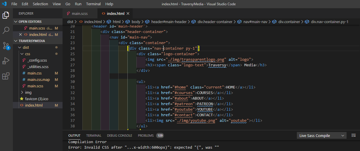
The simplest lines of code just don’t seem to work sometimes with media queries. I am probably tired and missing it but can I get an explanation on why this isn’t getting rid of the nav-container holding all nav elements completely?
Hmm, I’m not sure why you are seeing that. I’m looking at his site through Chrome dev tools using the iPhoneX and it looks fine. Click the three vertical dots in the upper right corner and activate ‘Add device pixel ratio’. You should see it show up between the percentage and ‘Online’. It should be at 3.0.
Some ideas if you want the design to respond responsively on screen resize:
Avoid using fixed widths on containers. If the width is 900px, it will still be 900px even if the screen gets resized.
Avoid positioning the elements with position: absolute. To set the spacing, use paddings and margins.
To make the Udemy courses resize properly, try removing display: grid; and instead add three divs wrapping three courses each. For the sake of clarity, I made you a Pen: https://codepen.io/Queryeleison/pen/XWmqrJY.
Try to deconstruct it and see what’s happening behind the scenes!
Man, this so cool, I have never tried a mobile first but i all be implementing it from now in all my projects. I like the way you are explaining things it’s nice and direct to the point. Thanks a lot.
Thanks for this question I have similar issues on the topic and by following through I have learnt a lot, I also follow Traversy, he’s a good teacher. I love it, and God bless you for the question though.