Tell us what’s happening:
Describe your issue in detail here.
Hello guys, I have challenged this project for 1-3 days and this project make me hyped because I really feel that this knowledge from this course can be used in real world medical field.
But, sadly, when I try to run the code in boilerplate for accomplishing this project, the error came up.
EE.['0.0', '0.0', '-0.0', '0.0', '-0.1', '0.5', '0.0', '0.1', '0.1', '0.3', '0.0', '0.0', '0.0', '0.0', '0.0', '0.0', '0.2', '0.1', '0.0', '0.2', '0.1', '0.0', '0.1', '-0.0', '-0.1', '0.1', '0.0', '0.2', '0.0', '0.1', '-0.0', '-0.0', '0.1', '0.0', '0.1', '0.4', '-0.0', '-0.0', '0.3', '0.2', '0.1', '-0.0', '0.0', '0.0', '-0.0', '-0.0', '-0.0', '0.2', '0.1', '0.1', '0.0', '0.0', '0.0', '0.0', '0.3', '0.0', '-0.0', '0.0', '-0.0', '-0.0', '-0.0', '0.0', '0.0', '-0.0', '0.0', '0.0', '0.0', '0.2', '0.0', '-0.0', '0.2', '0.1', '0.3', '0.2', '0.1', '-0.0', '-0.0', '-0.0', '-0.0', '0.1', '-0.1', '-0.1', '0.7', '0.0', '0.2', '0.1', '0.1', '-0.0', '0.0', '-0.0', '0.1']
.
======================================================================
ERROR: test_bar_plot_number_of_bars (test_module.CatPlotTestCase)
----------------------------------------------------------------------
Traceback (most recent call last):
  File "/home/runner/boilerplate-medical-data-visualizer/test_module.py", line 26, in test_bar_plot_number_of_bars
    actual = len([rect for rect in self.ax.get_children() if isinstance(rect, mpl.patches.Rectangle)])
AttributeError: 'numpy.ndarray' object has no attribute 'get_children'

======================================================================
ERROR: test_line_plot_labels (test_module.CatPlotTestCase)
----------------------------------------------------------------------
Traceback (most recent call last):
  File "/home/runner/boilerplate-medical-data-visualizer/test_module.py", line 13, in test_line_plot_labels
    actual = self.ax.get_xlabel()
AttributeError: 'numpy.ndarray' object has no attribute 'get_xlabel'

----------------------------------------------------------------------
Ran 4 tests in 8.004s
Your code so far
import pandas as pd
import seaborn as sns
import matplotlib.pyplot as plt
import numpy as np

# Import data
df = pd.read_csv('medical_examination.csv')

# Add 'overweight' column
df['overweight'] = df['weight'] / ((df['height']/100) * (df['height']/100))
df.loc[df['overweight'] <= 25, 'overweight'] = 0
df.loc[df['overweight'] > 25, 'overweight'] = 1

# Normalize data by making 0 always good and 1 always bad. If the value of 'cholesterol' or 'gluc' is 1, make the value 0. If the value is more than 1, make the value 1.
df.loc[df['cholesterol'] == 1, 'cholesterol'] = 0
df.loc[df['cholesterol'] > 1, 'cholesterol'] = 1
df.loc[df['gluc'] == 1, 'gluc'] = 0
df.loc[df['gluc'] > 1, 'gluc'] = 1

# Draw Categorical Plot
def draw_cat_plot():
    # Create DataFrame for cat plot using `pd.melt` using just the values from 'cholesterol', 'gluc', 'smoke', 'alco', 'active', and 'overweight'.
    df_cat = pd.melt(df,id_vars=['cardio'], value_vars = ['cholesterol', 'gluc','smoke', 'alco', 'active', 'overweight'])
    df_cat = df_cat.sort_values(by='variable')
    df_cat['value'] = df_cat['value'].astype(int)

    # Group and reformat the data to split it by 'cardio'. Show the counts of each feature. You will have to rename one of the columns for the catplot to work correctly.
    df_cat['total'] = None
    df_cat = df_cat.groupby(['cardio', 'value', 'variable'])
    df_cat = df_cat.agg(['size'])
    df_cat = df_cat.reset_index()
    df_cat.columns = ['__'.join(col).strip() for col in df_cat.columns.values]
    df_cat = df_cat.rename(columns={'cardio__': 'cardio', 'value__': 'value', 'variable__': 'variable', 'total__size': 'total'})
    # Draw the catplot with 'sns.catplot()'
    fig = sns.catplot(y="total", x='variable', hue="value", kind="bar", col='cardio',data=df_cat)

    # Do not modify the next two lines
    fig.savefig('catplot.png')
    return fig


# Draw Heat Map
def draw_heat_map():
    # Clean the data
    df_heat = df.loc[(df['ap_lo'] <= df['ap_hi']) & (df['height'] >= df['height'].quantile(0.025)) & (df['height'] <= df['height'].quantile(0.975)) & (df['weight'] >= df['weight'].quantile(0.025)) & (df['weight'] <= df['weight'].quantile(0.975))]

    # Calculate the correlation matrix
    corr = df_heat.corr()

    # Generate a mask for the upper triangle
    mask = np.zeros_like(corr)
    mask[np.triu_indices_from(mask)] = True


    # Set up the matplotlib figure
    fig, ax = plt.subplots(figsize=(12, 6))

    # Draw the heatmap with 'sns.heatmap()'
    ax = sns.heatmap(corr, mask=mask, annot=True, fmt='.1f', center=0,square=True,linewidths=.5)


    # Do not modify the next two lines
    fig.savefig('heatmap.png')
    return fig
Because something should go wrong in Cat_plot section, I try to compare figure1(in example folder) with my own created graph. But I don’t noticed anything, what I see is this 2 graph look really same (however the size of graph is slightly different from each other.)
This is my graph.
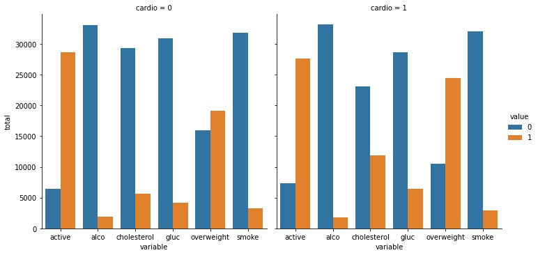
Therefore, what have gone wrong in my code? Did I miss something?
I would really appreciate if you could state my mistake and made me move on.
Thank you very much for your kindness.
Your browser information:
User Agent is: Mozilla/5.0 (Windows NT 10.0; Win64; x64) AppleWebKit/537.36 (KHTML, like Gecko) Chrome/91.0.4472.77 Safari/537.36
Challenge: Medical Data Visualizer
Link to the challenge:
