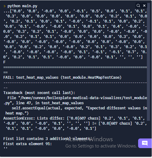
I am almost done with this assignment but here come the problem when I am running the test it fails at values of expected and actual for heat_map.
I have no clue what is happing here. As the problem was discussed a times few earlier in the forum; all those recommendations didn’t work in my case. I think I am making some silly mistake somewhere, please help me out as am working on this assignment for almost a week now 

here is my repl
My repl
import pandas as pd
import seaborn as sns
import matplotlib.pyplot as plt
import numpy as np

# Import data
df = pd.read_csv('medical_examination.csv')
df = df.dropna()
#TESR CODE#START#
# Where to save the figures

#TESR CODE#END#
# Add 'overweight' column
bmi = (df['weight'])/((df['height']/100)**2)
df['bmi'] = bmi;
df.loc[df['bmi']>25, 'overweight'] = '1'
df.loc[df['bmi']<25, 'overweight'] = '0'
df=df.drop('bmi', axis=1)
df['overweight'] = df['overweight'];
df = df.dropna() # dropping all rows which has any nan value.
df['overweight']= pd.to_numeric(df['overweight']) # Coverting the strings 1 and 0 into numeric in coulumn overweight
#df['overweight'] = None

# Normalize data by making 0 always good and 1 always bad. If the value of 'cholesterol' or 'gluc' is 1, make the value 0. If the value is more than 1, make the value 1.


# Draw Categorical Plot
def draw_cat_plot():
    df.loc[df['cholesterol']> 1, 'cholesterol'] = '1'
    #Normalising the data in coulumn of cholesterol and assigninning 1 and 0 for bad and good values;
    df.loc[df['cholesterol']==1, 'cholesterol'] = '0'

    df['cholesterol']= pd.to_numeric(df['cholesterol'])
    # Here I am converting the type of this column from string to integer.
    df.loc[df['gluc']> 1, 'gluc'] = '1'
    df.loc[df['gluc']== 1, 'gluc'] = '0'
    df['gluc']= pd.to_numeric(df['gluc']) # Here I am converting the type of this column from string to integer.
    # Create DataFrame for cat plot using `pd.melt` using just the values from 'cholesterol', 'gluc', 'smoke', 'alco', 'active', and 'overweight'.
    df_cat = df.drop(['id','age','gender','height','weight','ap_hi','ap_lo'] , axis=1)
    # dropping all coulmns which we are not going to plot in the chart

    # Group and reformat the data to split it by 'cardio'. Show the counts of each feature. You will have to rename one of the columns for the catplot to work correctly.
    df_cat = pd.melt(df_cat,id_vars=['cardio'],var_name='variable', value_name='value')
    # converting data into long format for ploting.

    # Draw the catplot with 'sns.catplot()
    fig = sns.catplot(x="variable", hue="value", data=df_cat, col="cardio", kind="count", sharex=False)


    # Do not modify the next two lines
    fig.savefig('catplot.png')
    return fig


# Draw Heat Map
def draw_heat_map():
    # Clean the data

    df_heat = df.loc[(df['ap_lo'] <= df['ap_hi']) & (df['height'] >= df['height'].quantile(0.025)) & (df['height'] <= df['height'].quantile(0.975)) & (df['weight'] >= df['weight'].quantile(0.025)) & (df['weight'] <= df['weight'].quantile(0.975))]


    # Calculate the correlation matrix
    corr = df_heat.corr()# Compute the correlation matrix

    # Generate a mask for the upper triangle
    mask = np.triu(np.ones_like(corr, dtype=bool))


    # Set up the matplotlib figure
    fig, ax = plt.subplots(figsize=(11, 9))

    # Draw the heatmap with 'sns.heatmap()'
    grap = sns.heatmap(corr,ax=ax, mask=mask, vmax=.3, center=0,square=True, linewidths=0.3,annot= True,fmt = '.1f',cbar_kws={"shrink": .5}) # ploting heatmap

    fig = grap.figure
    # Do not modify the next two lines
    fig.savefig('heatmap.png')
    return fig