Mobile Web Design === Advice, are you as bad as me?

##The Problem=>
I have been making what I thought were solid attractive web apps. i just decided to go on codepen for the first time on my regular sized iphone 4… and what I saw was very poor renditions of what I thought were my great sites. Half the time the dimensions and scale was off. Half the time the site didnt function right with touch. Safari added a button to clear an input that is supposed to submit a value…

I use the occasional media query and when i build i try to use liquid dimensions, but I haven’t gone further than dev-tools until now…I mean, should I be going back and fixing all of this or remaking things? or do I just keep moving ahead trying to keep mobile in mind. how important is it to have one site do all?

what do you guys do as you build to stay mindful of mobile. are there any standard ways to go about the process?

I don’t have a lot of experience, but I will use what I do have to share a couple of thoughts.

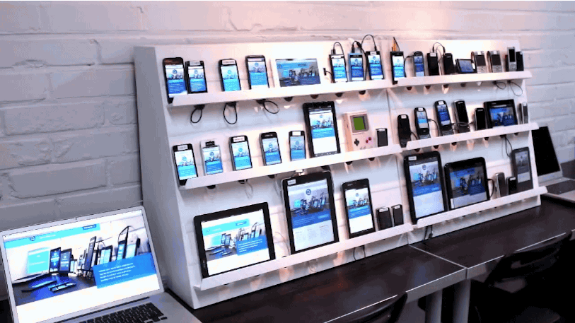
There could be several things that are impacting how your sites are appearing on mobile, some of which might even be outside of your code (such as your phone). I could hypothesize a couple of reasons, but I think examples would help the community and I cite specific reasons why your websites aren’t showing as intended.

If your site looks fine when resizing it in a desktop browser or otherwise using dev tools to visualize them at smaller sizes, I could see how it would frustrate you if you went onto an actual device and saw something completely different. Again, examples would help us troubleshoot.

If it isn’t so much a technical issue with displaying your work and more of a design aspect, I find it can be easy to overestimate or underestimate proper size for buttons, text, etc. when you can’t see it on an actual device.I think with experience you will learn what are reasonable measurements for your different elements, but trial and error is always a good way to find what works. Try to imagine what you are making not on your giant desktop but on your comparatively minuscule phone, perhaps while you’re trying to get from one place to another in blinding daylight. Build your site to be usable in the worst case scenarios of accessibility, and you should be fine. This doesn’t necessarily have to be at the expense of intriguing design or eye-candy, especially since you can use media queries to optimize it for different screens, even if it means making it look arguably better on one screen for the sake of accessibility on another.

Regarding process, I can’t help a whole lot, but I’ve heard “mobile first” tossed around a lot, where you design for a small screen first and work your way up to desktop+ in comparison to building for desktop and trying to scale down. This might help, but your mileage may vary.

In short, examples will help us help you figure out how to best design for the wide variety of screens out there.

This is highly personal. I will operate on the assumption that many of your sites that you have made thus far were strictly for practicing development and not in use by others. If this is true, then you only need to update your sites if you want. If I were in your shoes, I would consider updating them for the sake of getting the experience doing so with material that you are personally interested in. Not to mention that you may be able (and probably should) use your work in your portfolio and have it look more impressive with responsive qualities done right. If you don’t want to invest more time into these sites, I don’t think it would matter if you went ahead and started projects from scratch with your new perspective and attention to responsive design.

1 Like

@benjaminadk,

First of all, I am leery of saying to use CodePen.io for checking your website in regards to mobile responsiveness. There are too many factors involved in using the CodePen.io for your website. The main reason that we use CodePen is the convenience of setting up the website for beginners. There is a steep learning curve of setting up a ‘real’ website.

In addition, it is easy for us to examine your code on CodePen.io to see what is supposedly going through your head as you code.

If you want, you can get started with GitHub’s pages for your very own website. Once you finish setting these things up, you then will be in better position to do mobile-responsiveness projects.

Yes, it’s awesome that you are keeping mobile-responsiveness in mind but CodePen, in my opinion, is not a good place to test it. Most people will advise you to ‘move’ your projects off CodePen.io once you learn to swim in deeper water. So go ahead and dive deeper.

I make a rough layout before coding. A desktop size and a mobile size.

I start the project with the browser width as narrow as it can go, and then add media queries for larger widths. It’s a lot easier to go mobile -> desktop in your css. Rather than start with the desktop version and and going down.

Adding this meta tag to your html also will also help

<meta name="viewport" content="width=device-width, initial-scale=1">
2 Likes

Good responses above.

When you get to the point of designing mobile sites (or cross checking them to make sure it works properly), I highly suggest using CodeKit3 (for OSX).

Setup your site on CodeKit3. You can use the built-in web server of Codekit3 if all you have are html and css files.

If you need server-side rendering (PHP, C#, ASP.NET), then you can toggle a switch in Codekit3 telling it that you’re using an external server (MAMP, Windows virtual machine, Docker, etc), and enter the URL/IP address of your internal dev server.

After setting up Codekit3, click the Preview button. It will automatically open up the site in your browser, using a localhost/IP and a port number.

You can use an iDevice simulator program (available from Apple, part of XCode) to view the same site on your iDevice (select which device, ipod, iPhone, iPad, etc… landscape/portrait, etc). Use the same URL address as shown in your desktop browser.

But this doesn’t tell the whole story… the site may load very slow on an actual iPhone device… so you can also use your real iPhone via USB cable to your computer, or via Wi-fi wireless connection. Just connect to the same url as shown on your desktop browser.

HERE’s THE COOL THING:
When you click/tap to load a new page on your dev site, ALL YOUR DEVICES will also update automatically and show you the new page.

When you update CSS or html code, and click save… all your devices will also update to show the change.

1 Like

@owel Not to hijack this wonderful person’s topic, but are you aware of any good software like Codekit3 for Windows/Linux (but mostly Windows) with the same level of ease of use, polish, and functionality? If so, I’m sure several people would like to know. :smile:

Hey Chance,

It used to be Adobe had a product called “Adobe Edge Inspect”… it’s basically a browser extension you install on your web browser (Chrome for example). Then you also have a corresponding “Edge Inspect” app installed on your phone… So you run the Edge Inspect App on your phone, then click the desktop browser extension and voila… any website magically appears on the phone too. Whatever is displayed on the desktop browser, is also displayed on the mobile phone’s browser. It’s synchronize scrolling too!

Alas… Adobe discontinued this product. :frowning: I don’t know why.

Nowadays, Adobe has something called “Adobe Preview CC”, but it’s really geared more towards UX/UI graphics designers… whatever UI/UX image they’re designing in Photoshop will appear on the phone’s display. – but it’s not the same as their previous Adobe Edge Inspect product.

But check out this site for possible alternatives! I just personally haven’t tested these solutions though.

1 Like

Chance

Check out Ghostlab… just installed it, and it works great. Syncrhonized scrolling on all devices!

– not FREE though, but reasonable at $49. I’m digging up all my mobile devices and will setup a lab (iPhone, ipod, iPad, MS Surface, Nook, etc). Now when I scroll on the desktop, all devices also scroll! It’s pretty magical!

Pretty neat though. (found this photo on a blog site)

UPDATE: Sorry, seems OSX only.

@dr.shreeman so i have a github account. i taught myself to use the bare essentials of git on cloud 9 and have 8 or 10 repos hooked into git pages. you are saying that those git pages are where i should be doing my mobile testing?

im just scratching the surface of using codepen project and adding things like favicons. right now im building a portfolio there and including all my projects locally into one codepen project. with that comes the file paths. i looked at a boilerplate which might be a small portion of that complicated stuff u are talking about…i went with bare bones just so i can eventually add all the things i need manually and again teach myself whats up.

i have realized also that media queries are way more complicated than i thought…earlier i tried to get an iframe of my weather app into a 200by200 window so it would run in real time on my portfolio…it didnt work out all i could think of was a transform scale in the query which i couldnt get right…anyway i ve gone on long enough about my problems. ill look into checking things more on the cloud nine end for me. thanks

@owel
##wow that is crazy

i have a chromebook that i do all the coding on. there is also an ipad and iphones. i didnt realize they had this sort of software…but i think saw a youtube video of a guy messing with this. that is some pro level shiz. i can imagine this lab you talk about. mine has three 55 inch tvs for me. then scaling down with all the iproducts and samsung and watches…then theres me in middle just tweaking out at a keyboard…ahh someday.

a month ago all i did was watch netflix…now i need 8 monitors. ha gameboy;s not lighting up.

If I may add a piece about the media queries, I just did Codecademy’s 3-hour course on how to make a website responsive by using only relative units and media queries. It’s not perfect, and I didn’t think it went far enough, but It might help to clarify them and I recommend it solely for that purpose.

Take a look at it here.

Thanks for taking the time to look, I saw that you updated your post thinking that Ghostlab was OSX only, but this is a screenshot of their download page:


Note the Windows downloads.

I’ll have to look into it, thanks!

1 Like

I think the photo I posted above is a little too much :slight_smile:

In reality, testing on iPhone, iPad, Android and Windows device is enough… as these are the major market share holders. If somebody is still using a Blackberry today, they can get lost. hahahahah :slight_smile:

Think you replied to the wrong person btw

Yeah, the photo was probably a bit much, but it did its job! :stuck_out_tongue:

They also appear to have a 7-day trial for anyone who might be interested.

@benjaminadk

cloud9 and Codepen is a virtual desktop experience. I am not sure when you said that you have git pages, you meant to say that it was all from cloud9?

The big disadvantage that I immediately saw is that you stated in your other messages that you were using a Chromebook? It is not a developer friendly per se since it does not really provide you with local host experience (setting up your own HTML, CSS, javascript files via text editor all on your computer).

With all that aside, it is still possible to develop website virtually, like you did. Bootstrap will help you with responsive designs. The media queries that you need to deal with right now is just adding this to the head part of HTML.

  <meta name="viewport" content="width=device-width, initial-scale=1">

Then just add styling of width = 100% of given element to respond by stretching everything to the window’s width. The percentage of the width is one of the keys to making the elements respond respectively. If you set fixed heights/widths then it will not be a responsive element (it can be mobile friendly if small).

If you are confused with media queries, don’t bother with it right now, and focus on learning the basics of Bootstrap’s columns. See examples such as https://codepen.io/pkshreeman/pen/LLYZqm which is Bootstrap based column settings and more simple version of this: https://codepen.io/pkshreeman/pen/ybdBZa

Resize the window to see what it does.

By the way, stay away from HTML5boilerplate. Nothing bad about it, just not something I would recommend to someone who is trying to learn to code the basics. I highly recommend starting with a blank “paper”, and writing from scratch.

Hope this is less confusing and more helpful now.

2 Likes

Thanks for the advice. The fact that I only have this chromebook is holding me back a little. I can’t build my developing environment locally like you stated (i’m not a linux user either i think some do this). This is why I use cloud 9, otherwise I can’t learn git or any other thing from the command line. I use materialize, but it is similar to bootstrap in its grid system.
Cool Demo I just realized that using the built in system I can assign col m6 AND s12 to the same element. That is materialize class syntax…That helps alot, so as I build a page I can be constructing both versions at the same time…or even multiple versions. Very cool.
If you have time I have been working on this unrelated project and could use an opinion. It uses css variables. CSS SANDBOX
Thanks Again Now I get why codepen lets you add that meta line AND you cleared up multiple col sizing.

1 Like

@benjaminadk

That’s really awesome website! One thing that I think you should add is margins. The reason is that most people have hard time understanding difference between the margins and padding. You used both border and outline features, so this will illustrate the difference perfectly.

Now, the engine, concept, and the functionality is out of the world! I love it! Just one thing…it’s downright ugly. The interface started too low for me, and I had to scroll down when I realized it was actually “down there”. I have not really used materialize so I can’t say whether you can add responsiveness and pretty things up a bit.

I know…I do the same thing with most of my projects…simple and direct without too much fluff. But people respond to UI/UX much more strongly than you think. If it looks like 1980’s then they are not interested even if it solved all of their problems. So, I suggest you take some time and practice prettying things up, vertically center it all, and make it a bit more responsive, then you’d definitely land a job!

Let me know when you pretty it up, so I can tweet it out to the world! People will love this stuff.

thanks man. yah. i went bare bones just to see what i could do…it definitely has the look of something from the cutting edge of 1991…if u think mine is good…this other guy on here made one for images with a clipping tool and photoshop style options…sort of…he’s got custom ui with color inputs and sliders…ill grab the link…this is cool

@benjaminadk,

yes, that’s awesome Codepen! I recommend that you join 100DaysOfCode and the Twitter. It is very supportive. I think if you tweet out these things, they will love it.

Hey, @nazarja, I checked out some of your websites, and it’s really awesome! @benjaminadk sent me one of your projects.

Again, I strongly recommend that you tweet this stuff out, and one of the best ways to get connected is to join this #100DaysOfCode stuff. The guy @kallaway started this and it is a really powerful tool to spread out your fabulous works.