Hi all,
I am creating this bar-chart where you can see man-hour values per month. Here is the thing there are 2 types of man-hour for a given month, including early man-hour and late man-hour. When I create the bar chart, these two values are overlapping for a given month. I want them to have their own bars and be side by side. Anyone can help me with that?
This is something that I can do in excel so I think it should be doable in python too.
fig = px.bar(
df_selection,
x = df_selection[“date”],
y = df_selection[“man_hour”],
color_discrete_sequence = [“#0083B8”] * len(df_unit[“unit_type”]),
template = “plotly_white”)
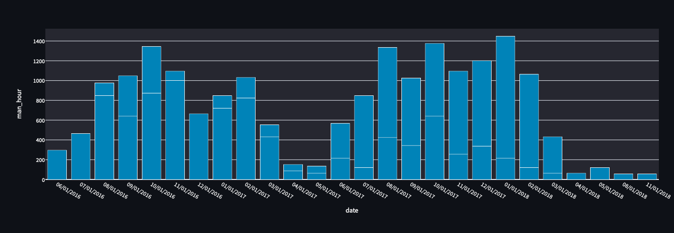
The figure below has the bar-chart have. You will see that 2 bars are overlapping for the month and divided by a white line.
Thanks in advance!