Alas, I’ve conquered the Page View Time Series Visualizer!
… or so I thought.
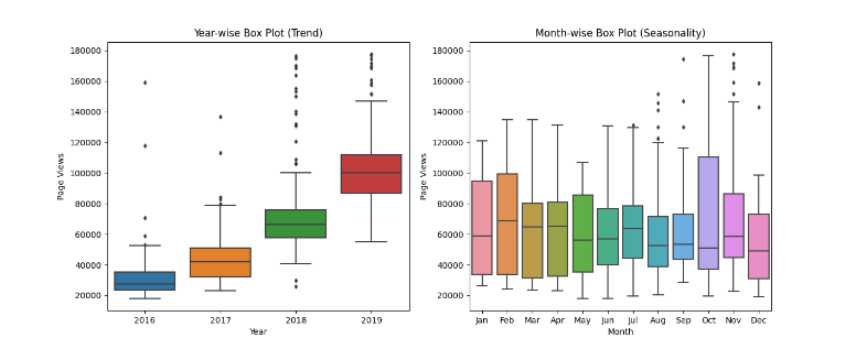
After receiving a passing set of tests, I was ready to go about my day being the latest 80% certified Python Data Analyst. I decided to take one last look at my victory. Upon further inspection, I discovered that while my program does pass all the tests, the test module does not inspect the values on the plots. It appears that Box Plot 2 (The ‘Monthly (Seasonality)’ box plot), doesn’t match with its example-image counterpart. Is this difference caused by appearance customization differences or an actual data error?
My boxplot:
You’ll notice the whiskers and outliers don’t align between the two plots. The rest of the plots seem to match just fine. I thought maybe I cleaned the data improperly, but from what I can tell the Month-wise box plots are the only mismatched plots.
I generated graphs very similar or the same as what you did and noticed the same problem. I did some investigating of the generated graphs versus the statistics I generated from the data set and convinced myself the graphs were correct. I looked at the range of values on several of the monthly box plots, comparing the generated and example, and they were very close. The boxes, whiskers, and outliers were not the same, but the ranges were approximately the same. I attributed this to either the example being generated with older data, data that had been cleaned (or not) differently, or possibly a different version of matplotlib. It’s hard to determine from our perspective.
It’s hard to say from the unit tests whether or not we have the correct graphs. If you passed the cleaning test, then I feel like your graphs are probably correct. There are tests for the box plots, but they are only testing the titles, labels, and shapes, and not the actual values, so while we have the right labels and boxes, the tests do not definitively say this is the correct box plot.
So all this was enough to convince me mine were correct, but you may be more paranoid than me. Absent testing actual values in the box plot unit tests, I’m not sure there is a definitive answer. However, since you got what appear to be identical graphs to me and we both passed all the unit tests and we didn’t collaborate, I feel we got the correct answers.
For what it’s worth I’ve played a bit with date ranges, and including for the right box plot, only dates in year 2017 and 2018, will give plot similar to the example. However there isn’t any indication that such filtering is indeed expected.