I’m currently doing the FCC challenges again, with the new rules.
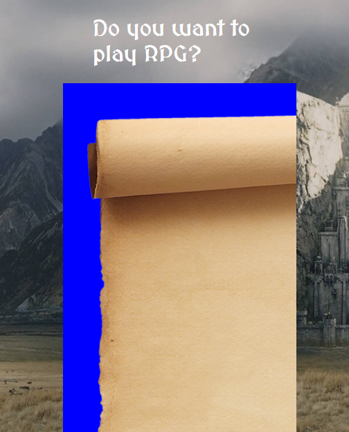
In the “Responsive Web Design Projects - Build a Survey Form”, I’m trying to put an image inside a DIV. I moved this DIV to the middle of the screen using CSS GRID( grid-column: 3/11; grid-row: 2/12;), it’s a 12x12 grid, each row and column takes 1fr of space of the whole screen.
I need help to make the image fill the space of the div in a way I can see the scroll fully (the area I want to fill is the blue background one), I also neede help so when I resize the image, so it shrinks or enlarges responsively, currently when I change the screen size, part of the image disappears. I need this because I’ll try to place the form the area of the scroll. Currently only when the screen is in “middle” size, it works as I would like, with the scroll appearing fully.
Here’s the pen: https://codepen.io/JAEN_C/pen/GGZZPa