Tell us what’s happening:
Describe your issue in detail here.
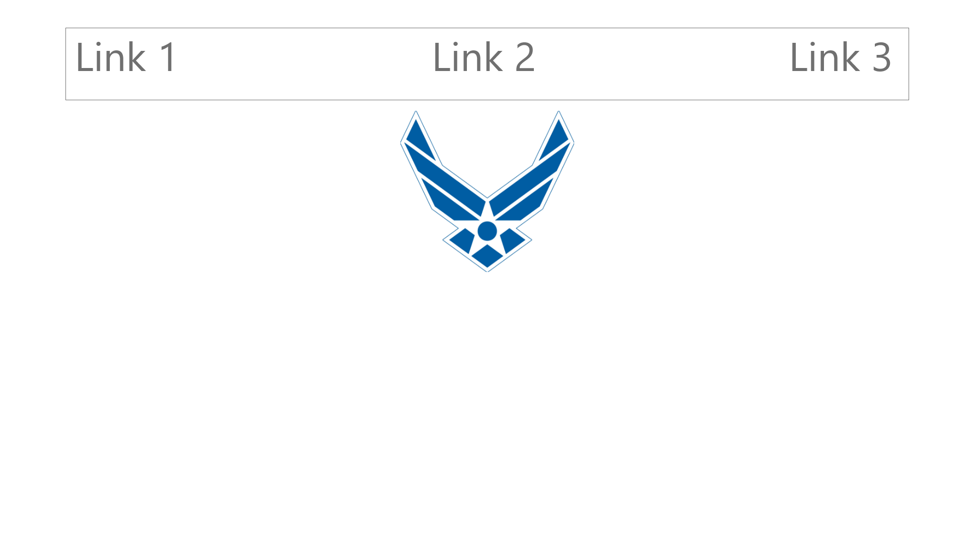
I am working on the product landing page project and I stumbled upon the following situation: the nav bar overlaps with the logo. I want either to be on the side like in the first picture or right below as in the second.

Regards!
**Your code so far**
\ file:
<link rel="stylesheet" href="styles.css">

<nav id='nav-bar'>
  <ul>
    <li><a href='#one' class='nav-link'>1</a></li>
    <li><a href='#two' class='nav-link'>2</a></li>
    <li><a href='#three' class='nav-link'>3</a></sli>
  </ul>
  </nav>
  <header id='header'>
<img id='header-img' src='https://media.defense.gov/2003/Apr/24/2001497066/-1/-1/0/24-F-ZZ999-097.jpg'>
</header>

<iframe id="video" width="560" height="315" src="https://www.youtube.com/embed/4MqMubrE62s?start=81" title="YouTube video player" frameborder="0" allow="accelerometer; autoplay; clipboard-write; encrypted-media; gyroscope; picture-in-picture" allowfullscreen></iframe>

<form id="form" action="https://www.freecodecamp.com/email-submit">
<input type="email" id="email" placeholder="email" name="email">
<input type="submit" id="submit">
 </form>
\ file: * {
  margin: 0px;
  padding: 0px;
  box-sizing: border-box;
}


#header-img {
width: 150px;
height: 150px;
}

form {
padding: 25px;
}

#nav-bar {
width: 100%;
  position: fixed;
}

ul {
  background-color: #cacaca;
  padding: 10px;
  margin: 15px;
  display: flex;
  flex-direction: row;
  justify-content: space-between;
}

#header {
display: flex;
align-items: center;
justify-content:center;
}

li {
text-decoration: none;
list-style-type: none;
}

form {
display: flex;
justify-content: center;
align-items: center;
}


@media (max-width: 600px){
  ul{
    flex-direction: column;
  }
}

#video {
display: flex;
margin: 100px;
justify-content: center;
align-items: center;
}

* {
  margin: 0px;
  padding: 0px;
  box-sizing: border-box;
}


#header-img {
width: 150px;
height: 150px;
}

form {
padding: 25px;
}

#nav-bar {
width: 100%;
  position: fixed;
}

ul {
  background-color: #cacaca;
  padding: 10px;
  margin: 15px;
  display: flex;
  flex-direction: row;
  justify-content: space-between;
}

#header {
display: flex;
align-items: center;
justify-content:center;
}

li {
text-decoration: none;
list-style-type: none;
}

form {
display: flex;
justify-content: center;
align-items: center;
}


@media (max-width: 600px){
  ul{
    flex-direction: column;
  }
}

#video {
display: flex;
margin: 100px;
justify-content: center;
align-items: center;
}
**Your browser information:**
User Agent is: Mozilla/5.0 (Windows NT 10.0; Win64; x64) AppleWebKit/537.36 (KHTML, like Gecko) Chrome/102.0.5005.61 Safari/537.36
Challenge: Build a Product Landing Page
Link to the challenge: