I dont know how to make the navbar the top of the viewport, I also want to make the words in the navbar (about/inspiration etc) span out so that they are side by side but I don’t know how to do it. Please help
My code so far:
Your browser information:
User Agent is: Mozilla/5.0 (Windows NT 10.0; Win64; x64) AppleWebKit/537.36 (KHTML, like Gecko) Chrome/95.0.4638.69 Safari/537.36
Tell us what’s happening:
how do i make the nav on top of the viewport? Also I want to make the about/inspiration etc text on the nav bar to be side by side and go on the right but I have no idea how to do that. Please help me
Your code so far
Your browser information:
User Agent is: Mozilla/5.0 (Windows NT 10.0; Win64; x64) AppleWebKit/537.36 (KHTML, like Gecko) Chrome/95.0.4638.69 Safari/537.36
There are a lot of ways to do it.
But the best way includes having a semantically structured HTML doc.
Take this example:
<nav>
 <ul>
   <li> hello </li>
   <li> world </li>
</ul>
</nav>

<!-- all your other codes -->

<style>
/* to keep the nav at the top fixed, even when user scrolls down */
nav{
position: fixed;
top:0;
}
</style>
Keep the nav within itself and not within a header for a more semantically structured doc. Although nesting it within the header tag is not a problem at all.
Keep the nav tag at the top of the body and it’ll automatically stay on top of other doc contents
if you are aiming to achieve a fixed position for the nav so that it stays on top even when a user scrolls.
Tl;Dr: Nav in itself is a semantic tag, so it makes sense why you may wanna use it independently. without nesting it within header
thank you so much for the help but now that I aligned the texts in the body the logo has moved to the center too and I dont want that. How do I fix this?
the header has 2 elements nested inside it, the image elem and the nav elem.
if you flex the header, the elements inside them will be aligned in a row.
if you would want the logo and the nav to be separate and not in the center
you can try:
<style>
header{
display:flex;
justify-content:space-around;
alighn-items:center;

}
/* align items to center them vertically*/
/* justify-content: space-around to have spaces around the img and nav and the border*/
</style>
additionally you can also play around w/ the width of the img tag and the nav tag for more visual design…
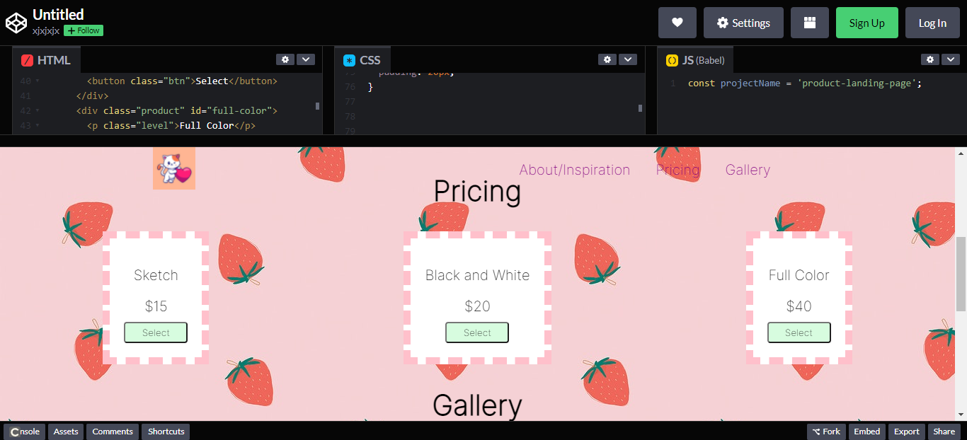
Thank you so much it worked! Also I’m sorry I keep asking so many questions but how do i make it so that each pricing is spread out horizontally and each have their own column instead of being stacked on top of each other? I’ve tried display: flex; display: column; display:inline-block; and a bunch of others but nothing really worked