I am having the issue of my sections overlapping on my site, specifically the the id=“work” section. I added position: relative but it does not seem to fix the issue. Suggestions?
It did correct the issue but now my content is covered by the next section and my nav bar is no longer stays on the top of the page. See the picture attached.
Part of the problem I think is that my divs(id=“project-tile”) are too large but I’m not sure how to make them smaller without messing something else up.
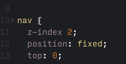
You can solve the issue you’re facing by adding a z-index of anything greater than 1 to the navbar. The z-index property is used to manage the overlapping of different “layers” or the arrangement of elements along the z axis (from the screen to your face). This seemed to work for me.
nav{
  z-index: 2;
}
I also noticed that you had a width of 100% set to your nav element but you’re also adding padding of right-left to it which is making it overflow the containing element. Browsers by default use something called the “content box” sizing model which adds up padding and margins when you set a width for example.
if you want your element to be 100px wide, you would instinctively set its width to be 100px, what you havent thought about is that if you add a padding of 10px to right and left of that element, now the total width becomes 140px which is not what you want.
There are two ways you can solve this, you can
Calculate the paddings and margins manually each time when you set each width.
You change the box-sizing property that will take care of it for you.
I like the second approach so i basically do this
* {
  box-sizing: border-box;
}
i used the universal selector here to set each element’s box sizing to border box meaning if i want my navbar to be 100% of the container, i wont need to worry about the other stuff. Here’s an awesome article which explains this in detail if you wanna learn more about it.
Browsers by default apply some styling to your html page so even if you don’t add any CSS to your HTML it wouldn’t look ugly but sometimes, these styles get in the way of our CSS as it is doing it in your site, basically reset the body element’s padding and margin to 0 so you can get rid of that spacing on the sides…
You were using the div tag for each project-tile, you can change them to article tags to make the html a bit more semantic.
The sections no longer overlaps each other either but now they get cut off, specifically the id=“work” section. Any recommendations so the entire sections appears on the page at all times?
Hey i found the problem, so when you click an internal link, the browser shifts its focus to the center of the element you set the id too. Right now, you have a link to the #projects so the main focus of the viewport is the projects and not the whole section. Change the link’s href to #work and it works fine for me.
Also maybe try increasing the padding-top to your #work element or align the items inside it to the center using the flex property.
You can also add a scroll-behavior property to add a transition to the scrolling.