You can view my personal website here: https://gracious-torvalds-39f1c5.netlify.com
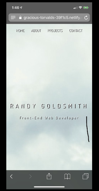
I am using an iphoneX, and as you can see in mobile view it seems to “zoom” in on the image to where it only shows the clouds rather than showing the whole img.
Relevant code:
My HTML
<body>
    <header id="showcase">
            <nav id="myHeader" class="top-left">
                <ul class="navbar">
                    <li>
                        <a href="#top">Home</a>
                    </li>
                    <li>
                        <a href="#about">About</a>
                    </li>
                    <li>
                        <a href="#projects">Projects</a>
                    </li>
                    <li>
                        <a href="#contact">Contact</a>
                    </li>
                </ul>
            </nav>
            <div class="intro-text">
                <h1>Randy Goldsmith</h1>
                <p>Front-End Web Developer</p>
            </div>
    </header>
body {
    margin: 0;
    padding: 0;
    box-sizing: border-box;
    font-family: 'Dosis', sans-serif;
}

#showcase {
    background-image: url('../imgs/johannes-ludwig-8dejZGw3Hec-unsplash.jpg');
    background-size: cover;
    background-repeat: no-repeat;
    background-attachment: fixed;
    background-position: center;
    height: 100vh;
    display: flex;
    flex-direction: column;
    justify-content: center;
    align-items: center;
}