Please see [Number-label : should contain text that describes that input] test.
I can’t understand why the number-label is still showing as uncomplete when the name and email label elements are complete.
**Your code so far**
/* file: index.html */
<!DOCTYPE html>
<html>
<head>
  <link rel="stylesheet" href="styles.css">
  <body>
    <h1 id="title">
       freeCodeCamp Survey Form
    </h1>
    <p id="description">
      Thankyou for taking the time to help us improve the platform
    </p>
    <form id="survey-form">
    Name:
   <input id="name" type="text" required><label id="name-label"><label>
    Email:
    <input id="email" type="email" required><label id="email-label"><label>
    Age(optional): <input id="number" type="number" min="10" max="120"><label id="number-label"></label>
    </form>
  </body>
</head>
</html>
/* file: styles.css */
**Your browser information:**
User Agent is: Mozilla/5.0 (Windows NT 10.0; Win64; x64) AppleWebKit/537.36 (KHTML, like Gecko) Chrome/103.0.5060.114 Safari/537.36 Edg/103.0.1264.62
Challenge: Survey Form - Build a Survey Form
Link to the challenge:
I would try using “age” or “age-label” as your label ID because you are describing the input that is going into that field. The input is age.
<input id="number" type="number" min="10" max="120"><label id="age"></label>
or
<input id="number" type="number" min="10" max="120"><label id="age-label"></label>


Hope this works for you, good luck on your code and stay strong. You got this :)
This is not valid HTML. You can either next the input in the label or have them separate, but not both.
Age is not the input id described to add. It specify’s that is must be “number-label”
A label should have a for attribute and also text inside of.
Also, it is much better to paste your HTML in here than to post pics of it. To display your code in here you need to wrap it in triple back ticks. On a line by itself type three back ticks. Then on the first line below the three back ticks paste in your code. Then below your code on a new line type three more back ticks. The back tick on my keyboard is in the upper left just above the Tab key and below the Esc key.
Final style edits help - please see attached:
I believe as I used
elements for the options that when it comes to styling the “description” and when the screen size becomes to small as the SS shows below my headers seem to uncenter. I’m a little usure why this is accuring so i’d appreciate any advice on changes to my code to fix this. It all looks okay on wide screen as shown so I can’t understand why that might be.


**Your code so far**
/* file: index.html */
<!DOCTYPE html>
<html lang="en">
<head>
<link rel="stylesheet" href="styles.css">
<body>
<h1 id="title"> freeCodeCamp Survey Form </h1>
<p id="description"> Thank you for taking the time to help us improve the platform <h2 id="description"> </h2></p>
<form id="survey-form">
<fieldset>
<label id="name-label"> Name:<input id="name" type="text" placeholder="Enter your name" required ><label>
</fieldset>
<fieldset>
<label id="email-label"> Email: <input id="email" type="email" placeholder="Enter your email"required><label>
</fieldset>
<fieldset>
<label id="number-label"> Age: <input id="number" type="number" placeholder="10" required min="10" max="120"></label>
</fieldset>
<fieldset>
Which option best describes your current role?
<select id="dropdown" >
<option> Student <label></option>
<option> Full Time Job </option>
<option> Full Time Learner </option>
<option> Prefer Not to Say </option>
<option> Other </option>
</select>
</fieldset>
<fieldset>
Would you recommend to a friend?
<p> <input type="radio" name="recommend" class="inline" value="definetly"/> Definetly </p>
<p><input type="radio" name="recommend" class="inline" value="mabey"/> Mabey <p>
<p> <input type="radio" name="recommend" class="inline" value="not sure" /> Not Sure <p>
</fieldset>
<fieldset>
What is your favorite feature of freeCodeCamp?
<label>
<select>
<option> Select an option </option>
<option> Challenges </option>
<option> Projects </option>
<option> Community </option>
<option> Open Source </option>
</select>
</label>
</fieldset>
<fieldset>
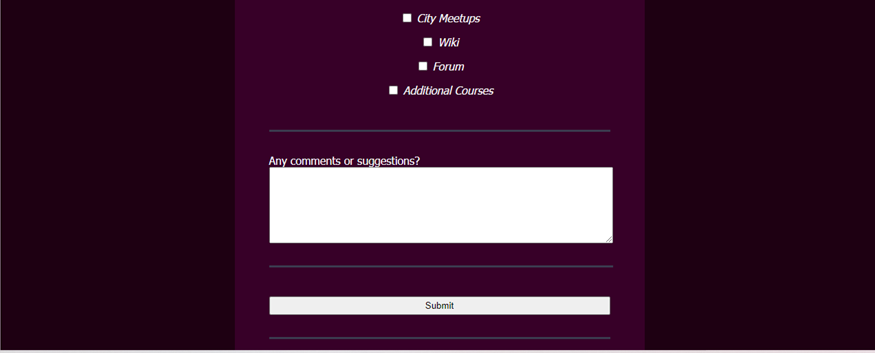
What would you like to see improved? (Check all that apply)
<p><input type="checkbox" value="front-end-projects"> Front-end Projects </input></p>
<p><input type="checkbox" value="back-end-projects"> Back-end Projects </input></p>
<p><input type="checkbox" value="data-visualization"> Data Visualization </input></p>
<p><input type="checkbox" value="challenges"> Challenges </input></p>
<p><input type="checkbox" value="open-source-community"> Open Source Community </input></p>
<p><input type="checkbox" value="glitter-help-rooms"> Gitter help rooms </input></p>
<p><input type="checkbox" value="videos"> Videos </input></p>
<p><input type="checkbox" value="city-meetups"> City Meetups </input></p>
<p><input type="checkbox" value="wiki"> Wiki </input></p>
<p><input type="checkbox" value="forum"> Forum </input></p>
<p><input type="checkbox" value="additional-courses"> Additional Courses </input></p>
</fieldset>
<fieldset>
Any comments or suggestions?
<textarea name="comments" rows="7" cols="65" placeholder="I like, This could be better..."> </textarea>
</fieldset>
<fieldset>
<button id="submit" type="submit"> Submit </button>
</fieldset>
</form>
</body>
</head>
</html>
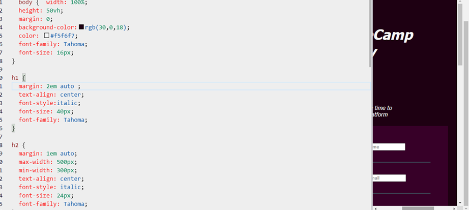
/* file: styles.css */
 body {  width: 100%;
 height: 50vh;
 margin: 0;
 background-color:rgb(30,0,18);
 color: #f5f6f7;
 font-family: Tahoma;
 font-size: 16px;
}

h1 {
 margin: 2em 2em ;
 text-align: center; max-width: 500px;
 min-width: 300px;
 font-style:italic;
 font-size: 40px;
 font-family: Tahoma;
}

h2 {
 margin: 1em auto;
 max-width: 500px;
 min-width: 300px;
 text-align: center;
 font-style: italic;
 font-size: 24px;
 font-family: Tahoma;
}

p {
 margin: 1em auto;
 text-align: center;
 font-style:italic;
}

form {
 width: 60vw;
 max-width: 500px;
 min-width: 300px;
 margin: 0 auto;
 padding: 1em 3em;
 background-color: rgb(55,0,40)
}

fieldset {
 border: none;
 padding: 2rem 0;
 border-bottom: 3px solid #3b3b4f;
}

button{margin: 10px 0 0 0;
 width: 100%;
 min-height: 2em;
}
**Your browser information:**
User Agent is: Mozilla/5.0 (Windows NT 10.0; Win64; x64) AppleWebKit/537.36 (KHTML, like Gecko) Chrome/103.0.5060.114 Safari/537.36 Edg/103.0.1264.62
Challenge: Survey Form - Build a Survey Form
Link to the challenge:
Replace the 2em you have for the left/right margin on the h1 element with auto.
h1 {
  margin: 2em auto;
}
The text still Centers to the left for the 2 headers.
It’s not. You have an overflow that unfortunately seems to be hidden in the editor preview. Not sure why that is happing but it’s not good. You need to be able to see the overflow to correct it.
Edit: I guess you do see it, never mind.
It is mainly caused by the textarea element. The form itself will also start to overflow at around 400px, which isn’t the end of the world.
As an aside, I’d suggest you validate your HTML.
Would putting a min-width on the other style elements stop this then?
You can start by just giving the textarea element width: 100%.
I would also suggest you set the box-sizing at the top of the CSS
* {
  box-sizing: border-box;
}
top of the css, meaning linked to the body element?
No, just as the first thing in the CSS. So before all other CSS at the top of the file.
The * selector selects everything. So it sets the style for all elements.