Looks good.
Everyone loves neat, simple and plain design, like this one you did, very good.
It’s responsive, this is really good.
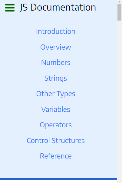
One suggestion I have is about desktop view, the left navigation panel. I think it’s a little wide, could be smaller(less width) so more space for reading panel.
One thing I found in your code, you set min-width for body, please don’t. Because even 300px looks so small, but for browsers with zoomed confs, this value could be applied for larger (e.g. 400px / point) screen, and causes scroll.
In mobile view I also suggest you apply less padding, so more space for content. this will be great.
Also consider browser may apply default margin/padding value for body, (e.g. chrome is 8px), so override this value with 0 to use more space for mobile.
body{
margin:0
}
Also same thing about ul, check in mobile view, the top navigation panel, ul tag caused some notable spacing(which is a little too much) after and before ul tag, check:
some space becasue of padding/margin before bottom border, and after “js documentation” title, it’s not cool for mobile especially, please fix. I tried zero for padding and margin, worked for me.
And your question
This is the same thing you did for body, and min-width, I suggest you don’t.
Overall it’s a neat work, I liked it, perfect.
Like to see some improvements, especially about spacing in mobile layout soon.
keep goin on great work, happy programming