hello! maybe it’s a bit early to ask since it’s one of the first bootstrap challenges (i am currently at the 72th one, but the problem began few challenges earlier), but i don’t understand why the text in the buttons “like” and “info” is aligned to the center while in the button “delete” it is not aligned despite all of these three buttons use the very same bootstrap classes; and it is not my code, it’s the code provided by the site. here is a screen shot of what i mean:

It is aligned just fine, same as the other buttons. In this case, it’s just that the actual text “delete” is longer than the space available to it in the button in that screenshot. You can see the effect of the padding applied to the buttons on the left side. But the text carries on all the way to the right of the button.
You can demonstrate this by replacing the word with something shorter, like “del”; with the shorter word, it’ll be more obvious the alignment is exactly the same as on the other buttons’ text.
Make the text of the buttons smaller, or reduce the padding, or give the buttons more space.
Edit: or what @marcaaron says, it’s just the size of the FCC viewport; 250px is tiny, things will tend to look wierd at that size if you just shrink things down horizontally. There isn’t actually anything wrong with what you’ve done.
1 Like
This is not quite a bug but I suspect it’s happening because of the width of the window set by FCC for this challenge. The buttons are responsive but the text within them itself is not. If you take this same code and recreate it in a local dev environment it should look fine up until a certain point…
e.g.
Here’s how it will actually look on an iPhone 6:

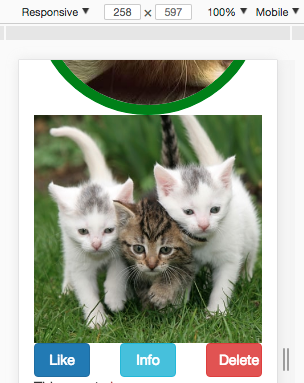
And here’s how it looks on a screen 258px wide:
There are many ways around this issue. Off the top of my head… setting a min-width on the buttons or messing with the flex properties to allow buttons to take up more space on their row or even a good old fashioned media query to perhaps ditch some of the margin or change the font size or… you get the idea…
Perhaps a more important question is if this will really ever need look good at a width of 250px?
1 Like
oh, i got it, thank you!
I’m confused. Isn’t this a padding issue? I"m not a bootstrap expert, but if it was center aligned, whether using text-align or even flexbox, it would at least be touching the left edge before stretching to the right.
When you learn more CSS you’ll pick up flexbox and won’t have to deal with this sort of thing.