With the following code:
  <div class="row">
    <div class="col-xs-4">
      <button class="btn btn-block btn-primary">Like <i class="fa fa-thumbs-up"></i></button>
    </div>
    <div class="col-xs-4">
      <button class="btn btn-block btn-info">Info <i class="fa fa-info-circle"></i></button>
    </div>
    <div class="col-xs-4">
      <button class="btn btn-block btn-danger">Delete <i class="fa fa-trash"></i></button>
    </div>
  </div>

You will notice that (a) the thumbs up icon is almost at the edge of the button without margin, (b) the info button has a wider left margin than in the right, and © the trash icon is chopped off from being displayed.
With the code:
  <div class="row">
    <div class="col-xs-4">
      <button class="btn btn-primary">Like <i class="fa fa-thumbs-up"></i></button>
    </div>
    <div class="col-xs-4">
      <button class="btn btn-info">Info <i class="fa fa-info-circle"></i></button>
    </div>
    <div class="col-xs-4">
      <button class="btn btn-danger">Delete <i class="fa fa-trash"></i></button>
    </div>
  </div>

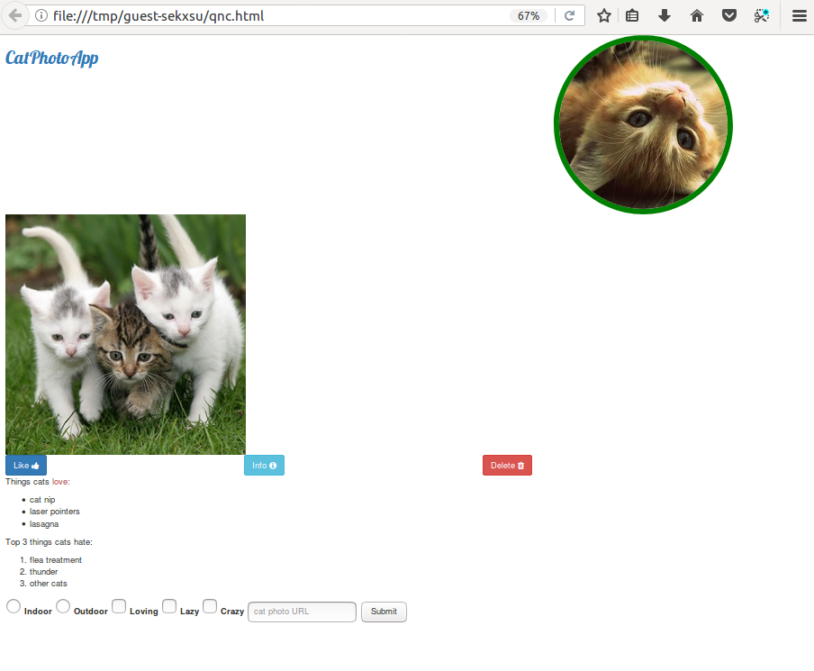
Here the margins are okay with the text and icons centered in each button. However, you will notice that the delete button has moved to touch the right edge of the screen.
I don’t exactly know what is the solution in this aesthetic problem is suggested by freeCodeCamp but adding the following looks like to solve the problem:
  #button-react .col-xs-3
  {
    margin-right: 10px;
  }

  <div class="row" id="button-react">
    <div class="col-xs-3">
      <button class="btn btn-primary">Like <i class="fa fa-thumbs-up"></i></button>
    </div>
    <div class="col-xs-3">
      <button class="btn btn-info">Info <i class="fa fa-info-circle"></i></button>
    </div>
    <div class="col-xs-3">
      <button class="btn btn-danger">Delete <i class="fa fa-trash"></i></button>
    </div>
  </div>

Now, is there a better solution?
It looks so disarranged in the desktop view: