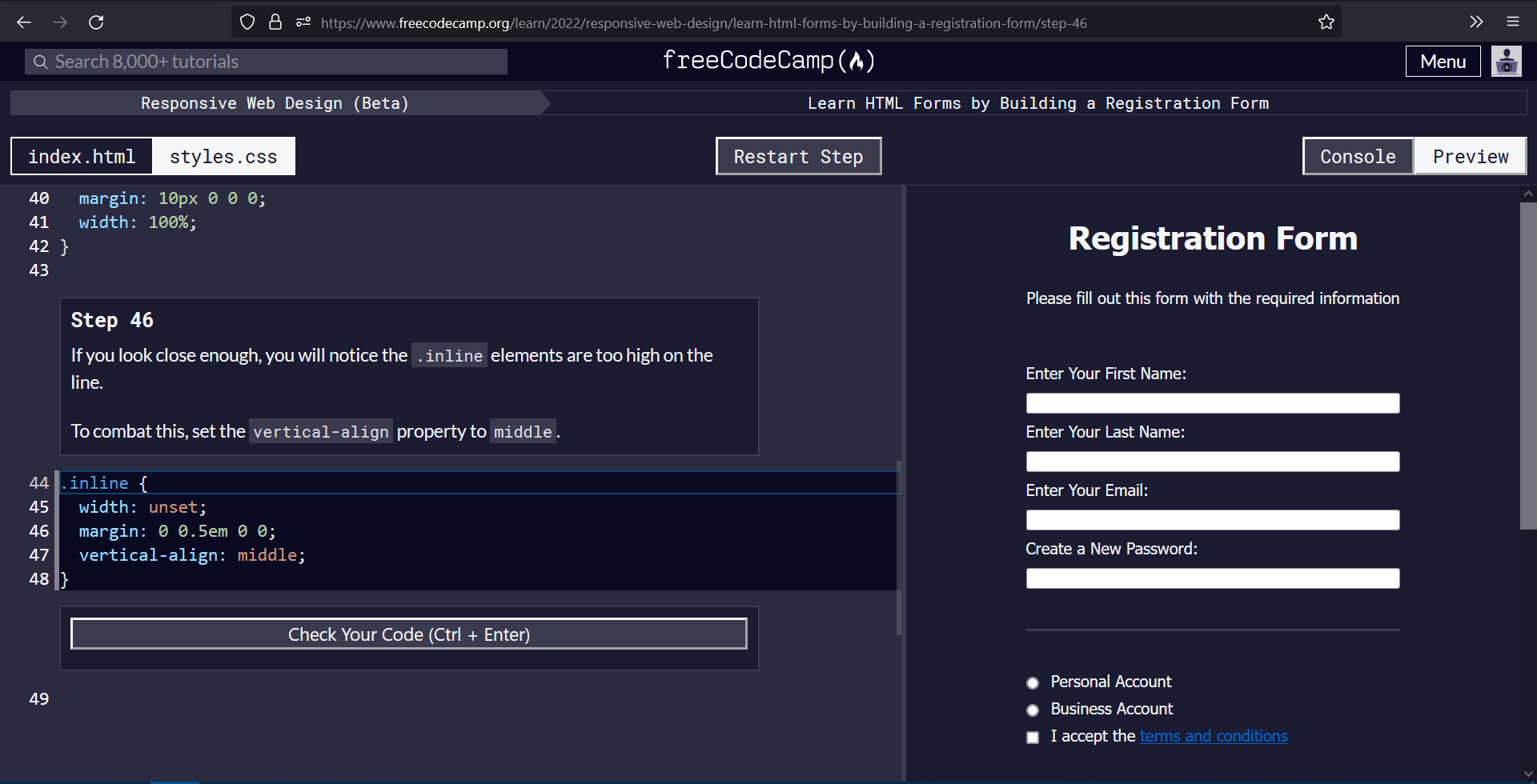
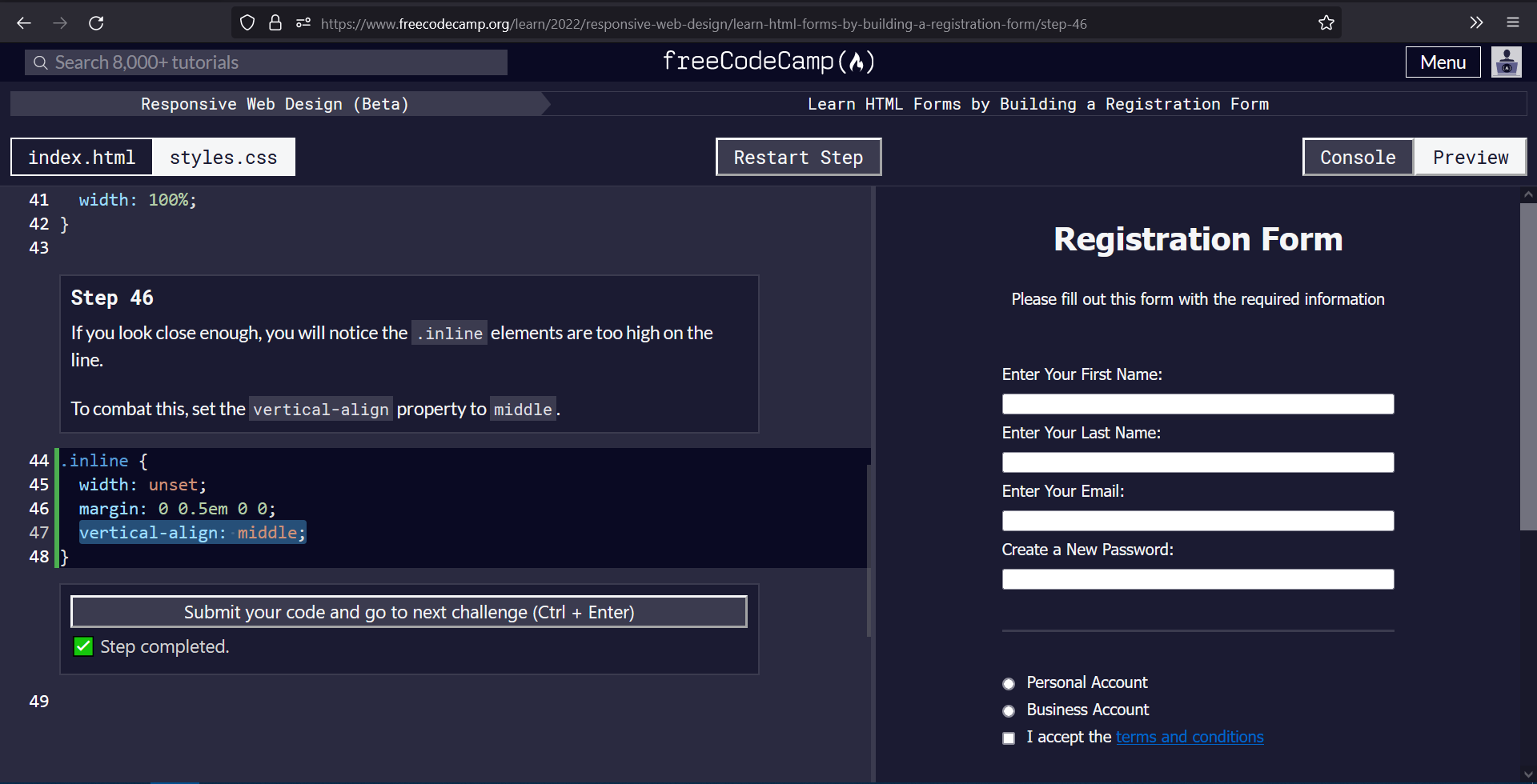
I am following the registration-form project on the new Responsive web development (beta).
On step 46, it instructions you to use vertical-align property to style the checkbox and radio boxes to align the input boxes slightly lower with respect to the label text.
I don’t understand the need for this, as the boxes seem to be already aligned with the label text.
code-
vertical-align: middle;
Link to the challenge - https://www.freecodecamp.org/learn/2022/responsive-web-design/learn-html-forms-by-building-a-registration-form/step-46