I set the padding, margins, and borders of both elements to zero, but the space is still there. It would seem that the red rectangle should be touching the heading. How do I do that? What’s causing that space?
I cannot see your code.
Please provide a link to codepen or your code.
Also, if this is for a specific fcc challenge, please provide a link to the challenge here.
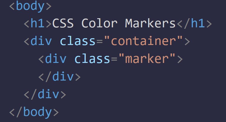
It’s for the colored markers challenge. The only thing else there is to see is my CSS, but I can assure you I set the padding, border thickness, and margins to zero. I don’t think there is any border or padding by default, but I set them to zero just to make sure.
Please do not send a screenshot of your code for this type of user. We actually need all your actual lines of code so we can plug it into the exercise. (Or run it through a validation)
It is probably the font itself that is causing these two to not touch.
You can set the div’s tip margin to -7pm for eg to make it touch. (Or the bottom margin of the h1, either way).
But tbh I am confused by this whole topic. You are just testing the code right? This is not for an actual challenge?
Okay, they do touch when I set the margin to -7px. I wouldn’t have figured that the font would be causing extra space. Visually, it doesn’t make sense, so I don’t understand that yet.
No, that wasn’t a part of the challenge. It’s just something I noticed and wanted to get to the bottom of. Thank you for your help!