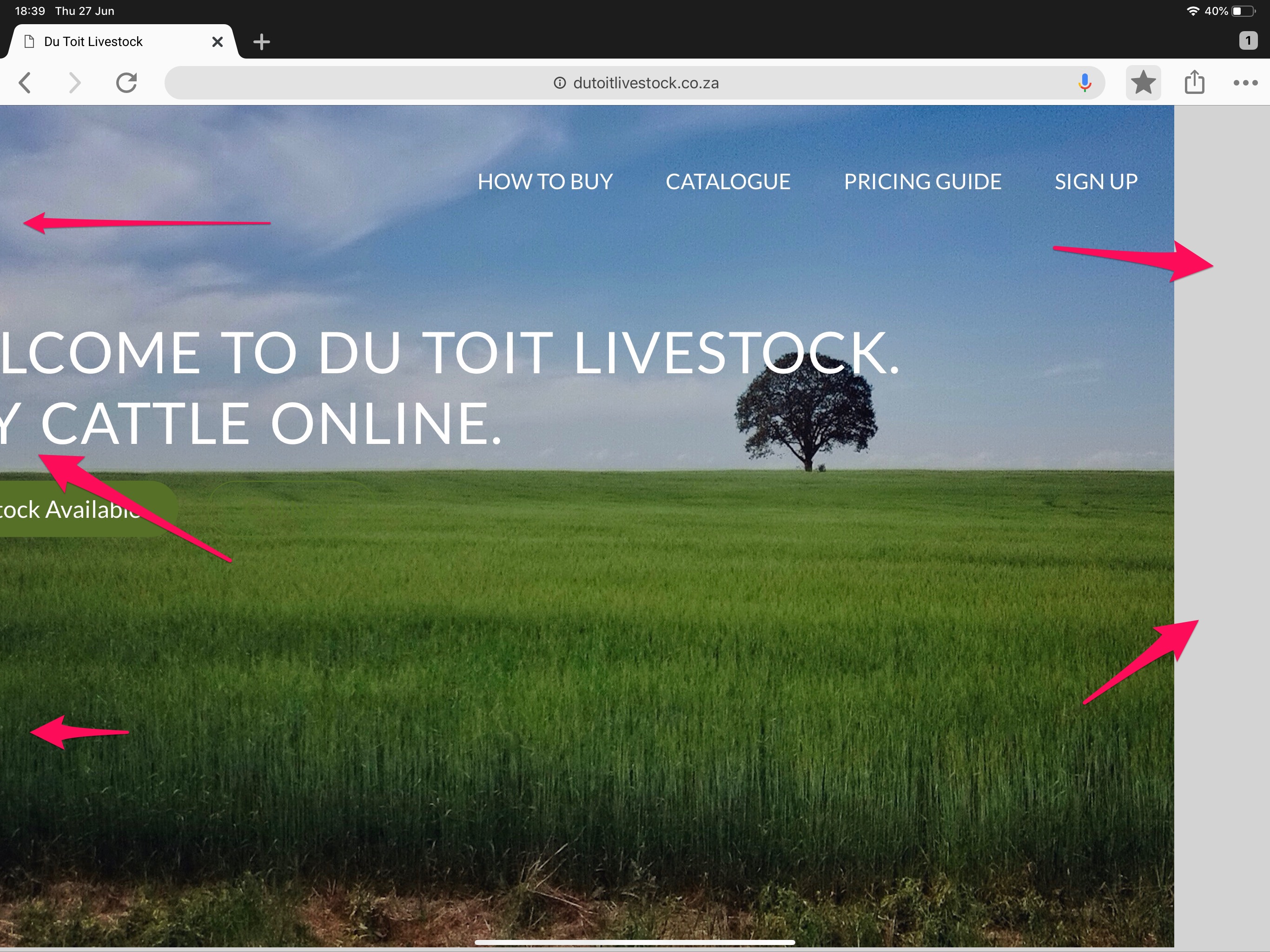
Please can someone help me… I am in the process of developing my first website however it is not fitting on Chrome or Safari on mobile devices (iPad and iPhone). However, it does fit on a browser on a laptop. What am I doing wrong?
/* ----------------------------------------*/
/* BASIC SETUP*/
/* ----------------------------------------*/
* {
    margin: 0;
    padding: 0;
    box-sizing: border-box;
}
html {
    background-color: #D3D3D3;
    color: #555;
    font-family: Lato, 'Arial', sans-serif;
    font-size: 20px;
    font-weight: 300;
    text-rendering: optimizeLegibility;
}
/* ----------------------------------------*/
/* REUSABLE CONTENTS*/
/* ----------------------------------------*/
.row {
    max-width: 1140px;
    margin: 0 auto;
}

section {
    padding: 80px 0;
}
h1,
h2,
h3 {

    font-weight: 300;
    text-transform: uppercase;
    letter-spacing: 1px;
}
h1 {
    margin-top: 0;
    margin-bottom: 20px;
    color: #fff;
    font-size: 240%;
    word-spacing: 4px;
}
h2 {
    font-size: 180%;
    word-spacing: 2px;
    text-align: center;
    margin-bottom: 30px;
}
h3 {
    font-size: 110%;
    margin-bottom: 15px;
}
h2:after {
    display: block;
    height: 3px;
    background-color: #557026;
    content: " ";
    width: 150px;
    margin: 0 auto;
    margin-top: 30px;
}
/* ----------------------------------------*/
/* PARAGRAPHS/
/* ----------------------------------------*/
.long-copy {
    line-height: 145%;
    width: 70%;
    margin-left: 15%;
}
.box {
    padding: 1%
}
.box p {
    font-size: 85%;
    line-height: 145%;
}
/* ----------------------------------------*/
/* HEADERS/
/* ----------------------------------------*/
header {background-image: linear-gradient(rgba(0, 0, 0, 0.2), rgba(0,0,0,0.2)), url(imagescs/background_farm_grass.jpeg);
background-size: cover;
/*background-position: center;*/
height: 100vh;
}
.hero-text {
    position: absolute;
    width: 1140px;
    top: 41%;
    left: 50%;
    transform: translate(-50%,-50%)
}
.logo {
    height: 100px;
    width: auto;
    float: left;
    margin-top: 10px;
}
.main-nav {
    float: right;
    list-style: none;
    margin-top: 50px;
    margin-right: 30px;
}
.main-nav li {
    display: inline-block;
    margin-left: 40px;
}
.main-nav li a:link,
.main-nav li a:visited {
    padding: 8 0;
    color: #fff;
    text-decoration: none;
    text-transform: uppercase;
    font-size: 90%;
    border-bottom: 2px solid transparent;
    transition: border-bottom 0.2s;
}
.main-nav li a:hover,
.main-nav li a:active {
    border: 1px solid #557026;
    border-bottom: 2px solid;
    border-top: none;
    border-right: none;
    border-left: none;
}
/* ----------------------------------------*/
/* ICONS
/* ----------------------------------------*/
.icon-big {
    font-size: 300%;
    display: block;
    color: #557026;
    margin-bottom: 10px;
}


/* ----------------------------------------*/
/* BUTTONS
/* ----------------------------------------*/
.button:link,
.button:visited {
    display: inline-block;
    padding: 10px 30px;
    font-weight: 300;
    text-decoration: none;
    border-radius: 200px;
    color: #fff
}
.button-full:link,
.button-full:visited {
    background-color: #557026;
    border: 1px solid #557026;
    margin-right: 20px;
}
.button-ghost:link,
.button-ghost:visited {
    border: 1px solid #557026;
    color: #557026;
}
.button:hover,
.button:active {
    background-color: #384a19;
}
.button-full:hover,
.button-full:active {
    border: 1px solid #557026;
}
.button-ghost:hover,
.button-ghost:active {
    border: 1px solid #557026;
    color: #fff;
}
/* ----------------------------------------*/
/* CATTLE SHOWCASE
/* ----------------------------------------*/
.section-cattle-photos {
    padding: 0;
}
.cattle-showcase {
    list-style: none;
    width: 100%;
}
.cattle-showcase li {
    display: block;
    float: left;
    width: 33%;
}
.cattle-photo {
    width: 100%;
    margin: 0;
    overflow: hidden;
    background-color: black;
}
.cattle-photo img {
    opacity: 0.7;
    width: 100%;
    height: auto;
    transform: scale(1.15);
    transition: transform 0.5s, opacity 0.5s;
}
.cattle-photo img:hover {
    opacity: 1;
    transform: scale(1.03);
    animation:
}
