The title says it all.
So if this happened to you what did you do?:
-
Used Bootstrap?
-
Studied the entire Flexbox manual?
-
Learned a native app framework (Reat Native or Ionic or NativeScript or other)?
-
Decided to learn crochet?
The title says it all.
So if this happened to you what did you do?:
Used Bootstrap?
Studied the entire Flexbox manual?
Learned a native app framework (Reat Native or Ionic or NativeScript or other)?
Decided to learn crochet?
I just use Bootstrap for all of my layout, but I’m still in the early stages of FCC so aside from media queries I don’t know the other alternatives for responsive design (except for crochet. Love crochet.)
I find it’s easiest to design a wireframe and do the responsive layout in Bootstrap first. Then I add the functionality to the project. This helps me avoid phone-view shock.
cheers,
Ali
Oh yeah, I should add most web design processes use the concept of ‘mobile first’. So you get the project design working on a mobile layout first then adjust it for tablet and computer screens. This can help.
@Aldek, I think I’d be a terrible crocheter - my OCPD tendencies would hinder my artistry.
For some reason I’ve been avoiding Bootstrap (other than doing the intro FCC challenges). I am averse to it because as much as I appreciate its power and usefulness, I wanted to learn CSS properly first. Bootstrap looks too easy - and it’s also over-used (too many websites looking the same). My opinion.
I started learning Flexbox a few months ago but put it aside so I only know the basics. There are just so many things to learn. I’ve been focusing a lot on JavaScript so my JS skills are starting to surpass my CSS skills. I’m also diving deeper into HTML5.
I’m very aware of “mobile first” but it’s always good to be reminded of it. I’m going to have to put it higher on my priority list.
Cheers
I use Bootstrap only to use the grid. Rest of the RWD work I do by css.
Yep. I agree with devguru. Just use Bootstrap for layout then you can use custom CSS for the ‘look and feel’. This means your site won’t look identical to every other site and gives you a lot of freedom for the visual design. Using the 12-column grid you have a lot of freedom in layout.
I agree that it is very useful to learn how to do all of this with CSS first. If you still want to avoid Bootstrap for now just follow these steps:
It is a LOT more time consuming doing it this way. Learning how to do it is useful, though, because sometimes you may want to make a change in a site between official Bootstrap breakpoint. It gives you a lot more control over the design.
Bootstrap looks too easy because it is easy. This is why front-end frameworks are used extensively in industry. If you are going to learn to do responsive design just with CSS I’d recommend doing it just as a learning step and eventually move to Bootstrap to save you time.
Do you run the Web browser on your computer in a window? Resizing it to a narrow window will help catch a situation like that really early. 
You don’t need Bootstrap for mobile compatibility, just use media queries.
That’s a good plan @Aldek! Thank you for this detailed suggestion - much appreciated!
I use Chrome @astv99 and I do use dev tools but it doesn’t compare to looking at it on my phone. My initial post was slightly exaggerated in that I already knew my project wasn’t mobile friendly but it turned out worse than expected.
I’m having fun in the process so it’s all good.
I tend to design desktop screen first, while checking on smaller screens and making adjustments as necessary using media queries.
Also, I turn off/hide certain divs (unimportant stuff/eye-candy, etc) on the mobile screen so only the important sections appear on the mobile device. (This is where Bootstrap’s hidden and visible classes come in very handy).
I think it’s still important checking on the actual device as there are differences between checking the site on a smaller desktop browser window vs. the actual mobile browser. Some things just behave differently (usually embedded videos), parallax, mouse-over effects (or lack of it).
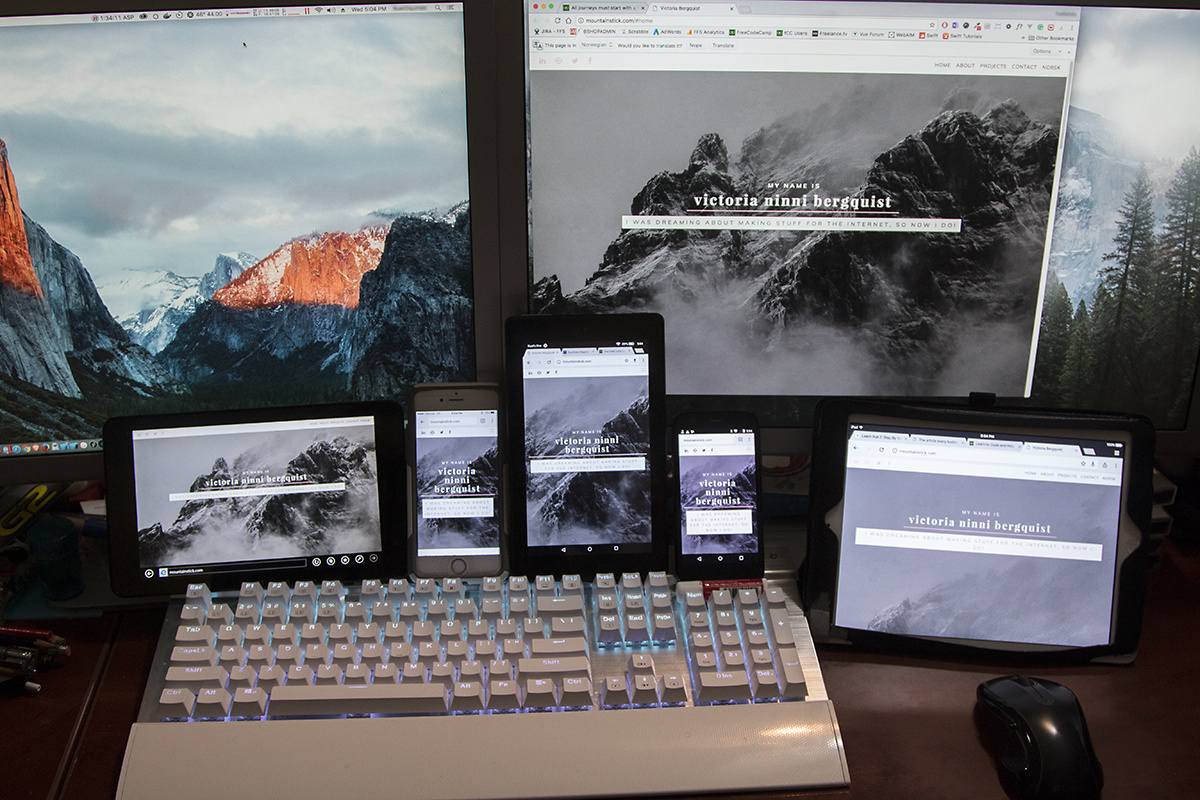
** my setup, here checking the portfolio site of one fCC user. I have another 3rd monitor to the right (off-screen)
That’s a very nice setup @owel! I remember us having a discussion about this kind of setup a while ago but back then you showed me a concept pic. You did it!
I’m glad it’s not just me who thinks that the device view in dev tools doesn’t accurately represent devices (other than screen sizes).
Thanks. The iPhone and iPad I already own. The rest are eBay finds, so not really expensive to get this setup. I think this is a good representation of iOS, Android and Windows devices.
Win8 Dell Tablet - $50 on eBay
Motorola Android phone - $20 eBay
Amazon Fire 7 tablet - $50 @ Amazon, or $10/month
B&N Nook Color - $20 eBay (not pictured)
Focus on the positives. You got something great done in a month.
A learning project can realistically only have a few goals, what were yours when you started the project? Did you meet them? Don’t beat yourself up over a goal that wasn’t part of the project, just add it to the goals for the next one!
Now this is coming from someone who hasn’t touched Bootstrap yet (I’ve dabbled a bit with Foundation but that’s it), but I’ve shifted all my coding to chrome because of the device tool bar in developer tools. I’ve yet to have any major display issues when checking projects on my phone.
You can check out this site too: http://www.responsinator.com/?url=about:blank it’s my go to for further mobile testing.
You can either enter a url at the top or, just make it a bookmark on your browser’s toolbar. What you can do is load up your webpage and then click the bookmark and it will load up your page in each one of those mobile display frames. They are frames though, so if you make any changes to the code, you have to right click on whatever device your testing for and have it reload that frame. Or can just relaunch the entire responsinator page, it’s up to you.
As Owel indicated, nothing beats actually having devices for testing of course, but I find both of those good options that haven’t lead me astray yet.
I’m glad you’re learning the backbone of responsive design first as to me Bootstrap or any other framework is something to just speed up your production. But truly understanding what goes into making a site responsive will save you a ton of frustration and reworking down the line.
Thank you @craigrpears. You’re right I should focus on the positives. it was the Random Quotes project. My goal was to do it differently from the example.
My accomplished goals were the following:
Draw my own quote bubble image using an svg editor
Center it in the middle of the page
import a series of quotes in json format from an external source using AJAX (non jQuery)
pick a random quote from the json object
have it fade in in the center of my quote bubble image (jQuery)
have it fade out after 8 seconds (using setInterval) and then replaced with a new random quote
have a button to clear the interval and pick a new random quote (stop the quotes rotation)
have a second button to resume the rotation of quotes
have a third button to tweet the current quote
have an alert popup if the quote is greater than one-hundred-forty characters saying that the quote cannot be tweeted
pick an interesting color palette for the background, quote bubble and buttons
I am reworking it to be responsive.
Thanks @dlyons for your input. I will check out the link you provided.
I like doing things the hard way first so I appreciate your feedback about me not using Bootstrap.
I will learn it eventually but I want to be able to work without it.
Cheers