My page text and icons don’t appear to be in the centre. For example, the arrow on section one looks slightly towards the left than the centre. In addition, in terms of section 2 I think the title is centred. However, if you compare the section 2 title with section one’s text you can clearly see it’s slanted to the left.
How can I resolve this so all the text and the bouncing arrow is dead in the centre?
I have done further research by asking other developers regarding this. Here are the responses that I got that maybe could help you give me a solution.
“It doesn’t look centred to me, the issue could be the navigation bar or the scrollbar.”
“It could be a dead pixel”
“Try using dev tools”
“Looks fine to me” http://imgur.com/4hUWu9b (keep getting mixed answers) Could the issue be depending on screen size?
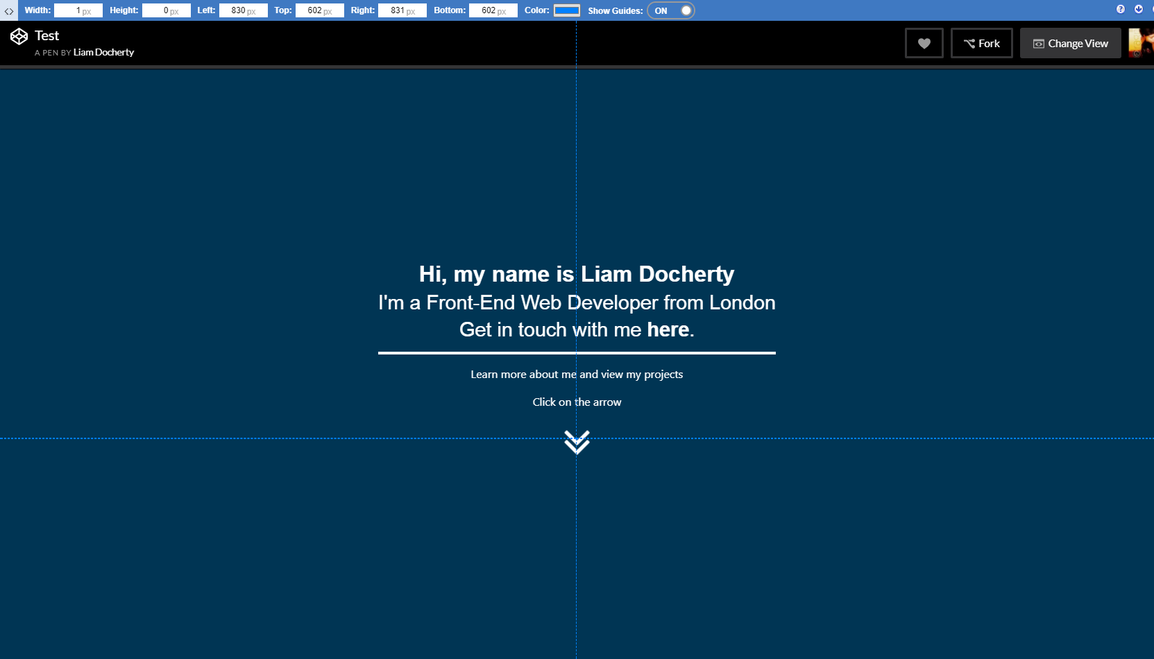
EXAMPLE SCREENSHOT

Below I have listed two ways of how you can view my website. On both I can see it doesn’t look centred.
HTML CODE FOR SECTION 1/2 so you can review it to see if there is a mistake which is causing this.
<!-- SECTION1 -->
       <section id="part1">
          <div class="container h-100 d-flex justify-content-center align-items-center">
             <div class="row">
                <div class="col">
                   <div class="chevron-row bounceInDown animated">
                     <h1 class="text-center" id="title1">Hi, my name is Liam Docherty</h1>
                     <h4 class="text-center" id="title2">I'm a Front-End Web Developer from London</h4>
                     <h5 class="text-center" id="title3">Get in touch with me <a href=#part4 class="txtlink" target=_blank>here</a>.</h5>
                     <hr class="line">
                     <p class="text-center">Learn more about me and view my projects</p>
                      <p class="text-center">Click on the arrow</p>
                      <a href="#part2">
                        <i class="fa fa-angle-double-down bounce fa-4x"></i>
                      </a>
                   </div>
                </div>
             </div>
          </div>
       </section>
       <!-- SECTION2 -->
       <section id="part2">
          <div class="container-fluid">
          <div class="row">
          <div class="col">
            <div class="chevron-row bounceInLeft animated">
              <h1 class="text-center" id="title4">About Me</h1>
              <hr class="line2">
          </div>
          </div>
          </div>
        </div>
       </section>