Hi there,
I need help with styling CSS Grid.
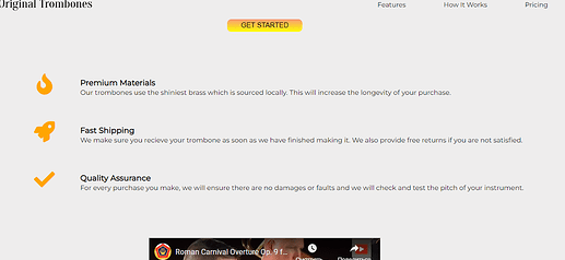
I have this outcome for this page section:
Pay attention to how text is not wrapping on the right side and how wide it is. Compare it to what I am trying to achieve as a outcome which is this:
The difference between the two is that MINE is styled using GRID and the EXAMPLE is styled using FLEX!
I am trying to make MINE look like the EXAMPLE.
This is my HTML:
<!DOCTYPE html>
<html lang="en">

<head>
    <meta charset="UTF-8">
    <meta name="viewport" content="width=device-width, initial-scale=1.0">
    <meta name="author" content="Johnny John">
    <meta name="description" content="This is the seventeenth project within freeCodeCamp courses">
    <meta name="content" content="text">
    <meta name="content" content="image">
    <link rel="stylesheet" href="styles.css">
    <link rel="stylesheet" href="https://use.fontawesome.com/releases/v5.8.2/css/all.css">
    <title>Landing Page</title>
</head>

<body>

    <header id="header">
        <img src="Landing_Page_Header_Logo.png"
            alt="Original Trombones logo. Trombone on the left side of the logo and Original Trombones sign on the right side of the logo"
            id="header-img">
        <nav id="nav-bar">

            <ul>

                <li>
                    <a href="#features" class="nav-link">Features</a>
                </li>
                <li>
                    <a href="#how_it_works" class="nav-link">How It Works</a>
                </li>
                <li>
                    <a href="#pricing" class="nav-link">Pricing</a>
                </li>

            </ul>

        </nav>

    </header>

    <main>

        <section class="email-section">

            <h1>
                Handcrafted, home-made masterpieces
            </h1>

            <form action="https://www.freecodecamp.com/email-submit" id="form" target="_blank">

                <input type="email" id="email" name="email" placeholder="Enter your email address" required>
                <br>
                <input type="submit" name="submit" id="submit" value="Get Started">

            </form>

        </section>


        <section class="description-section" id="features">
            <!-- THIS ONE CONTAINS DESCRIPTION  -->
            <div class="grid-middle">
                <i class="fa fa-fire grid-left"></i>
                <div class="grid-right">
                    <h3>Premium Materials</h3>
                    <p>Our trombones use the shiniest brass which is sourced locally. This will increase the
                        longevity of your
                        purchase.</p>
                </div>
            </div>

            <div class="grid-middle">
                <i class="fa fa-rocket grid-left"></i>
                <div class="grid-right">
                    <h3 class="grid-right">Fast Shipping</h3>
                    <p>We make sure you recieve your trombone as soon as we have finished making it. We also
                        provide free
                        returns if you are not satisfied.</p>
                </div>
            </div>

            <div class="grid-middle">
                <i class="fa fa-check grid-left"></i>
                <div class="grid-right">
                    <h3 class="grid-right">Quality Assurance</h3>
                    <p class="grid-right">For every purchase you make, we will ensure there are no damages or faults and
                        we will
                        check and test the
                        pitch of your instrument.</p>
                </div>
            </div>

        </section>

        <figure class="video-figure" id="how_it_works">
            <!-- THIS ONE CONTAINS VIDEO -->
            <iframe src="https://www.youtube.com/embed/y8Yv4pnO7qc" id="video" width="550" height="300"></iframe>
        </figure>


        <section class="prices-section" id="pricing">
            <!-- THIS ONE CONTAINS PRICINGS -->
            <div>
                <h4>TENOR TROMBONE</h4>
                <p><strong>$600</strong></p>
                <p>Lorem ipsum.</p>
                <p>Lorem ipsum.</p>
                <p>Lorem ipsum.</p>
                <p>Lorem ipsum.</p>
                <button>Select</button>
            </div>
            <div>
                <h4>BASS TROMBONE</h4>
                <p><strong>$900</strong></p>
                <p>Lorem ipsum.</p>
                <p>Lorem ipsum.</p>
                <p>Lorem ipsum.</p>
                <p>Lorem ipsum.</p>
                <button>Select</button>
            </div>
            <div>
                <h4>VALVE TROMBONE</h4>
                <p><strong>$1200</strong></p>
                <p>Plays similar to a Trumpet</p>
                <p>Great for Jazz Bands</p>
                <p>Lorem ipsum dolor.</p>
                <p>Lorem ipsum.</p>
                <button>Select</button>
            </div>
        </section>


    </main>

    <footer>

        <nav id="footer-nav">

            <ul>

                <li><a href="#">Privacy</a></li>
                <li><a href="#">Terms</a></li>
                <li><a href="#">Contact</a></li>

            </ul>

        </nav>

        <p>Copyright 2016, Original Trombones</p>

    </footer>

</body>

</html>
This is my CSS:
@import url("https://fonts.googleapis.com/css2?family=Montserrat:ital,wght@0,300;0,400;1,300&display=swap");

html {
  font-size: 62.5%;
}

body {
  overflow-x: hidden;
  font-size: 1.6rem;
  font-family: "Montserrat", sans-serif;
  background-color: rgb(238, 237, 237);
  margin: 0;
  padding: 0;
  box-sizing: border-box;
  text-align: center;
}

/* HEADER START*/

#header {
  width: 100%;
  height: 7rem;
  display: flex;
  justify-content: space-between;
  align-items: center;
  position: sticky;
  top: 0;
  background-color: inherit;
}

img {
  width: 30rem;
  height: 3.5rem;
  margin-left: 4rem;
}

#nav-bar ul {
  display: flex;
  column-gap: 9rem;
  margin-right: 7.5rem;
}

#nav-bar ul li {
  list-style-type: none;
}

.nav-link {
  text-decoration: none;
  color: inherit;
  font-size: 1.55rem;
}

/* HEADER END*/

/* SECTION WITH EMAIL START*/

#email {
  height: 2rem;
  width: 18%;
  border-color: transparent;
  border-radius: 1rem;
  padding: 0.5rem 0.4rem 0.5rem 0.4rem;
}
#email:focus-visible {
  outline: none;
}

#submit {
  margin-top: 1rem;
  padding-top: 0.5rem;
  padding-bottom: 0.5rem;
  height: 3rem;
  width: 12%;
  font-size: 1.65rem;
  font-weight: 300;
  text-transform: uppercase;
  background: linear-gradient(180deg, rgba(255, 69, 0, 0.5), rgba(255, 255, 0));
  border-radius: 1rem;
  border: transparent;
  cursor: pointer;
  transition: background-color 0.6s;
  transition: width 0.3s;
}

#submit:hover {
  background-color: sandybrown;
  width: 15%;
}

/* SECTION WITH EMAIL END*/

/* SECTION WITH DESCRIPTION START */

.description-section {
  display: grid;
  grid-template-columns: 20rem max-content 20rem;
  margin-bottom: 10rem;
  margin-top: 10rem;
  row-gap: 5rem;
}

.grid-middle {
  grid-column: 2/3;
  display: grid;
  grid-template-columns: 5rem max-content;
  column-gap: 6rem;
}

.grid-left {
  grid-column: 1/2;
}

.grid-right {
  grid-column: 2/3;
  text-align: left;
  line-height: 0.5rem;
  overflow-wrap: break-word;
}

.fa {
  font-size: 5rem;
  color: orange;
}

/* SECTION WITH DESCRIPTION END */
As you can see this section in the middle with the DESCRIPTION is the middle column (.grid-middle) of the Grid which consists of 3 columns.
The left and right columns are set to auto and the middle one (.grid-middle) is max-content
.grid-middle is also Grid with two columns: .grid-middle-left (icons) and .grid-middle-right (text)
I have tried to change max-content to other values to make it more narrow and wrap the text but it is either not changing at all or changes the way I don’t expect it to.
It may be due to the difference between the two layouts (Grid is in my page and Flex is in the example), I guess.
Yet, I want to understand how I can make mine look like the example using Grid, if it is possible.
Best regards!

