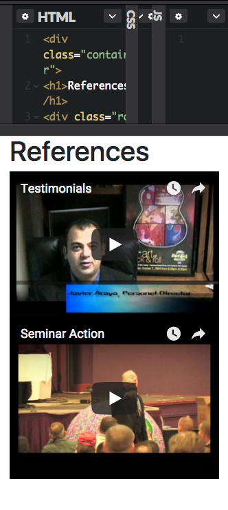
I can’t seem to figure out how to get a two column grid to re-stack to one column on top of each other in smaller screen views. Currently my grid sizes down and when it hits approx 556px wide screen, the videos stack on top of each other, which is what I want. Once the screen size is smaller than approx 476px wide, the videos in the column resize to just skinny columns side by side. The image is what it

<div class="container">
<h1>References</h1>
<div class="row mb-2">
<div class="col-sm-6">
<div class="embed-responsive embed-responsive-16by9">
  <iframe class="embed-responsive-item" src="https://www.youtube.com/embed/aaINOaWt938?rel=0?"></iframe>
<p>Click Above To View Testimonial Video!</p>
</div>
</div>
<div class="col-sm-6">
<div class="embed-responsive embed-responsive-16by9">
  <iframe class="embed-responsive-item" src="https://www.youtube.com/embed/e6UWqeLaMm4?rel=0?"></iframe>
<p>Click Above To View Peter In Seminar Action!</p>
</div></div></div>
<div class="clearfix visible-sm"></div>
I really would like to stick with the Bootstrap css and not add something custom if possible.