Tell us what’s happening:
My calculations are giving results different from intended:
Your code so far
def create_spend_chart(categories):
    total_withdrawals = list()
    for category in categories:
        withdrawals = 0
        for i in range(1, len(category.ledger)):
            withdrawals += category.ledger[i]["amount"]
        total_withdrawals.append(withdrawals)


    percentages = [round(w/sum(total_withdrawals)*100, -1) for w in total_withdrawals]
    print(percentages)
It gives following list as O/P:
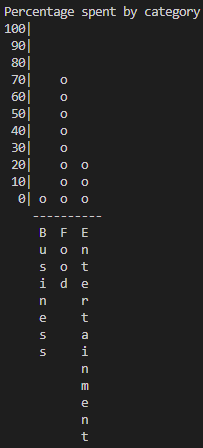
If I use the above list to plot graph, my o/p is:
But, the expected o/p is:
As it can be seen that the first graph plots, 10 + 70 + 30 = 100%, but the second graph plots 0 + 70 + 20 = 90% .
So, what should I do?
Your browser information:
User Agent is: Mozilla/5.0 (Windows NT 6.3) AppleWebKit/537.36 (KHTML, like Gecko) Chrome/90.0.4430.85 Safari/537.36.
Consider why the expected output only adds up to 90% when the y-axis is in intervals of 10.
Perhaps calculate the exact percentage/value that each column/bar represents?
I don’t remember the exact percentages, but I believe it’s something like 7% + 72% + 21%. The reason you get the percentages 10, 70 and 20 might be because you use real-life math where you would round 7 up to 10 rather than down to 0.
In other words; Consider why you get 7, 72 and 21 to respectively 10, 70 and 20 instead of 0, 70 and 20 like the expected output - and how you could accommodate this in your code!
Yes, that’d be one way to solve the issue, however if I remember correctly, you are not supposed to import any modules in the challenge …
Instead you could consider how to either:
a) Floor it “manually” (without the help of the math module), or
b) Maybe a comparison operator can do the trick - If you store the exact percentage, say ~7%, instead of converting this to 0, why not check if this number is greater than or equal to 0 (yes, so make the o in the output here, but when it compares it to 10 it will not print the o.
Does that make sense?