This topic is for members of the January 2018 fCC cohort to share information, review, and give feedback for the beta curriculum survey form project. Click on the cohort link if you’d like to join.
Reply below with your questions, comments, and additional resources regarding the Survey Form Project.
Is the HTML structure convoluted and unnecessarily nested? Are container elements used in a way that enhance overall page structure? In other words, does the student effectively use container elements to create a coherent structure without venturing into divitis territory?
Does the stylesheet make good use of the cascade and classes to avoid redundancy in the CSS?
Can the CSS or HTML be simplified?
Are selectors too long (say greater than three elements) and does the student try to keep CSS specificity low?
Are the relative paths correct?
Are semantic tags being used correctly? Are deprecated tags being used?
Are concise but descriptive alt attributes being used?
Missed on submitting and reviewing stuff yesterday because of the forum being down when I had time. Hopefully i get to review a few for this one if grad school allows!
@gilvarry The forum was down because a server ran out of space. One can choose to follow the deadlines or not follow them. They’re not mandatory. Also, one can submit one’s project for review and review other projects at any time, before or after the deadlines.
Added my survey to the list. Very basic and I still need to work on making it look better but if anyone has any suggestions for me then please let me know.
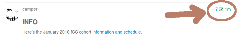
I just finished the beta of my survey form, but when I edited the post to add my link I accidentally deleted the last link posted. I can’t remember whose page it was, sorry!!!
@slamoureux I added it back to the post. In the future, you can see the revision history of the first post by clicking the top right of the post where it has a number and an edit icon:
@gilvarry
Your survey form is failing one objective if you check it with the test suite. I would also recommend looking at other’s forms to get idea’s for a better visual layout and color scheme.
Now that I’m a little behind, I finally finished this project. I’ll make some minor tweaks here and there but it felt like putting band-aids on when I was creating the mobile versions after doing the desktop layout.
I was unable to figure out how to make the checkbox section required. Currently, a survey-taker can submit the form without answering Which Meals on the Move have you tried?
I don’t like the look of the dropdown (Which store do you shop at?) Any suggestions?
I believe it’s acceptable for the logo to be ignored by screen readers. However, I don’t seem to be doing it correctly. The deque aXe accessibility checker doesn’t seem to like what I have currently.
Truth be told, I understood very little of the results from the aXe accessibility checker. Any suggestions?
Notes:
After reviewing and implementing all of your wonderful feedback and suggestions, I will refactor the CSS so that it is DRYer.
I feel that I’ve made noticeable growth since the Tribute Page project. Thank you to everyone in the cohort who has offered feedback, suggestions, and resources!
Question:
Does it make sense to put a minimum width on the contents? I’m thinking of what happens when the screen is dragged to a tighter and tighter width and the contents get super narrow. Mostly I’m thinking aloud here, hopefully this line of thought makes a wee bit of sense.
 Please REVIEW AT LEAST 2 PROJECTS using the checklist below.