After looking at my page and code, please let me know how it looks to you. Did I make any mistakes, or did I forget something? What would you change to make it better? I passed all the tests, but I don’t know if I’m satisfied with what I made.
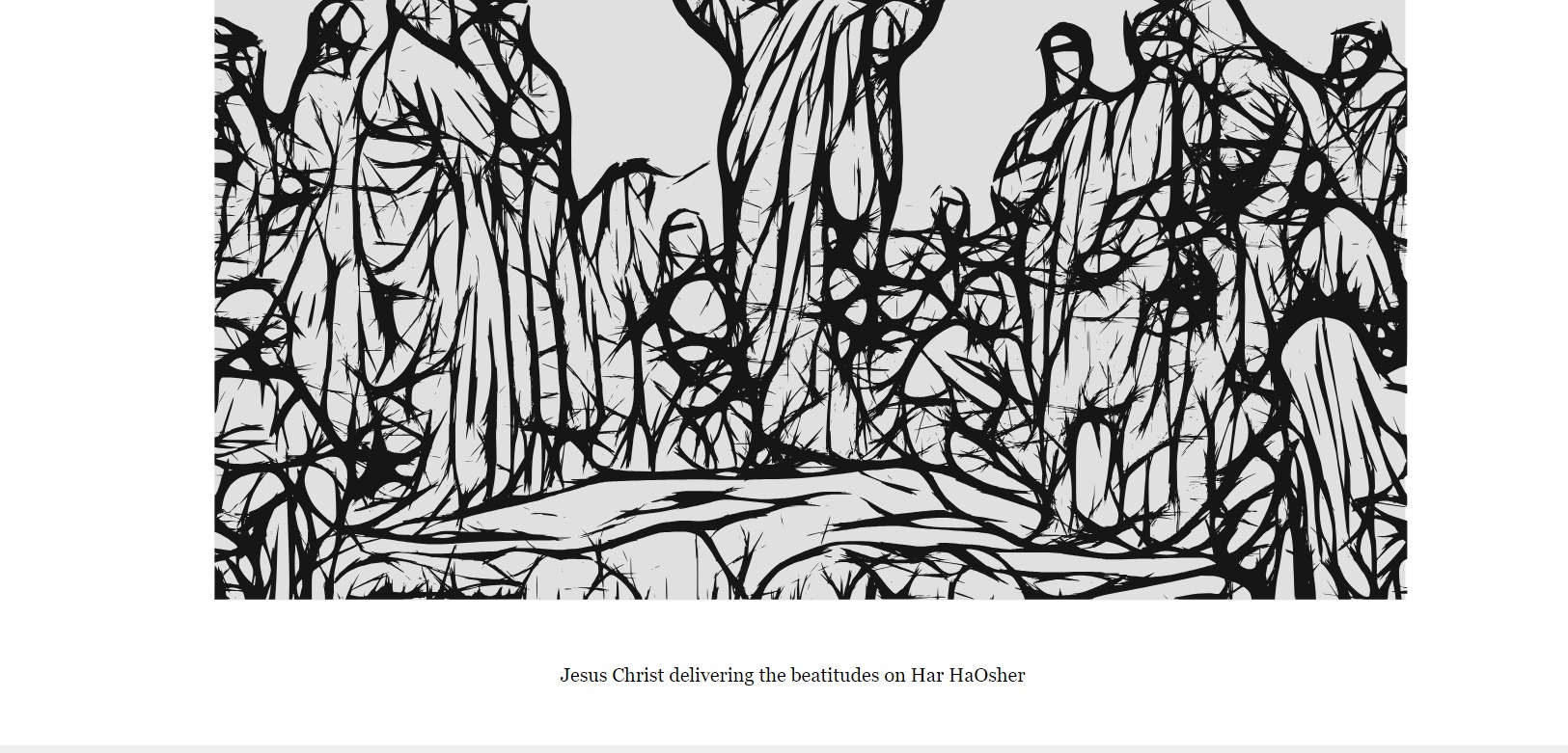
Also, there’s one thing I spent hours on but couldn’t figure out despite trying multiple solutions from stack-overflow and even after looking at the source of the example. In the tribute page shared as an example by freeCodeCamp, there’s even space on all 4 sides of the image, however, I am getting some unwanted space between my img and figcaption in the figure. What can I do to remove it? It looks hideous, tbh. Also, unlike the tribute page of freeCodeCamp, my tribute page isn’t optimized for different screen sizes, for instance, if the screen width is too less, the caption gets on top of image. Even after spending my entire morning, I couldn’t figure out how to improve the figure element.
I passed all the tests actually because there are no tests for CSS. The problem I have is that my figcaption is lying at the bottom of the figure. I spent hours trying to get in the middle of the bottom white space around the image, but nothing worked. I don’t like the way it looks.