It’s pretty late right now but I’ve been stuck for a little while on getting my page to be responsive. And I don’t mean sizing down my window screen to check if it is…because that works fine. What I mean is when I type in the url for my full screen pen, it’s just awful. It’s really frustrating me. What am I not seeing or adding?
PS: I’m not done yet. I haven’t added all the requirements for the project so please, don’t respond back with anything like that. I’m in the process of doing everything else.
Thanks!
Your pen looks fine to me full screen.
What don’t you like about it? The only issues I can see at a glance are the misspelling of Opportunities, the lorem ipsum and that clicking on a navbar heading or scrolling to a section doesn’t activate that section’s heading on the navbar like here.
Loool wow I must be really tired… Thank you for pointing that out.
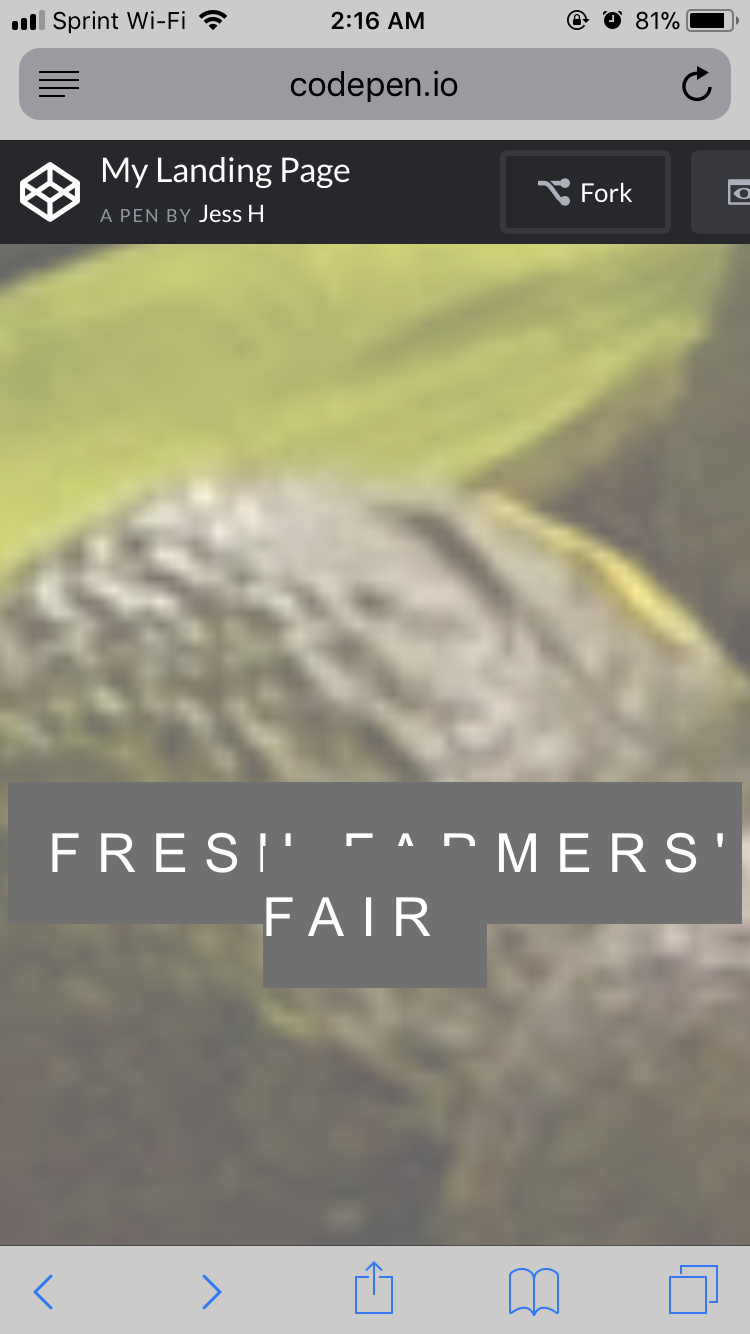
Well, what I meant is that on my phone, my page looks like this:
So I’m having some responsiveness issues on my device itself. It was suggested something on the Project Feedback Page that I’m gunna try once I get some rest. Any suggestions you may have?
And thanks for linking your page. I’ll look into it more soon for reference
I guess there are a few ways you can deal with this.
Here is one, set the span to be inline-block and then on the container adjust for the padding.
.ptext {
  position: absolute;
  top: calc(50% - 20px); /* 50% - the padding on the span */
  width: 100%;
  text-align: center;
  color: #000;
  font-size: 27px;
  letter-spacing: 8px;
  text-transform: uppercase;
}

.ptext .border {
  display: inline-block; /* Make the span inline-block */
  background-color: #111;
  color: #fff;
  padding: 20px;
}
Edit: Totally forgot to say nice page, i like it.
1 Like
Do yourself a huge favour and learn flexbox:
https://css-tricks.com/snippets/css/a-guide-to-flexbox/
In the past, CSS did not have a proper solution to web layout. Then flex-box came along and everything got so much easier.
1 Like
I’ll definitely do this today. Thanks for the link
I haven’t seen that calc attribute before. I’ll have to look into what that is for me to better understand it and use it when I need to in the future. I appreciate you taking the time to code that. And thank you! Lol this has been a cool project for me to create, just kicked my butt hard yesterday/early this morning
1 Like
Hey thank you again for sending that article. It saved my project! I have it saved to my bookmarks and I’m gunna continue referencing this whenever I feel I’m getting stuck with responsiveness again.
1 Like
If you guys wanna check out the responsiveness now: https://codepen.io/pleeseno/full/zyReJV
Nice job. I would move the mobile menu breakpoint from 600px to 656px to avoid the nav links wrapping.
Also, I forgot to say if you want the span to be in the center you have to use transform: translateY(-50%). If you do that you also don’t need the calc function.
.ptext {
  /* All the other CSS */
  top: 50%;
  transform: translateY(-50%);
}
Note: I explain the need for transform: translate here.