It’s pretty late right now but I’ve been stuck for a little while on getting my page to be responsive. And I don’t mean sizing down my window screen to check if it is…because that works fine. What I mean is when I type in the url for my full screen pen, it’s just awful. It’s really frustrating me. What am I not seeing or adding?
PS: I’m not done yet. I haven’t added all the requirements for the project so please, don’t respond back with anything like that. I’m in the process of doing everything else.
Thanks!
What’s awful about the full screen? I just visited the link to your pen and it seems fine on my laptop.
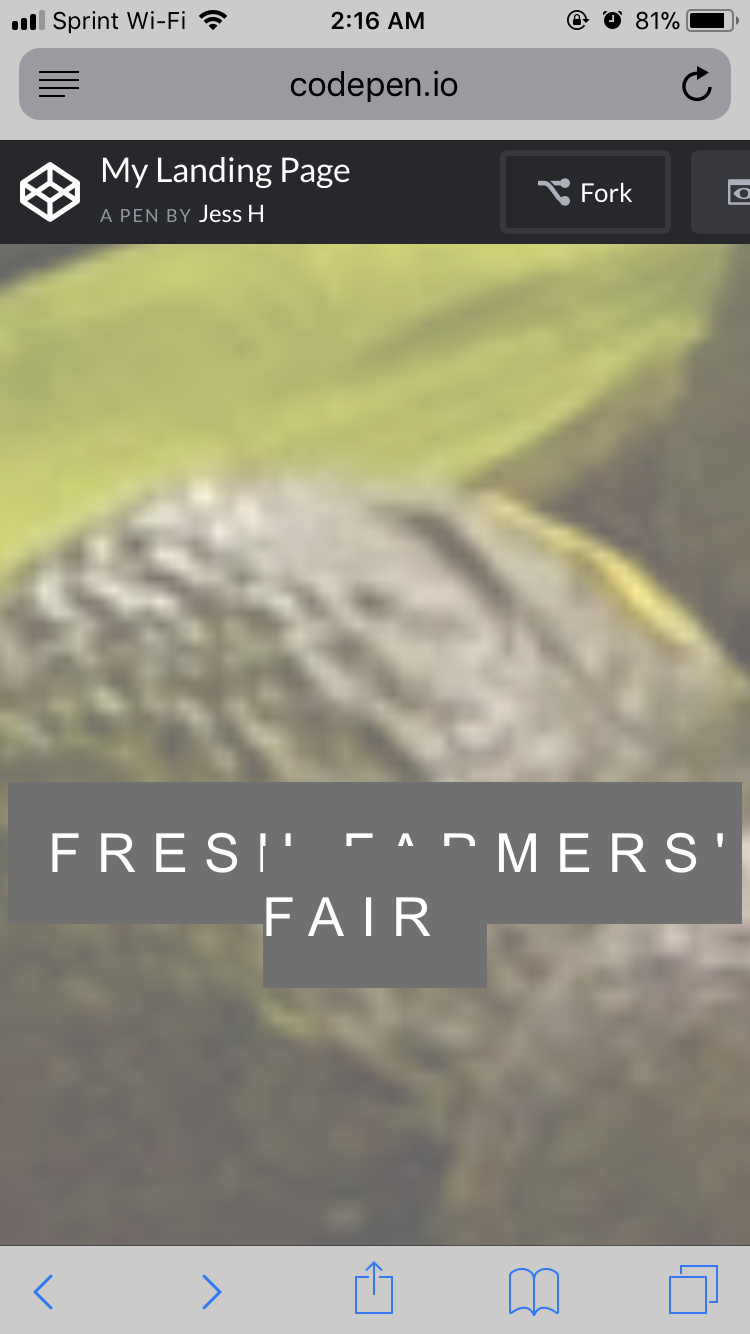
Yeah, the laptop view is fine! But when I go on my iPhone…
This is what I see. Is it just CodePen acting this way?
It’s not CodePen, this is happening because some of your components are not fully responsive. Open the Google Chrome Dev Tool and change the view to phone, there you can select the element that is breaking the layout and play with the CSS and see what you can do to make it responsive.
Yeah, I didn’t think it was…
That’s a good place to start, but I’ll have to come back to it after some rest. Thank you for the suggestion. I’ll update whether I can crack it or not.
Yeah, sometimes a rest is all you need to fix a bug. By the way, are you familiar with Chrome Dev Tool? I’m asking because I noticed that you mentioned that you are visiting the link on your phone, but you can easily check that using the tool I just mentioned.
If you are not familiar with it, start doing it now, it’s an extremely helpful tool.
Yeah, I am. When you right click on a page and hit ‘Inspect,’ right? You can change the views to different media devices at the top and even see it in landscape. I should use it more often. I wouldn’t have to switch back to my phone all the time if I did. That’s where my frustration started haha
So I’d ‘Inspect’ when on the full screen view on CodePen, right?