Okay so I’m trying to make sure my portfolio page is responsive starting with mobile view first but no matter what I try there is some strange behaviour when the width gets really small. How small of width are we suppose to account for? Because at a certain point there’s no one with devices that small and skinny. For instance see my picture:
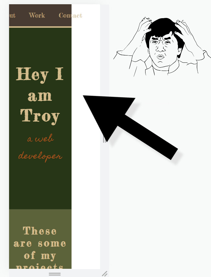
This is at 200px wide. View is in inspect mode in browser not CodePen.
CodePen: https://codepen.io/troy_b16/pen/gOXRxRO
If I change the body viewport width to 100vw it seems to solve this issue but then the problem is the page always has a scroll bar horizontally at the bottom that scrolls the tiniest amount, completely pointless. I can’t seem to solve one issue without creating another, not having the scroll bar at the bottom of the page and responsive down to the smallest width I could image anyone ever needing… like what is this… a screen for ANTS?! (dating myself with this joke I know, not dating like a relationship, like date but not the big raisins kinda date, time… you get it? I’ll shut up now.)
Anyways, rant over. Someone help my n00b coding brain 