I am still learning the basics of programming , especially with html and css, but making this was very fun! I think it turned out… alright? But I have an issue with the gallery of images. I dont understand why they wont shrink responsively as the screen gets smaller. I am passing the tests but want to improve this site a little bit before I move on. Any tips?
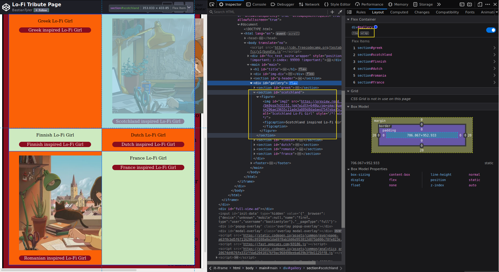
When you have a look at the highlighted box on the left side, you can see that the flex items actually work as expected, the yellow boxes on the right side show the wrap attribute.
You can also see on the left side, that your image is overflowing its parent elements, e.g. section and figure. This is because images without custom height or width take their original size.
How would I go about adding a custom width/height than? I figure I must be mistaken in believing that my width:50% on line 74 of the css file would act as the custom width/height.