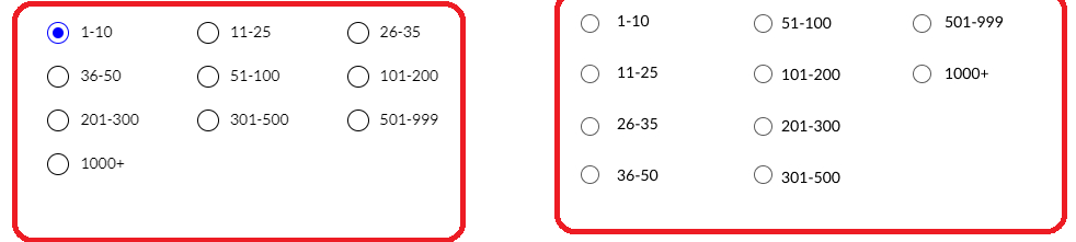
left is the image i am having , right is what i want
I need help with flexbox to acheive it
 radioFormStyle: {
        display: "flex",
        flexWrap: "wrap",
        color:"#009BBD",
    }
left is the image i am having , right is what i want
I need help with flexbox to acheive it
radioFormStyle: {
display: "flex",
flexWrap: "wrap",
color:"#009BBD",
}
Normally to change orientation of flexbox you would use
flex-direction: row | row-reverse | column | column-reverse
By default it is set to row. Here’s little demo where I set flex-direction to column.
I did flex-direction:column but all the items are now one vertical column. it is not breaking up into more columns
How to create a break-point after a certain elements ?
You will need to set a fixed height of your container.
Take a look at the example that I’ve sent you. On the container I set height to 200px so if there is no more space available for items they span in the next column 
flex-flow:column wrap; - this should be the basic, from there you might need to set height of the container and adjust items aligment
If you have a two-dimensional layout, as you have here, note that it is much easier to control this using grid rather than flex.
you can do flex:1 0 20%