Hello, I am currently designing the about page of my portfolio website. After tinkering around for a long time, I think my strategy for styling this page is going to be to set each column in my row equal to 100% of the .row. I want to set the .row’s height equal to the height of my image because I believe it’s height has to be set in order to use the 100%. I’d then use percentages to set things like padding and margins to get everything aligned nicely.
Unfortunately the size of my image is set using the width property, where the width is equal to 100% of the .col that it’s in (in picture col-lg-3). I’m not sure how I can align everything based on the height of the image when that is constantly changing based on the viewport.
Any ideas on how to accomplish this or alternative strategies for styling this page would be greatly appreciated.
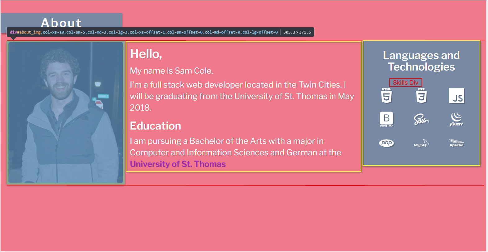
Below is an image of the page and the code.
<div id="about">
    <div class="row">
        <div class="title col-xs-7 col-sm-5 col-md-3 col-lg-3" id="about_title">
            <div class="container-fluid">
                <h3>About</h3>
            </div>
        </div>
    </div>

    <div class="container-fluid">
        <div class="row" id="about_content">
            <div class="col-xs-10 col-sm-5 col-md-3 col-lg-3 col-xs-offset-1 col-sm-offset-0 col-md-offset-0 col-lg-offset-0" id="about_img">
                <img class="img-fluid" src="img/profile.jpg">
            </div>

            <div class="col-xs-10 col-sm-7 col-md-6 col-lg-6 col-xs-offset-1 col-sm-offset-0 col-md-offset-0 col-lg-offset-0" id="about_content_primary">
                <strong>Hello,</strong>
                <p>My name is Sam Cole.</p>
                <p>
                    I'm a full stack web developer located in the Twin Cities.
                    I will be graduating from the University of St. Thomas in May 2018.
                </p>
                <p>
                    <h5>Education</h5>
                    I am pursuing a Bachelor of the Arts with a major in Computer and Information Sciences and German at the <a href="https://www.stthomas.edu/">University of St. Thomas</a>
                </p>
            </div>

            <div class="col-xs-10 col-sm-5 col-md-3 col-lg-3 col-xs-offset-1 col-sm-offset-0 col-md-offset-0 col-lg-offset-0" id="about_content_secondary">
                <p>
                    <h5>Languages and Technologies</h5>
                    <div id="skills_icons">
                        <div class="row">
                            <div class="col-xs-4">
                                <i class="devicon-html5-plain-wordmark"></i>
                            </div>
                            <div class="col-xs-4">
                                <i class="devicon-css3-plain-wordmark"></i>
                            </div>
                            <div class="col-xs-4">
                                <i class="devicon-javascript-plain"></i>
                            </div>
                        </div>
                        <div class="row">
                            <div class="col-xs-4">
                                <i class="devicon-bootstrap-plain-wordmark"></i>
                            </div>
                            <div class="col-xs-4">
                                <i class="devicon-sass-original"></i>
                            </div>
                            <div class="col-xs-4">
                                <i class="devicon-jquery-plain-wordmark"></i>
                            </div>
                        </div>
                        <div class="row">
                            <div class="col-xs-4">
                                <i class="devicon-php-plain"></i>
                            </div>
                            <div class="col-xs-4">
                                <i class="devicon-mysql-plain-wordmark"></i>
                            </div>
                            <div class="col-xs-4">
                                <i class="devicon-apache-line-wordmark"></i>
                            </div>
                        </div>
                    </div>
                </p>
            </div>

</div>
$blue-dark: rgb(102, 106, 134);
$blue-main: rgb(120, 138, 163);
$blue-neon: rgb(23, 190, 187);
$red: rgb(239, 121, 138);
$stthomas: #9e28b5;

$shadow-main: 0 3px 6px rgba(0,0,0,0.16), 0 3px 6px rgba(0,0,0,0.23);
$text-shadow-main:  1px 1px rgba(0,0,0,0.23);
$text-shadow-heavy: 2.5px 2.5px rgba(0,0,0,0.23);

body {
    font-family: 'Libre Franklin', serif;
    color: white;
    text-shadow: $text-shadow-main;
}

.img-fluid {
    width: 100%;
}

.no-margin {
	margin: 0;
}

.btn-default, .btn-default:focus, .btn-default:hover {
    border: none;
    color: white;
    background: $blue-main;
    box-shadow: $shadow-main;
}

.title {
    background: $blue-main;
    box-shadow: $shadow-main;

    margin-bottom: 3vh;
}

.title h3 {
    margin: 0;
    line-height: 8vh;
    font-size: 25px;
    font-weight: 700;
    letter-spacing: 3px;
    text-align: center;
}

@media (min-width: 768px) {
	.title h3 {
		font-size: 2.5vw;
	}
}


$border-radius: 5px;

#about {
    background: $red;
    min-height: 100vh;
    padding-top: 5vh;
    font-size: 10px;
}

#about_img {
    padding: 5px;
    background: rgb(120, 138, 163);
    border-radius: $border-radius;
    box-shadow: $shadow-main;
}

#about_img img{
    border-radius: 5px;
}

.row {
    margin-right: 0;
    margin-left: 0;
}

#skills_icons {
    text-align: center;
    font-size: 6vh;
    text-shadow: $text-shadow-heavy;

    .row{
        padding: 5px;
    }
}

#about_content_primary, #about_content_secondary {
    padding: 2vh 0;

    h5 {
        padding-top: 1vh;
        font-size: 15px;
        font-weight: 700;
    }

    a {
        font-weight: 700;
        color: $stthomas;
    }

    strong {
        font-size: 20px;
    }

    p {
        margin: 1vh 0;
    }
}

@media (min-width: 768px) { //bigger than a phone
    #about_content_primary, #about_content_secondary {
        padding-left: 2vw;
        font-size: 1.7vw;

        h5 {
            font-size: 2.2vw;
        }

        strong {
            font-size: 2.5vw;
        }
    }
}

@media (min-width: 992px) { //bigger than a tablet
    #about_content_primary, #about_content_secondary {
        padding: 2vh 1vw;
    }

    #about_content_secondary {
        background: $blue-main;
        border-radius: $border-radius;
        box-shadow: $shadow-main;

        h5 {
            padding-top: 0;
            text-align: center;
        }
    }

    #skills_icons {
        padding: 2vh 0;

        div {
            padding-top: 2vh;
        }
    }
}
 Flexbox was developed to address this type of layout problem. Here is a link you might want to read, I didn’t read the whole thing but it looks relevant: