Hello guys, i have a problem with my tribute page, responsive part, i tried many ways but cannt to reach solution… this is the link https://codepen.io/germanp007/pen/eYRgLBj?editors=1100 apreciate a little help…  PD: sorry for my english is not my native language
Can you be more specific about what the problem is?
exercise ask a responsive image, i tried to use @media or .responsive but it wasnt solution
Be sure to read the first few lines of the error message in the test.
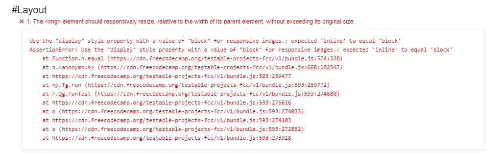
The <img> element should responsively resize, relative to the width of its parent element, without exceeding its original size.
Try using the "max-width" style property : expected 'none' to not equal 'none'
This is telling you that you should set a max-width on the image. Since the image should not exceed its original size I’m guessing that would be a clue as to what max-width should be set to.
1 Like
i did that…
@media (max-width : 800px) {
  img {max-width: 100%;
         height: auto;
  }
}
iam not sure what px image is
You don’t want it in a media query, you want the max-width on the image at all times. There are several ways to get the original size of the image. You can use your browser’s dev tools and go into the inspector, select the image and the layout pane should show you the width in px. In Firefox I can also right click on the image and choose “Open image in new tab” and then the size is shown in the title bar of the new tab.
i trid this
img{
 max-width:100%;
  height: auto;
}
but it is not the solution either
This means you need to set the max-width in px.
Hi @pintogerman281 !
It’s not working because you didn’t read the new error message. 
Open up the test suite and read the new message.
It tells you what is missing
Once you fix that error a new one pops up.
Open the test suite again and read that new error message.
Once you fix that then all the tests will pass
You need to reread this part
Use the “display” style property with a value of “block” for responsive images.: expected ‘inline’ to equal ‘block’
Do you understand what the error message means?
Right now, I don’t see that in your code
img {
  border-radius: 50%;
  border-color: black;
  border-style: solid;
  max-width: 800px;
  height: auto;
}
1 Like
img {
  border-radius: 50%;
  border-color: black;
  border-style: solid;
  max-width: 800px;
  height: auto;
  display: block;
  align-image: center;
  margin:auto;
}
  THX!!! i could do it wiiiiiiii :smiley:
This topic was automatically closed 182 days after the last reply. New replies are no longer allowed.