I have an issue in my page.The navbar is not at the top of the viewport.
I’ve tried these:
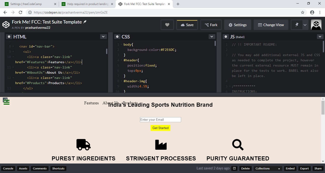
#header{
position:fixed;
top:0px;
}
<nav id="nav-bar" class="fixed-top">
None of the above is working.Please help.
I have an issue in my page.The navbar is not at the top of the viewport.
I’ve tried these:
#header{
position:fixed;
top:0px;
}
<nav id="nav-bar" class="fixed-top">
None of the above is working.Please help.
Hi,
Apply the below properties to#nav-bar selector
position: fixed;
top: 0px;
right: 0px;
This will keep the navbar fixed on top right corner of the page
close the div tag just before the header. You have something like this going on:
<div
<header>...</header>
If you close that tag, you can style the header as you are attempting to do. I’d also set the width on it to 100%, and a background color. 
I’m guessing the OP also wants the company logo (everything contained in the header) to remain fixed to the top of the page. Setting the nav bar to fixed works, but the logo scrolls off.
Do you have a link to the page at this point, or did you revert it back?
Just before your header, you have this:
<div
Which isn’t closed. Also, that particular tag doesn’t ever have a matching </div> tag.
Here is a link to your page, with that tag fixed, and the CSS added for the header as I’d suggested. Also, I wrapped everything BUT the header in a <main></main> tag, as I could then bump that down below the header so it doesn’t get cut off.
The only things I changed between that and YOUR page were:
div tag;main element wrapping everything but the header;#header style as we’d discussed;main to give it some top padding.Thanxx a lot…Actually in the previous attempt I removed that <div tag…
So what else did you and I do differently? Is that more like the look you wanted to see?
yeahh…thanxx for the help…well any feedback you can give related to the design.
I haven’t applied the media queries yet.
I actually like the design. I might suggest you cut the padding-top on the main to half that, and add padding-top to each of the sections within main. Doing that, when you click on (for example) “About us”, the element is pushed below the menu bar.
Here’s a link showing what I mean.
Also, looking through your css, why do you have .flex-container, .Flex-Container, and .abc all doing pretty much exactly the same thing?
In order to pass the test, you will want to change your id from “vedio” to “video”. It is one of the requirements.
But I like the way it is starting to look.
I did this kind of css because in the beginning it was showing diff patterns.But I’ll give it a try by declaring “flex-container” for all…
okayy…thanxx for the feedback
Okayy… I’ll fix that
Thanxx for the feedback.