Hi!
Can anyone help?? This is driving me crazy!
How can I fix my content to the bottom of the navbar so that it doesn’t:
a) disappear behind the navbar when the screen gets smaller
and
b) doesn’t create a gap between the navbar and div as the screen gets bigger
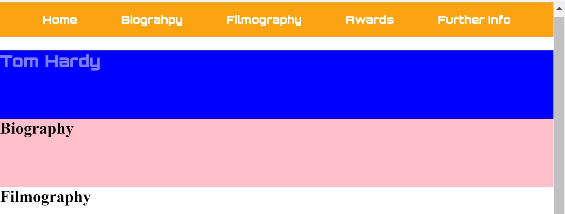
This is what it looks like as i make the screen smaller to bigger:


my html is:
 <main id="main">
    <nav id="navbar">
      <ul>
        <li><a class="nav-link" href="#Home">Home</a></li>
        <li><a class="nav-link" href="#Biography">Biograhpy</a></li>
        <li><a class="nav-link" href="#Filmography">Filmography</a></li>
        <li><a class="nav-link" href="#Awards">Awards</a></li>
        <li><a class="nav-link" href="#Info">Further Info</a></li>
      </ul>
    </nav>
    </header>

  </main>
  <div id="content">

    <section id="Home" class="container">
      <h1 id="home-title">Tom Hardy</h1>
    </section>

    <section id="Biography" class="container">
      <h1 id="bio-title">Biography</h1>
    </section>

    <section id="Filmography" class="container">
      <h1>Filmography</h1>
    </section>
</div>
my css is:
*{
box-sizing: border-box;
}

body{
  margin: 0 auto;
  padding: 0;
}

nav ul{
  position: fixed;
  top: 0;
  left: 0;
  width: 100%;
  list-style: none;
  text-align: center;
  background-color: #FCA311;
  margin: 0 auto;
  padding: 15px;
}

li{
  display: inline-block;
}

.nav-link{
  text-decoration: none;
  color: white;
  padding: 30px;
  font-family: Orbitron, sans serif;
}

.nav-link:hover{
  color: #EB5E28;
}

#content{
  position:relative;
  top:78px;
  z-index: -1;
  }

.container{
  height: 100px;
}