Hi folks, I’m doing a website project, and the instructor doesn’t use any absolute positioning to center his div within a div, but somehow his method works. But, when I copy his method, mine doesn’t work. Can you tell me why? See screenshots below. This is driving me insane! Thanks in advance for any help! Cheers!


Look at instructor’s version here (his is perfect):

Here’s my CSS code:
*{
box-sizing: border-box;
}
body{
font-family: 'Roboto', sans-serif;
background-color: #19202a;
}
#top-section{
position: relative;
height: 100vh;
}
header{
position: absolute;
z-index: 3;
padding: 20px;
display: flex;
width: 100%;
justify-content: space-between;
padding: 0 10px;
}
.logo{
width: 50px;
}
.logo img{
width: 100%;
}
nav{
align-self: center;
}
nav a{
color: white;
text-decoration: none;
font-size: 1.2rem
font-weight: 300;
padding:0;
}
.blurred-background{
background-image: linear-gradient(45deg, rgba(25,32,42,1) 0%,rgba(25,32,42,1) 33%,rgba(25,32,42,0.96) 36%, rgba(25,32,42,0.47) 69%, rgba(176, 38,183,0.32) 79%, rgba(125,185,232,0) 100%), url("https://s15.postimg.cc/qjk9kwnt7/top.jpg");
background-size: cover;
width: 100%;
height: 100vh;
filter: blur(40px) saturate(130%);
position: absolute;
z-index: 1;
}
.floating-img{
width: 100%;
height: 100vh;
display: flex;
justify-content: center;
align-items: flex-end;
position: absolute;
z-index: 2;
}
.Tekashi-img{
width: 30%;
}
.Tekashi-img.img{
width: 100%;
filter: contrast(150%);
}
.container{
max-width: 1400px;
margin: 0 auto;
}
#bio {
/*display: flex;*/
/*padding: 50px;*/
background: black;
position: relative;
z-index: 3;
padding: 100px 0;
}
#bio .container {
display: flex;
}
#bio p {
color: white;
line-height: 1.8;
font-size: 0.9rem;
padding: 50px;
/*display: flex;*/
padding: 0 50px;
}
#bio .logo-centered {
display: flex;
justify-content: center;
align-items: center;
width: 50%;
padding: 0 50px;
}
#media{
background-image: url('https://s15.postimg.cc/dun7slqij/original.jpg');
background-size: cover;
padding: 100px 0;
}
#media .title{
background-color: black;
font-size: 1.1rem;
font-weight: 300;
text-transform: uppercase;
padding: 20px;
text-align: center;
width: 100%;
max-width: 500px;
margin: 0 auto;
/* margin-bottom: 0 0 80px 0;*/
color: white;
}
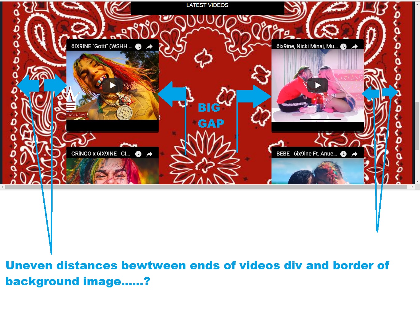
#media .videos{
display: grid;
grid-template-columns:50% 50%;
grid-gap: 50px;
}
.videos .video{
border-radius: 4px;
overflow: hidden;
height: 300px;
-webkit-box-shadow: 0 5px 0 0 rgba(0,0,0,0.75);
-moz-box-shadow: 0 5px 0 0 rgba(0,0,0,0.75);
box-shadow: 0 13px 24px -8px 0 rgba(0,0,0,0.75);
}
.videos iframe{
height: 100%;
}
And here’s my HTML code:
<!DOCTYPE html>
<html>
  <head>
    <meta charset="utf-8">
    <title></title>
    <meta name="viewport" content="width=device-width, initial-scale=1">
    <link rel="stylesheet" href="main.css">
    <script async defer src="https://buttons.github.io/buttons.js"></script>
  </head>
  <body>
  	<header>
  		<div class="logo">
  		<a href="#"><img src="https://s15.postimg.cc/61he9krdn/logo.png"></a>
  		</div>
  		<nav>
  			<a href="">Bio</a>
  			<a href="">Tour</a>
  			<a href="">Music</a>
  			<a href="">Videos</a>
  			<a href="">Shop</a>
  		</nav>
  	</header>
    <section id="top-section">
    	<div class="blurred-background"></div>
    	<div class="floating-img">
    	  <div class="Tekashi-img"><img src="https://s15.postimg.cc/rlug3593v/tekashi.png"></div>
    	</div>
    </section>
    <section id="bio">
	    <div class="container">
		    <p>
		    Hernandez rose to prominence on social media due to a July 2017 Instagram post that went viral on both Reddit and Twitter, where Hernandez's eccentric appearance (rainbow-dyed hair, a rainbow grill, and multiple versions of the number 69 tattooed on his body) turned him into an internet meme. Hernandez's commercial debut single "Gummo" was released on November 10, 2017 and eventually peaked at number 12 on the US Billboard Hot 100. It was certified platinum by the RIAA on March 5, 2018. His next single "Kooda" debuted at 61 on the Hot 100 the week of December 23, 2017. On January 14, 2018, Hernandez released his third single "Keke" with Fetty Wap and A Boogie wit da Hoodie. Shortly afterwards, Hernandez announced his debut mixtape, Day69. The mixtape was released on February 23, 2018, and debuted at number four on the Billboard 200 album chart with 55,000 album-equivalent units, of which 20,000 were pure sales. According to Jon Caramanica of The New York Times, the tape was an outgrowth of the "SoundCloud rap explosion", and was notable for its willingness to deviate from hip-hop's norms and prevailing sound.
		    </p>
		    <div class="logo-centered">
		    	<img src="https://s15.postimg.cc/61he9krdn/logo.png">
		    </div>
	    </div>
    </section>
    <section id="media">
    	<div class="title">Latest Videos</div>
    	<div class="videos">
    		<div class="video">
    			<iframe width="100%" height="315" src="https://www.youtube.com/embed/z5WrgDzNIZ0" frameborder="0" allow="autoplay; encrypted-media" allowfullscreen></iframe>
    		</div>
    		<div class="video">
    			<iframe width="100%" height="315" src="https://www.youtube.com/embed/V_MXGdSBbAI" frameborder="0" allow="autoplay; encrypted-media" allowfullscreen></iframe>
    		</div>
    		<div class="video">
    			<iframe width="100%" height="315" src="https://www.youtube.com/embed/lgEk3Niie1E" frameborder="0" allow="autoplay; encrypted-media" allowfullscreen></iframe>
    		</div>
    		<div class="video">
    			<iframe width="100%" height="315" src="https://www.youtube.com/embed/ycV6cnK3SIs" frameborder="0" allow="autoplay; encrypted-media" allowfullscreen></iframe>
    		</div>
    	</div>
    </section>
    <div id="app"></div>
    <script src="/js/components/vendor.js"></script>
    <script src="/js/components/firstComp.js"></script>
  </body>
</html>