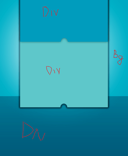
Hi everyone, I’m learning to make a website. So I’m designed a home page with style layout overlapping by Photoshop (just drag and drop, easy). But when I want to use html and css to make it look like my design, I can’t find the way to create layouts like that :
I’m using boostrap 4, please help me, thanks <3
I’m done with it
Have you been working on the problem on codepen or someplace? what have you got so far. you gotta come with something specific.
Heres a start. try this in codepen.
<head>
<style>
    #top {
        margin: 0 100px 0 100px;
        height: 300px;
        background-color: blue;
    }
    #bottom {
         margin: 0 100px 0 100px;
          height:200px;
        background-color: green;
    }
</style>
</head>
<body>
<div>
    <div id="top">Top area</div>
    <div id="bottom">Bottom area</div>
</div>
</body>
Ohh, sound like you still can’t know my problem. I mean a div tag overlapping another div tag
ghukahr
November 8, 2018, 10:35am
6
There’re lots of ways to do it and it depends on what you want to accomplish.
From the image you provided, maybe you can use a negative margin and position the div's with z-index.
I made an example for you: https://codepen.io/ghukahr/pen/QJNLGa
Hi, your link no longer available, I’m sorry that I just check my thread until now
ghukahr
November 10, 2018, 12:45am
8
Sorry about that, I just cleaned up my code pen
I did another one:
A live pastebin for HTML, CSS & JavaScript and a range of processors, including SCSS, CoffeeScript, Jade and more...
and-why
November 19, 2018, 1:24am
11
If I was you, I’d look into CSS grid. It’s a steep learning curve, gbut the power is amazing, and if you’re learning web dev in 2018, just use it as much as you can.
It’s by far the most flexible layout system. Here is a quick example that shows the power
<style>
body {
  display: grid;
  grid-template-columns: 1fr 1fr;
  grid-template-rows: repeat(4, 1fr);
}

.red {
  grid-column-start: 1;
  grid-column-end: 3;
  grid-row-start: 1;
  grid-row-end: 3;
  background: red;
  height:200px;

  opacity: 0.9;
}

.blue {
  grid-column-start: 1;
  grid-column-end: 2;
  grid-row-start: 2;
  grid-row-end: 5;
  background: blue;
  height:200px;
}
</style>
<!DOCTYPE html>
<html>
<head>
  <meta charset="utf-8">
  <meta name="viewport" content="width=device-width">
  <title>JS Bin</title>
</head>
<body>
  <div class="red"></div>
  <div class="blue"></div>
</body>
</html>
Thanks for your help. I got it <3


 Make sure that it’s can’t resolve my problem…

