I have made this button in html, CSS Responsive Issue

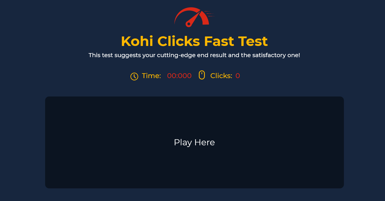
I’ve been stuck for a week trying to check in the code I have made this button in HTML and CSS, It’s my first experience and a lot of help in free code camp but a little bit of a problem in button with the mobile screen and some responsive issues. Does anyone give me suggestions, so that I do follow them? thanks

<div class="playhere-section" id="play_section">
        <div class="play-button" id="play-button">
          <button class="btn playbutton btn-lg active" role="button" id="play_btn" aria-pressed="true">Play Here</button>
        </div>
      </div>
.playhere-section {
    display: flex;
    justify-content: center;
    padding-bottom: 2%;
    /* align-items: center; */
}

Hey! responsive web design is a methodology with which a developer can make a website adaptable to different user devices. To add responsive-ness to your website, The first step is to learning how to use media queries. They will help you set a condition based on which your website will be able to change. for example:

p {
    width: 500px;
}

@media screen and (min-width: 500px){

// for the following code to run, the user's screen
// needs to be atleast 500px wide.

    p{
        width: 800px;
    }
}

they are identical to if/else conditions in other programming languages.

Hope this helps! :smile:

1 Like

This topic was automatically closed 182 days after the last reply. New replies are no longer allowed.