Hi everyone,
I’m building a newsletter in mailchimp (please note that I am a graphic designer and so I know very little about HTML and CSS coding  ) I have created a three column layout and each column is an image with a link.
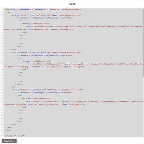
this is the code that I have written:
Now my question is: why it is working fine on mailchimp preview and my mobile through gmail, but not on desktop again through gmail and outlook for example? On desktop this content doesn’t appear at all!
I’d advise that you use HTML tables with inline styles if you want fancy email layouts, email clients don’t generally render stuff like in a normal web page. They’re a lot better than they were (the Gmail mobile client for example is pretty good), but you’re going to get issues like this if you don’t code them like it was the 1990s
Hi Dan, thanks for your reply. Can you then stack the table columns, can they be responsive? Thanks!
Ah, well, no is the simple answer  . Complex answer is yes, sort of, and in cases where it works, div’s rather than tables would be fine but it’s the inline CSS that is the issue: you can’t inline media queries, and that means any email client that strips out style declarations will kill your responsive stuff. Making email templates is a bit of a dark art, and quite often you just have to ignore all the niceties you get with modern CSS. Many clients do support CSS quite well; it’s been a while since I’ve had to do it, but desktop Gmail and Outlook always being a pita as far as I remember.
Thanks Dan for the clarification I get it now. I re wrote the code with tables as you suggested and it seems to be working fine on both gmail and outlook, desktop and mobile. many thanks!
1 Like
 ) I have created a three column layout and each column is an image with a link.
 . Complex answer is yes, sort of, and in cases where it works, div’s rather than tables would be fine but it’s the inline CSS that is the issue: you can’t inline media queries, and that means any email client that strips out style declarations will kill your responsive stuff. Making email templates is a bit of a dark art, and quite often you just have to ignore all the niceties you get with modern CSS. Many clients do support CSS quite well; it’s been a while since I’ve had to do it, but desktop Gmail and Outlook always being a pita as far as I remember.

