my overlaping works good in full screen size but what about small screen sizes it’s not working as spected, my icons are with position absolute and my inputs with position relative but is not working  here is my CodePen code https://codepen.io/CeciPeque/pen/axYRLr?editors=1100#0 and an image of what I want to achieve.

do you want the icon to be always in input?
by the way remove</input> (input hasn’t close tag )
also <fieldset > is used to group related form elements
not always but when :focus. becouse I change the width in :focus so it could fit.
It works fine at my end look to the picture
try to use chrome or update it to avoid any compatibility issues

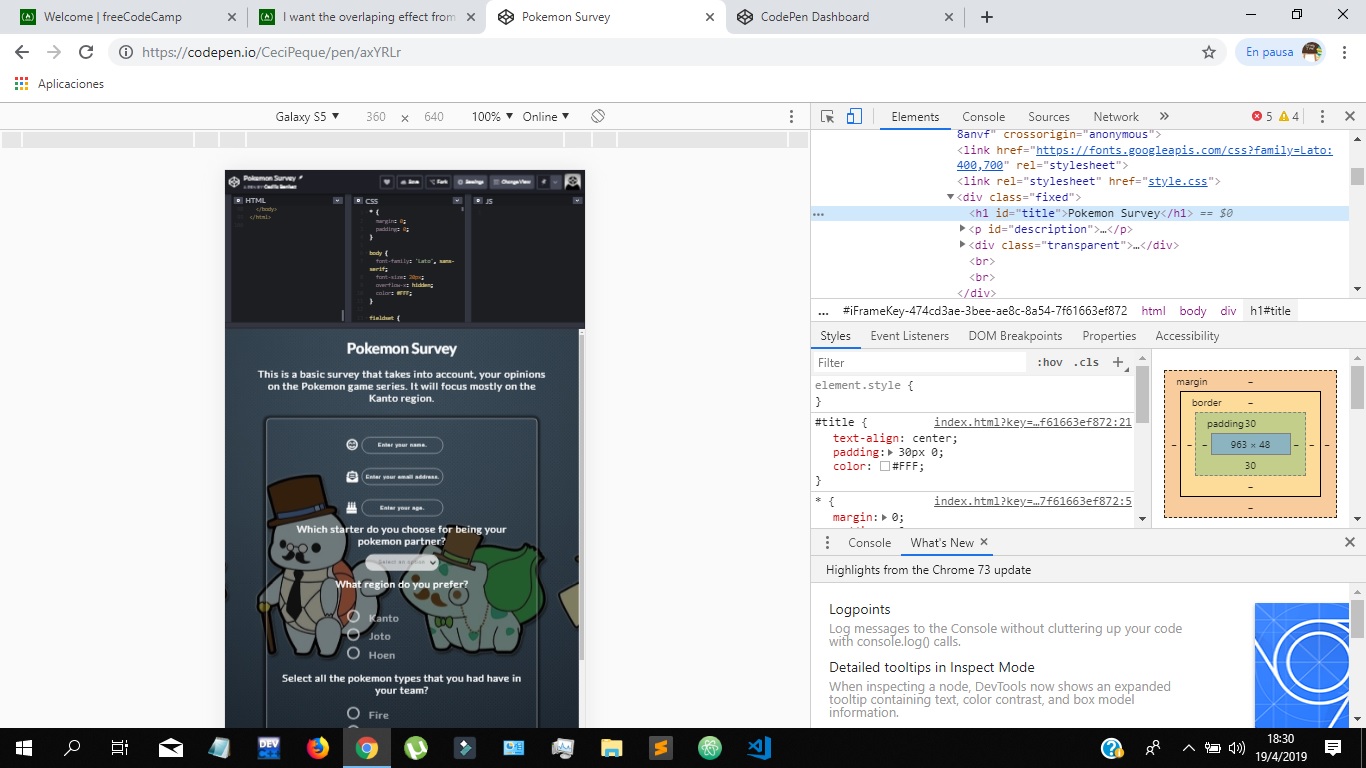
I reinstalled Google Chrome and had no loock, look at this link https://codepen.io/CeciPeque/full/axYRLr if I inspect this and set it to 360x640 the overlaping is lost and the icon goes right above the input.

I think the easiest solution is to give .transparent more width and lower padding inside the 360px media query.
This should let it work down to 320px window width.
@media (max-width: 360px) {
  .transparent {
    padding: 10px;
    width: 90%;
  }
}
Otherwise, I think you would have to make the fieldset container position relative and then the labels position absolute, and then you would have to reposition everything again. You would likely also have to adjust the width of the inputs when active as well. Which seems like a lot of work.