Nice page - I like the passion and idea behind it. I also liked Loki and I am glad you are being creative. When you first start off in web design it can take many webpages until you figure out a style you like. I would say you are on the right track and the webpage looks nice.
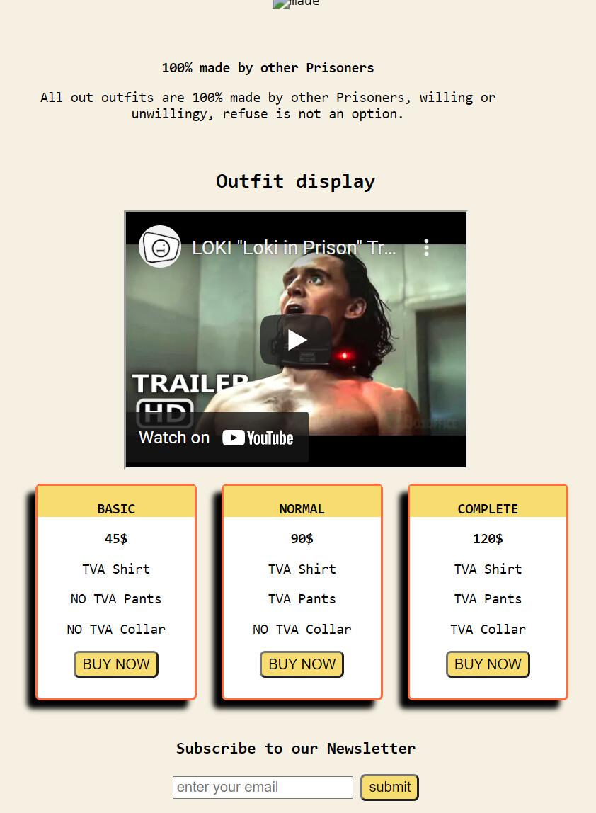
The first thing I notice is that the image and video size are not proportional. The big shirt image when you load up the page is too big and is double the height of my viewport. I am using a 4k display and the image gets upscaled a lot, resulting in it becoming more blurry. You might want to use max-width to cap the width of the image so it doesn’t become 3000 pixels wide on big screens (media code)
(The image I posted is downscaled to fit in the forum post so it won’t appear blurry.)
The image does a good job at drawing attention to the product, but the title of the page is too small and my eyes instantly skipped over it. I would suggest increasing the size of the title, decreasing the height of the image to less then 50vh.
The gray navigation bar blends in with the rest of the page and I didn’t even notice it nor the logo for a few minutes. I would change the color of the navigation bar to black or any other darker color. Then I would apply a box-shadow: 2px 2px 5px black; to the bar to make it pop out. I would also apply box shadow to the blue main box. I also didn’t even notice the navigation items to the far right of the page because they are too far over.
Add this to your CSS for smooth Nav
:root{scroll-behavior: smooth;
Try to find a futuristic font. I use space mono for a more technology/ futuristic font. Use google fonts to find the one you need. If you want to use mine, here is the font code:
@import url('https://fonts.googleapis.com/css2?family=Space+Mono&display=swap');
body {
  font-family: 'Space Mono', monospace;
}
I also mentioned before that the video was too small. I would suggest making it at least 50% of the width of the blue container.
For your price cards, change the background to white (other then the blue transparent background). Then I would add box shadows to each to make them pop. The prices should also be bigger (first thing you notice) and buttons could be styled.
Good work and happy coding


 i read about transitions but didnt include them as i tought there would be barely a difference but oh boy it does looks nice.