Learn CSS Grid by Building a Magazine - Step 77

Tell us what’s happening:

@media only screen and (min-width: 720px) {
  .image-wrapper{
    grid-template-columns: 1fr;
  }
}

Your browser information:

User Agent is: Mozilla/5.0 (Windows NT 10.0; Win64; x64) AppleWebKit/537.36 (KHTML, like Gecko) Chrome/105.0.0.0 Safari/537.36

Challenge: Learn CSS Grid by Building a Magazine - Step 77

Link to the challenge:

I’ve edited your code for readability. When you enter a code block into a forum post, please precede it with a separate line of three backticks and follow it with a separate line of three backticks to make it easier to read.

You can also use the “preformatted text” tool in the editor (</>) to add backticks around text.

See this post to find the backtick on your keyboard.
Note: Backticks (`) are not single quotes (').

Hello there,

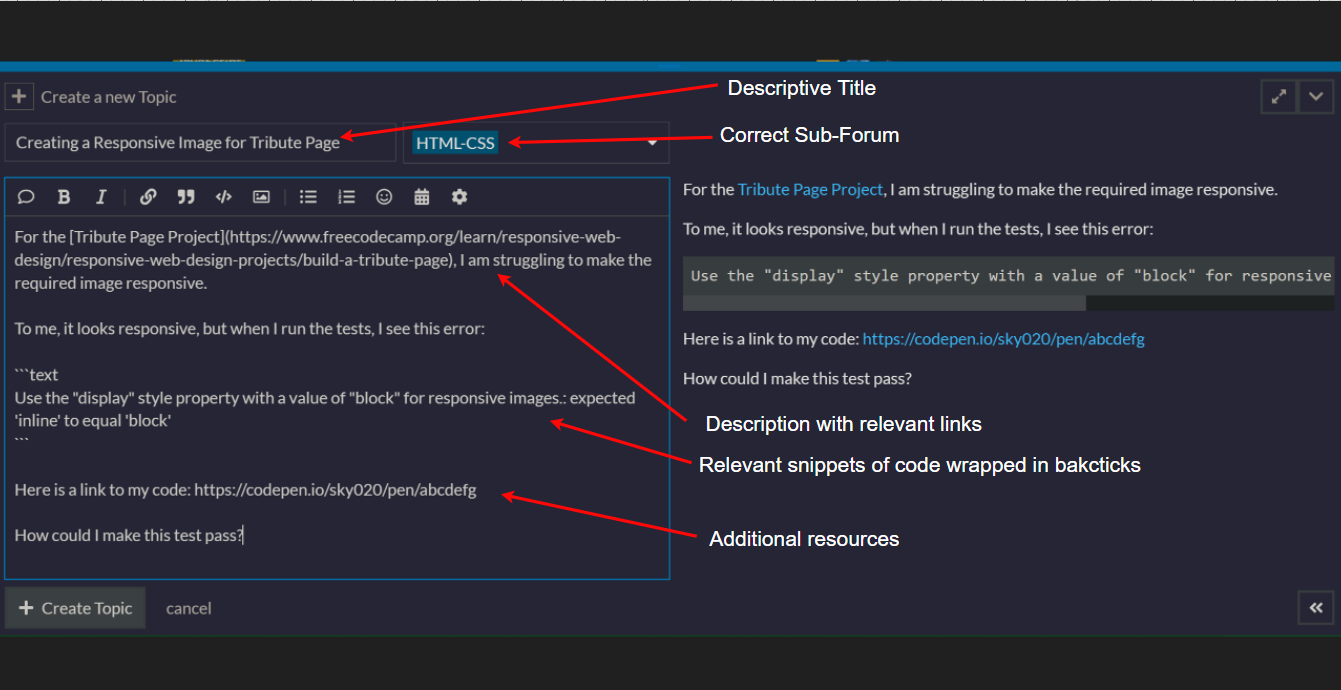
We recommend familiarising yourself with how to ask a question on this forum. Specifically, you are more likely to get useful help, if you provide a helpful title and description:

Hello World!
I am stuck here. I have tried all I could but it seem not working.

@media only screen and (min-width: 720px) {

It should be max-width not min-width

3 Likes

This topic was automatically closed 182 days after the last reply. New replies are no longer allowed.