Would love some constructive criticism/feedback on my technical documentation page 
Yes we love too, but I cannot find the link!? Looks like you forgot one ctrl+v boi to share the link
woops, bit braindead  . thanks, edited
Looks good, this is so great simple. Everyone loves simple designs.
Good colouring and contrast between fg and bg. very good. Except for the code snipped section, if you could use more better foreground color(pink/magenta over gray/silver is not very easy readable), or even better syntax colour the content.
About the functionality, it’s working, very good. no dead link.
Some issues I found, between desktop and phone(maybe tablets) the layout is broken(before the left navigation goes hide), check:
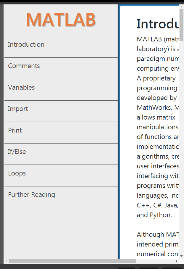
I suggest you apply less width for left link navigation panel, it looks like it’s a little too much.
About the mobile view, I suggest instead of you hide it, you placet it at the top of the page, or a fixed and toggleable panel at the left.
I see you used absolute units in css rules, please use relative units.
One suggestion, In desktop, and tablet(able) user to toggle(show/hide) the left navigation panel. it let user read the content data easier as it gets more space.
In content panel, data padding and spacing is very good. But in mobile view you may apply less padding value to utilize maximum screen space usage.
Keep going on great work, happy programming
1 Like
Thanks for taking the time to give such detailed feedback. I’ll have a go at making some adjustments tomorrow 