First of all thanks to @miku86 and @Roma for your feedback on my survey form. I didn’t know for the test option and it helped a lot. @miku86 McGregor reference was hilarious. I will fix all mistakes on the survey form now that I’m finished with this.
This is my take on the Product Landing Page project:
It’s my third project and I think it looks much better than the first two(definitely took me a lot more time :)).
I passed all tests, I’m planning to implement a few more media queries and finished touches.
Next time I will definitely start mobile-first and then upgrade, I saw a lot of recommendations to do it that way.
Feedback critique and advice are welcome
Thanks, Cheers!
there are some small errors in the HTML, but I think you are able to fix them!
you can increase the readability of your code by:
clicking on the small arrow on the right side of the code box and
clicking Format HTML/CSS
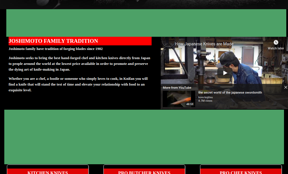
you can increase the overall readability of your page by adding some more consistency, e.g. between the different sections; as you can see, the spacing above and below this section is very different but I think there is no need for it: