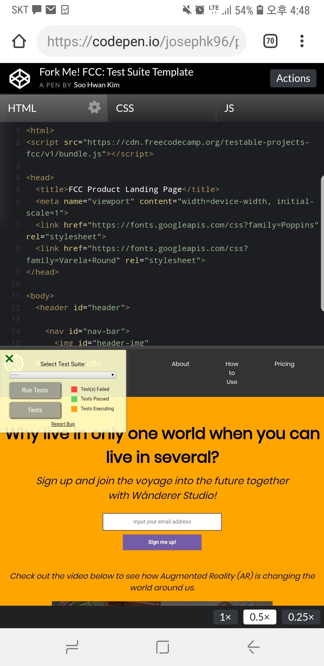
I am trying to move my image to the left of my text without using float.
The image in question is nestled within div class=“img2” .
Is there anyway I can do this without using float? I tried using float, but it is not responsive
when viewed on mobile.
Another question I have is =
my h2 id=“sign-up” element, when viewed on mobile, overlaps the p id=“signup” element. How can I fix this?
Is this on the right track to what you are trying to achieve?
I added a container div around the image and text and made the container display:flex and removed the float left
Issue 2: I am not familiar with making mobile-friendly sites yet and @media queries are still confusing to me. How to remove this from my site and set a certain width so that I would not be able to scroll to the right and see this blank space?
Issue 3: I have figured out on desktop how to keep the image from breaking apart from the rest of the body – by setting a max-width: 1080px and margin:0 auto; property to the body element in CSS. However, on mobile, even though I used a media query and used flexbox and centered all the elements, the img and text are not aligned with the rest of the page.
Hey dont worry, the only bugging going on around here are the bugs in your project.
I also misinterpreted the issue with your nav bar, I thought you meant the issue was with the ‘How to use’ button wrapping its text over 3 lines so that prior link will not help
I suggest using Bootstrap for your menu, it has a great navbar component that will automatically switch between desktop and mobile menu depending on the screen size.
Yes, I have made a few changes since I posted here
Thanks for posting a link to Boostrap navbar, I’ll take a look at that and decide whether to implement it in my site after I’m done finishing the rest of my page or whether I should implement it after I’m done with a few other projects, just to make my page look better and more responsive
Regarding the max-width: 1080px; , I did not think of 4k displays, thanks for reminding me that some people are actually able to afford such monitors! haha
Anyhow, I dont know how to thank you enough. I’m just gonna give you likes on all your posts here
The more I help other people the more I learn too so thank you.
And thank you for detailing your issues in a way that is easy to read and comprehend. It can be quite hard to explain to others what you are trying to achieve through text and screenshots.


 so thank you.