Tell us what’s happening:
Hi, I’m using VS Code and a local server to load my images, so you won’t be able to see them. The issue I’m facing is that my images aren’t displaying in a grid format. I’ve tried using the W3C HTML and CSS validator, and no errors come up. Could anyone please point out where I went wrong? I suspect that the errors lie in the CSS file probably lines 98-105.
Your code so far
<!-- file: index.html -->
<!DOCTYPE html>
<html lang="en">
<head>
<meta charset="UTF-8">
<meta name="viewport" content="width=device-width, initial-scale=1.0">
<title>Fateyha Portfolio</title>
<link rel="stylesheet" href="./styles.css">
<link rel="preconnect" href="https://fonts.googleapis.com">
<link rel="preconnect" href="https://fonts.gstatic.com" crossorigin>
<link
href="https://fonts.googleapis.com/css2?family=Poppins:ital,wght@0,100;0,200;0,300;0,400;0,500;0,600;0,700;0,800;0,900;1,100;1,200;1,300;1,400;1,500;1,600;1,700;1,800;1,900&display=swap"
rel="stylesheet">
<link rel="preconnect" href="https://fonts.googleapis.com">
<link rel="preconnect" href="https://fonts.gstatic.com" crossorigin>
<link
href="https://fonts.googleapis.com/css2?family=Noto+Serif:ital,wght@0,100..900;1,100..900&family=Poppins:ital,wght@0,100;0,200;0,300;0,400;0,500;0,600;0,700;0,800;0,900;1,100;1,200;1,300;1,400;1,500;1,600;1,700;1,800;1,900&display=swap"
rel="stylesheet">
</head>
<body>
<header>
<nav id="nav-bar">
<ul class="nav-links">
<li><a href="#welcome-section" class="nav-link">Welcome</a></li>
<li><a href="#projects" class="nav-link">Projects</a></li>
<li><a href="#contacts" class="nav-link">Contact</a></li>
</ul>
</nav>
</header>
<section id="#welcome-section">
<h1>Hello, I'm Fateyha</h1>
<p> A software engineer</p>
</section>
<section id="#projects">
<h1> These are some of my projects</h1>
<div class="projects">
<a href="#" class="project-tile">
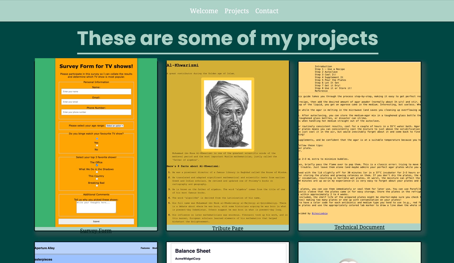
<img src="./survey_form.png" alt="Image of my survey form">
<p><span></span>Survey Form<span></span></p>
</a>
<a href="#" class="project-tile">
<img src="./tribute_page.png" alt="Image of my tribute page">
<p><span></span>Tribute Page<span></span></p>
</a>
<a href="#" class="project-tile">
<img src="./Tech_doc_page.png" alt="Image of my technical document page">
<p><span></span>Technical Document<span></span></p>
</a>
<a href="#" class="project-tile">
<img src="./aperture_alley.png" alt="Image of my mock website">
<p><span></span><span>Aperture Alley</span></p>
</a>
<a href="#" class="project-tile">
<img src="./balance_sheet.png" alt="Image of my balance sheet">
<p><span></span><span>Balance Sheet</span></p>
</a>
<a href="#" class="project-tile">
<img src="./penguin_css-transforms.png" alt="Image of CSS transforms penguin">
<p><span></span><span>CSS Transforms Penguin</span></p>
</a>
</div>
</section>
</body>
</html>
/* file: styles.css */
:root {
    --mint: #abd1c6;
    --base-100: #fffffe;
    --mint-focus: #001e1d;
    --accent: #001e1d;
    --secondary: #004643;
}

* {
    margin: 0;

}

body {
    font-family: "Noto Serif", sans-serif;
    text-align: center;
    background-color: var(--mint);
}

h1,
h2,
h3,
h4,
h5,
h6 {
    font-family: "Poppins", sans-serif;
}

h1 {
    font-size: 60px;
}

#nav-bar {
    display: flex;
    justify-content: center;
    position: fixed;
    top: 0;
    width: 100%;
    background-color: var(--mint);
    padding: 20px 0;
    font-size: 20px;
    border-bottom: 1px solid var(--mint-focus);
}

.nav-links {
    display: flex;
    list-style: none;

}

.nav-links a {
    text-decoration: none;
    padding: 0 10px;
    color: var(--base-100);
}

.nav-links a:hover {
    text-decoration: underline;
}

section {
    min-height: 100vh;
    padding: 70px 0;
}

#welcome-section {
    background-color: var(--mint);
    color: var(--base-100);
    display: flex;
    flex-direction: column;
}

#welcome-section h1 {
    margin-top: 30vh;
}

#welcome-section p {
    color: var(--accent);
    font-size: 25px;
    margin: 25px 0;
    font-style: italic;
}

#projects {
    background-color: var(--secondary);
    color: var(--mint);
    display: grid;

}

#projects h1 {
    border-bottom: 5px solid var(--mint);
    width: fit-content;
    margin: auto;

}

#projects .projects {
    display: grid;
    gap: 30px;
    padding: 20px;
    place-items: center;
    max-width: 1200px;
    margin: auto;
    grid-template-columns: repeat(auto-fit, minmax(300px, 1fr));
}

#projects .project-tile {
    height: 525px;
    width: 100%;
    display: flex;
    flex-direction: column;
    align-items: center;
    justify-content: center;
    background-color: var(--mint);
    color: var(--accent);
    border-radius: 5px;
    box-shadow: 8px 8px 10px 5px rgba(100, 100, 100, 0.3);
}

#projects .project-tile img {
    height: 100%;
    width: 100%;
    object-fit: cover;
}
Your browser information:
User Agent is: Mozilla/5.0 (Macintosh; Intel Mac OS X 10_15_7) AppleWebKit/537.36 (KHTML, like Gecko) Chrome/139.0.0.0 Safari/537.36
Challenge Information:
Personal Portfolio Webpage - Build a Personal Portfolio Webpage