The image took ages to load and the video in your previous pen didn’t play.
1 Like
I am a very new coder too. You are doing things that I have yet to do. So, don’t be discouraged.
1 Like
@coder20201 Sorry about the image. I’m going to take it away. The video didn’t work because there’s no video-I just thought the code was enough to show well, here would come the vid. My previous pen was left behind, I’d like to know how to erase it.
I’m not sure why it is loading like that but someone else might, so maybe hold onto it for now.
1 Like
Try the depth technique I recommended and make sure the user doesn’t need to read across your page too much. Try removing the background image or put it behind some form of toned webpage.

This is a example of using depth to the page. Note the use of a box-shadow. For your webpage, try and replace that red area with some form of background image design up keep that white main area.
1 Like
@michaelnicol I see what you mean. I’ll do that as soon as I can. I got a lot to do and not much time but as soon as I can I’ll go on working on this. I remember all your advices. Thank you again, in fact I can’t thank you enough. Regards
1 Like
@michaelnicol I’ve done a lot of changes to the page. I did not use a white background but I did replace the shocking image on the back. I created a container so I could enter the text there. I used a smooth gradient. I didn’t dare to go straight to white, to be honest. I also tried to make a theme in all the design, repeating light blue on the submit button, and soft orange as I hover by the links in the nav-bar to match the main div down there. I also made the h2’s white with a text shadow and I centered them.
I ask of you a favor: could it be that because of the time zone your messages arrive always at 4 am. I have no problem except on Tuesday I have to get up at 5:30 am and I can’t disable the notifications in my cell phone which I keep by the bed in case someone needs me. So please at the time you normally send your messages think that here in Buenos Aires it’s 4 am.
Thank you lots!
https://codepen.io/33P/pen/VwvojEv
1 Like
@michaelnicol Sorry if I bothered you or offended you with the time issue. As long as it is not Tuesday feel free to message me at any time. Maybe it’s the only time you can afford to. So thank you.
1 Like
Don’t worry, I completely understand your time zone situation. In fact, I find it honorable how much work you are putting into your education. You have used my advice and your webpage is looking at least 4x as better now that you have implemented some basic design features.
The orange tone you put over top of the background image is a major improvement and removes mostly all eye strain.
I also am not sure if you are native English speaker, but if you aren’t, congratulations on learning a foreign language. That is a hard task in of itself. I can understand all of what you are saying.
I am happy for you.
Remember those Media Quires I mentioned earlier? They help to change CSS styling on smaller screens.
I used right click --> inspect element to then resize my browser window to test the responsiveness.
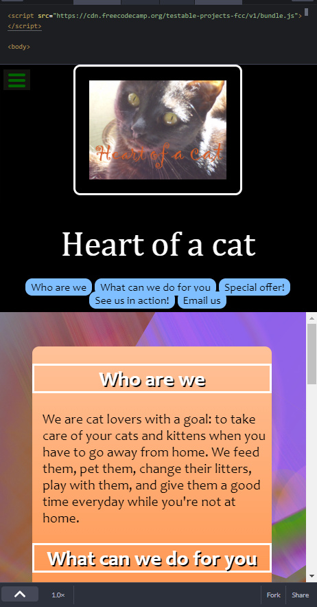
First, nice work on making the cat image go above the Navigation bar. That is showing how well you are learning Flexbox. A lot of beginners might have missed that.
However, notice how the #container padding and margin never changes on smaller screens. I would reduce it depending on the screen size and then at a certain point I would fully remove it. I would keep it on the top and bottom, but not on the sides. Make sure their is still some padding from the text to the edge of the screen though. When a user reads the text at the edge of the screen, their eyes can become distracted by the edge of their phone and what is past it. This can make it harder to focus and causes more strain on their eyes. They might not even realize they are doing it, but it does happen.
Your navigation bar elements work and I like the smooth scrolling, but they need more margin on smaller screens. They are going over top of each other as shown in the picture.
I do notice how you changed the main and #logo-text margin on smaller screens. That was a good idea and shows you are making progress on making responsive webpages.
I will try to time Tuesday posts past 05:30. You are one hour ahead of me, so I will most likely release at 12:00 here or 13:00 for you on those days. I actually posted that last reply 4 days ago and forgot to come back and check on it since I have notifications turned off.
1 Like
@michaelnicol Thank you so much for your time and understanding! You have made me feel so good with your words. Now it’s the time when I have to take care of my mum but I’ll answer you fully when she takes her afternoon nap. That’s right, siesta, I am a Spanish native speaker. So I’m happy I made myself understood. Regards and I’ll be with you shortly!
1 Like
@michaelnicol I think the best way to thank you for all your selfless help and kindness is applying the changes that you suggested to the page. Tonight I’m going to do that, so next time I post it will be with a better page. You’re very kind as I said and it’s probable I would never have noticed all the things you’re pointing me out, resulting in a poor work without even knowing it. So thanks again! And thank you too for understanding the time zone issue!
1 Like
@michaelnicol I started to code at 8pm and ended up almost at 1 in the morning! I must be really dumb to take such a long time for such an easy task. But the thing was more complicated it seems. Finally I could make a responsive main container by placing transitions. I think it helps in the change of view. And at last what I wanted since the beginning and couldn’t do up to now! To have a real column of nav-links when the screen is small. I arranged a whole number of things for this to work out. Too numerous to mention. I used media queries a lot. I also placed a much smaller margin-top for the container as I saw too much color in the background was unmatching the more sober tones of the header. I also took out the padding and white border of the cat photo when in a small screen. Master, I think I have learned.
Anyway. I hope I don’t disappoint you with my transitions.
So here it is. And thanks in advance for the helping words you surely have for me.
https://codepen.io/33P/pen/VwvojEv
1 Like
Excellent progress. Don’t feel bad about working all night, because in the end you did it and learned. Here is my JavaScript Number Systems Translator.
If you go the the JavaScript and scroll to line 43, you can notice how I put let i = 0; for the loop. Then on line 55 I put let j = 0; for another loop. However, when I first made it, I put let i = 0; for both lines which caused a error resulting in the crash of the entire 125 line program. It took me two days and a forum post to figure that out. Over one letter. Another time I made a entire program, but couldn’t figure out why it wouldn’t run. Made a forum post to figure out that I never even called the program to run in the first place. We all make mistakes and struggle sometimes.
Now for your code.
I would suggest moving the picture of the cat into the “who are we” section. Otherwise, the Nav bar becomes offset and looks a little weird. I would then make the navigation bar bigger, spanning maybe 50% of the header. Each navigation item could be much bigger and I would suggest a square style like the one used on the smaller screens. If you do this, make sure to also separate each navigation item with a bigger margin.
I think I understand what you were trying to do by attempting to blend the nav bar into the body for a nice transition. However, it doesn’t work that well because the color scheme changes too much between the header and the body along with the top margin on the container. By having a sharp contrast with the black header and the orange container, it feels like the nav bar should be more separate as previously stated.
I would also add a padding to the bottom of the header because the nav bar buttons are touching the background image. It looks a little off and removes the perception that each section is separating the page with its own purpose. Like what you did on the smaller screens with the square navigation items.
The nav bar looks great on smaller screens. Great work.
What I just said seems like a lot, but its mostly just styling and moving a few things around. You have the core functionality of it and you are on the right track (especially with your responsiveness). Do not give up because you are very close.
If you want to have the picture in the header, I suggest putting it above the navigation bar. Column flex instead of row flex. This will also save you so much time and energy when it comes to making the page responsive. Less worries about changing margins and padding’s to make sure the image, navigation bar and title don’t overlap, etc.
Here is why I would support either putting it above the nav bar or in the page section as stated before. Their is a 100 - 200 pixel zone in the re-sizing that causes the cat picture to go off the screen since you disabled the flexbox wrapping on CSS line 7 with the flex-flow: row nowrap; It seems like too much work to try and attempt to continue the current picture placement rather then simply moving it.

You don’t have much text in your container, so I would suggest having less of a width. Use percentages. Less of a width means that you need to put less responsiveness code because now it has a bigger margin for it to go into when the screen is re-sizing. Keep in mind that the less hard-coded margins and padding you use all together, the less you need to deal with later in the media queries. So having a big margin and a smaller width for your main container will save you later on.
It also prevents eye strain if the container is made smaller when their is little text on the page. It results in the users eyes moving scanning less across the page to read and therefor less eye strain. The main container is the center of attention and where the user’s eyes will be 95% of the time. By shrinking it width wise, it appears as if their is more text then their actually is. This is because we are so used to see more lines of text height wise and correlating it to more text rather then doing the same with width.
The brain also can’t read and compare what is happening on two different sides at the same time, so long strung out texts appears to be less text then if you compacted it together.By having more content or making it appear as if you do, the page seems more official. Hope that made sense.
Great start dude. Continue on. Everyone struggles at the start. Minor things hear and their but you are on the right track. Can’t wait to hear back from your tomorrow or the next day.
1 Like
@michaelnicol Hi Michael, I read your post thoroughly and did all you told me. But, alas, poor Yorick! My container got stuck. I know there must be just a little something and I put my pen inside out and upside down but couldn’t find it. Maybe you can help me or at least give me a hint. It reminds me of your “i” problem.
I spent last night trying to fix it. No way.
And, Michael, I must thank you yet again for all the help you’re giving me. You’re a teacher to me.
Oh, and something really curious but the page passed all the tests. Which implies, the problem is not a broken link or something. It’s the container that won’t move!
https://codepen.io/33P/pen/VwvojEv
1 Like
Congrats on working with the Navigation bar. Glad you see you took my advice and moved the picture above.
I would suggest making the naviatigon bar items be in a row on bigger screen sizes and a column on smaller screen sizes (rather then on every screen size). My concern is that the header will look too big even with this row. I also think that you maybe could just remove the navigation bar all together on smaller screens since it is not needed when the page is that compact.
I am going to propose another idea to you in regards to your header and picture.

The bar on top is your navigation items. They will be in a row with no margin between them (each item separated by a line). This could be accomplished by just putting them all next to reach other, removing margin, and then just changing the line color or width on the left or right side of the element. This is all of what will be in the header.
The box below is the picture of the cat. I would suggest using flex box to position it in the center with only a top and bottom margin. Justify to center.
Below that is all your main container.
All of this will have a box shadow. You might want to fool around with color schemes at little bit more (check out my useful tools for two links about that). The orange on a orange background with a black header is not giving it that pop. When you do the above (if you want), I could make a copy of the pen and fool around with the color schemes to show you what can be made. Its a very tricky process that is memorized more then anything. Usually some color schemes just work and don’t work, mostly no in-between. Give it a modern feel.
Also, give your pen a nice name. You deserve it.
Anyways, now for that container.
Main has position: fixed in it which is causing it not to scroll. However, removing it breaks the entire header.
It may be crazy, but try rebuilding the webpage from the ground up again with your new knowledge. You have tons of conflicting CSS code that is making it harder and harder for you to add more stuff. The main is just a background container for everything and should have no reason to have the fixed CSS style, but for some reason it is the only way for it to work. You now know a lot more since you initially posted, so rebuild it using flexbox and all of the simple CSS code.
Remember what I said about giving up and trying? This might be that point. With all of the conflicting CSS code making it harder and harder for you to continue (your page structure has changed twice now), it seems as if the best way to go forward is to start over and rebuild it with your new knowledge.
Engineers make tons of prototypes and we all struggle a lot in this process. You made this one and now it is time for your final design. Make it again with your new found knowledge and my previously stated ideas. Don’t take it as a insult, but as a opportunity.
I am happy with your progress and I believe you have the ability to rebuild the same page with better and simpler CSS code. Try to do as much with Flexbox and percentages as possible. More margin code = more media code. Use percentages! They are adaptive to screen size much better then pixel size.
Good luck on your mission.
1 Like
@michaelnicol OK. So I bought a half litre bottle of Coke and erased the whole CSS.
What I’ve done, here it is.
https://codepen.io/33P/pen/VwvojEv
1 Like
Nice work. I congratulate you on not giving up and taking my advice. 103 CSS lines code is very controllable and understandable. Nice work!
A few things to improve. Try to follow it in order.
- Remove every instance of position on all of your elements. Putting it on your
mainis not allowing it to scroll. Position is a very powerful CSS style and needs to be treated carefully. It will mess up the entire page with only one line and should only be used in very exact places. Its a common mistake. - Add the following code to the CSS after this:
html {
    overflow: scroll;
    overflow-x: hidden;
}
::-webkit-scrollbar {
    width: 0px;  /* Remove scrollbar space */
    background: transparent;  /* Optional: just make scrollbar invisible */
}
This will remove all of those scroll bars on the screen
-
After this, even out all of the margins and spacing.
-
Remember what I mentioned about reading across the screen. Try to make your container width smaller.
-
Make sure to add box shadows.. They are simple and add a nice contrast to the webpage.
-
I like the new navigation bar. The animation for the hover affect needs to be changed. Try using CSS Transitions to make smooth animations and try a different type of change.
As a start I tried:
.nav-link:hover{
  border: 1px solid black;
  transform: scale(1.05);
  cursor: pointer;
}
And in your .nav_link without the :hover I added:
transition: 0.5s;
The width part of it is not always needed. I always just used the time unlike in the W3 schools article.
Don’t forget! The most important part!
html {
  scroll-behavior: smooth;
}
This is all just a start. Make more fine improvements to all aspects of your page as you see. After you do all of this, I will show you some color combinations that you may like. Happy programming! I am happy with your progress and my replies are getting on more finer and finer details because you are greatly improving.
1 Like
Hi! I’ve done all you told me to. I added an animation to the cat photo but I’m not sure whether you’re gonna like it or not. It works great in smaller screens because it fills the something that they were lacking. The transitions you made seemed pretty cool to me, I didn’t want to mess them up so I left them where your instructions led me to put them.
The only down point is the contents of the container go up the header which is no longer fixed. I timidly tried two or three things but I didn’t want to mess it still more, so I left them where they were after the changes you suggested. Any idea? If you give me permission I’ll keep on trying but as I said I don’t want to put the foot in, to say it somehow.
So here it is.
https://codepen.io/33P/pen/VwvojEv
1 Like
Nice work again! You are getting very close to being complete for your first major project.
- Change the container width to 60%. Using pixel widths on very big elements like your container will make it much harder to make it responsive.
Make sure to change your container margins and width to be 100% on smaller screens.

- Use a black box shadow for your image, navigation bar, and main container. One tip for Box shadow is to add it to a button, then remove it when they click. With the use of CSS transitions, it looks like a 3D button. This isn’t required, but something to keep in mind. I like your cat animation, its a nice touch for your introduction to animations and makes this page special to you.
I am not sure what you meant by contents of container go up into the header. I am not seeing any glitches visually. I would suggest increasing the margin to make the image farther away from the container and header (top and bottom margins para image).
-
Center the content in your Email Us section. Also remove the border, doesn’t fit the page theme. I see what you were going for though. If you check out my portfolio webpage and scroll to the bottom, you can see I actually varied the colors of each sections to break up the page. This style is what you were somewhat going for in your page, but it doesn’t work unless your main container is 100% of the screen naturally. You will also notice how I failed to place a placeholder image in my certificates section, so when the image broke the width and height was not saved and it looks weird. Something to keep in mind with your images on your pages to make sure that the URL that they come from will still exist in the future so it doesn’t break.
-
I would suggest changing the color of the navigation bar item transition to something besides the background color.
-
One way to tell if a page is well made is the ability to make big changes easily. I have the ability to change your entire container width with one line of CSS code. That is a great sign and show simplicity compared to before. Same should go with every part of your program. I should be able to do the same thing to the header or image without difficulties.
My entire internet just crashed  and I can’t view codepen for some reason anymore today. But I think i said enough for now and you will busy. However, you are learning and I am very happy for you. I will try the color scheme part once we are done with these smaller details.
1 Like
@michaelnicol Hi Michael thanks as always. I know you can’t take a look at it now but what I meant is when I press the nav links to call the different sections they go over the complete header as if it wasn’t there. I have to scroll down again to see the nav bar and cat photo again. If I don’t press the nav links the navigation is OK.
I will apply those changes though. So thanks!
Almost forgot. I used this site for my color palette: https://colorinspo.com
And here it is!
https://codepen.io/33P/pen/VwvojEv
I hope your internet comes back soon!
Edit: one last question. Honestly. Do you think some day I will be able to make a living with this? I think for the work you’re investing in me somehow you must be seeing some prospect in my future. Answer if you want to.
1 Like