bbwd345
January 14, 2019, 12:31pm
1
Hallo , sorry about my English…
I build my layout with Grid .
I search to build a Responsive Web Design for Google Nexus Tablet .Mit this code;
@media screen and (min-width: 31em)
              and (max-width: 38em)
              and (orientation: portrait) {
    body {
      padding: 0;
      display: grid;
      grid-template-columns: 17% 72% 9%;
      grid-gap: 5px;
      grid-template-areas:
      "header  header  header"
      "nav     nav     nav"
      "linkBox main    main"
      "footer  footer  footer";

   }
   #externalLinks a	{

     text-decoration: none;
     display: block;
	 text-align: center;

     font-size: 15px;
	 font-family: Candara, Calibri, Segoe, "Segoe UI", Optima, sans-serif;
    }

    #externalLinks ul {
	 list-style-type: none;
	 margin: 5px;
     padding: 0;

    }

    #externalLinks li{float: left}
}
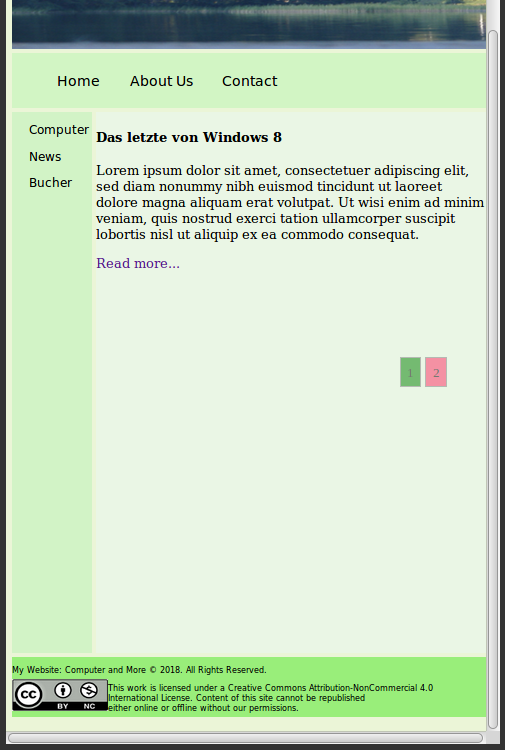
How the Screenshot to show ,with orientation: landscape , all is OK .
but with orientation: portrait i to receive this Screenshot…
How to see , are not change on the orientation: portrait Window…
The Code from my ID #externalLinks
<aside id="externalLinks">
<ul>
  <li class="dropdown">
    <a href="#" class="dropbtn">Computer</a>
     <div class="dropdown-content">
       <a href="windows.php">Windows</a>
       <a href="#">Link 2</a>
       <a href="#">Link 3</a>
       <a href="#">Link 4</a>
	  </div>
  <li><a href="#">News</a></li>
  <li><a href="#">Bucher</a></li>

 </ul>

</aside>
Can Please help me and this Problem to solve , Thanks !
I know why it have not work … that problem was because the low Number … , now i writing ;
@media screen and (min-width: 37.6875em)
              and (max-width: 47.93em)
              and (orientation: portrait)
the screenshot…
But now have another question…below from footer have empty place , what can to do and this Problem to solve ??
i to search with height: 100%;
How to see , it is a little better , but not 100% …
without seeing the rest of your markup there is no way to know where the extra footer space is coming from.
with that said, it is a good idea to use a reset stylesheet to normalize the behavior of a web page, as each user agent will employ their own stylesheet for their given browser. many times this shows up as extra margin around the body element.
a google search on css reset stylesheets will point you in the right direction.
thanks for your answer !
my code;
<?php

 header('Content-Type: text/html; Charset=utf-8');
 mb_internal_encoding('UTF-8');
 date_default_timezone_set('UTC');
 error_reporting(E_ALL);


?>


<html lang="en">
<head>
<meta name="viewport" content="width=device-width, initial-scale=1.0">

	<title>Computer</title>
<style>
  <?php include 'CSS/windows.css'; ?>
  <?php include 'CSS/tablet.css'; ?>

</style>
</head>

<body class="mella">
<header></header>
<nav>
  <ul>
    <li><a href="index.php">Home</a></li>
    <li><a href="https://wiki.selfhtml.org/wiki/HTML/Tutorials/HTML5-Seitenstrukturierung">About Us</a></li>
    <li><a href="#">Contact</a></li>
  </ul>
</nav>


<aside id="externalLinks">
<ul>
  <li class="dropdown">
    <a href="#" class="dropbtn">Computer</a>
     <div class="dropdown-content">
       <a href="windows.php">Windows</a>
       <a href="#">Link 2</a>
       <a href="#">Link 3</a>
       <a href="#">Link 4</a>
	  </div>
  <li><a href="#">News</a></li>
  <li><a href="#">Bucher</a></li>

 </ul>

</aside>

<main>
<h4>Das letzte von Windows 8</h4>
<p>Lorem ipsum dolor sit amet, consectetuer adipiscing elit, sed diam nonummy nibh euismod tincidunt ut laoreet dolore
magna aliquam erat volutpat. Ut wisi enim ad minim veniam, quis nostrud exerci tation ullamcorper suscipit lobortis nisl
ut aliquip ex ea commodo consequat.
</p>
<a style="text-decoration: none;" href="windows8.php">Read more...</a>
<br>
<br>
<br>
<br>
<br>
<br>


<?php include ('links_change.php'); ?>

<br>
<br>
<br>
<br>
<br>


</main>

<aside id="furtherInformation"></aside>

<footer id="copry" >
	<p>My Website: Computer and More  © 2018. All Rights
Reserved.</p>
<a id="img1" href="https://creativecommons.org/licenses/by-nc/4.0/"><img alt="Creative Commons License" width="120px" height="40px"
src="/Bilder/copry.png" ></a>
<p>This work is licensed under a Creative Commons Attribution-NonCommercial 4.0<br> International License.
	Content of this site cannot be republished<br> either online or offline without our permissions. </p>

</footer>


</body>
</html>
a google search on css reset stylesheets will point you in the right direction.
i have too to search on google…
nothing in the markup jumps out at me that would be a factor as i’m not getting the large space at the bottom. double check your css and look for margin values for your #copry id selector, footer and body. you can comment them out to test. if that doesn’t work i’d suggest normalizing your document with a reset stylesheet, which can be as simple as:
* {
    margin: 0;
    padding: 0;
  }
this ensures every newly created element receives no additional padding or margin. make sure this or any reset stylesheet is first in the cascade so you can overwrite styles later on.
and you don’t HAVE to search on google, you can use any search engine
but my problem is not on bottom , but below from bottom…
and have only this problem in the Tablet… as you can see in desktop , all is OK…
lasjorg
January 14, 2019, 10:37pm
8
You simply don’t have enough content to fill the page vertically. You can give the main content area some height using vh.
Strait on main
body > main {
  height: 70vh;
}
On the body grid using grid rows
body {
  grid-template-rows: auto auto 70vh auto;
}
The empty <aside id="furtherInformation"></aside> has not been included in the grid and is causing an implicit grid at the bottom of the page. The grid-gap will cause some space at the bottom.
Your columns do not add up to 100% add 1% more to one of the columns
grid-template-columns: 9% 73% 17%;

grid-template-columns: 10% 73% 17%;
Your header image is repeating, add this.
background-size: cover;
background-repeat: no-repeat;
Remove the defaul margin and any overflow on the body.
margin: 0;
overflow-x: hidden;
1 Like
bbwd345
January 15, 2019, 11:55am
9
Very Thanks for your Code , now i will to try it… , i tell your what does it…
bbwd345
January 15, 2019, 3:56pm
10
Dankeeeeee ! , now all is OK ,
I writing this Code;
/* Tablet Nexus Width */

@media screen and  (min-width: 39.6875em) and (max-width: 63em) {
  body {
    display: grid;
    grid-template-columns: 11% 75% 14%;
     grid-gap: 5px;
    grid-template-areas:
    "header  header  header"
    "nav     nav     nav"
    "linkBox main    main"
    "footer  footer  footer";
  }

}

/* Tablet Nexus Portrait */

@media screen and (min-width: 30.06em)
              and (max-width: 38.6875em)
              and (orientation: portrait){
    body {

      display: grid;
      grid-template-columns: 17% 70% 13%;
      grid-template-rows: auto auto 70vh auto;
      grid-gap: 5px;
      grid-template-areas:
       "header  header  header"
       "nav     nav     nav"
       "linkBox main    main"
       "footer  footer  footer";
    }
    body > main {
     height: 70vh;
   }
}
body > header {
	grid-area: header;
	background-image: url("/Bilder/nnnn.png");
        background-size: cover;
        background-repeat: no-repeat;
        padding: 80px;
a Screenshot how to see the Tablet …