Responsive Grid not working

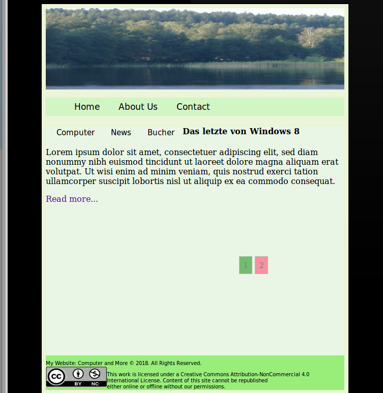
Hallo , sorry about my English… , I am very new with Html/Css …

I have a Website and I will this Website to see on Tablet , I have to search with this code;

@media (min-width: 48em) and (max-width: 64em) and (orientation: landscape) {
   #content {
     display: grid;
      grid-template-columns: 10% 72% 17%;
      grid-gap: 5px;
      grid-template-areas:
       "header  header  header"
       "nav     nav     nav"
       "linkBox main    infoBox"
       "footer  footer  footer";
    }

#content > * {
  background-color: yellow;
}

#content > nav {
  grid-area: nav;
	background-color: #d2f5c4;

}

#content > #externalLinks {
	grid-area: linkBox;
	background-color:  #d2f3c6;
	
}

#content > main {
	grid-area: main;
	background-color: #eaf6e5;
}

#content >  #furtherInformation {
	grid-area: infoBox;
	background-color: #d2f3c6;
}

#content > footer {
	grid-area: footer;
	background-color: #99ee7a;

}

/* Nav  */

nav {background-color: #d2f5c4;}

nav a{
    color: black;
    text-decoration: none;
	display: inline;
	padding: 0px 8px;
	font-size: 17px;
	font-family:  Candara, Calibri, Segoe, "Segoe UI", Optima, sans-serif;
}

nav ul {list-style-type: none;}

nav li {display: block;display:inline-block;}


/* ExternalLinks  */

#externalLinks a	{

    text-decoration: none;
	display: block;
	text-align: center;

    font-size: 15px;
	font-family: Candara, Calibri, Segoe, "Segoe UI", Optima, sans-serif;
}

#externalLinks ul {
	list-style-type: none;
	margin: 5px;
    padding: 0;

}

#externalLinks li{float: left}

/* Geben an Link1, link2, link3 ; Farbe , Padding, .... */


li a, .dropbtn {
    display: block;
    color: #000;
    padding: 8px 16px;
    text-decoration: none;

}

li a:hover, .dropdown:hover .dropbtn { background-color: #f1ebeb;}

.dropdown-content {
    display: none; /* display wird ausgeschaltet ,aber erlaubt die anderen elemente, position ,background ,.... */
    font-size: 12px;
	position: absolute; /* die stellung folgt der Erste Link(li) */
    background-color: #f1f1f1 ;
    min-width: 160px; /* macht größer die Inneren Links */
    box-shadow: 0px 8px 16px 0px rgba(0,0,0,0.2); /* Bau ein Schatte und geben an dem Schatten Farbe  */
    z-index: 1;    /*  Zeigen die Ordnung wie die Links gezeigt werden... */

}

.dropdown-content a {
    color: black;
    padding: 12px 16px;
    text-decoration: none;               /* Bekomme die Liks keine Unten Stricht ....*/
    display: block;
}

.dropdown-content a:hover {
background-color: #9f9e9e;
}
/* Offnen die Innere Links */

.dropdown:hover .dropdown-content {
    display: block;
	 left: 109px;       /* zeigt wo dem innere link fenster gezeigt wird */
     top: 214px;       /* zeigt wo dem innere link fenster gezeigt wird */

}

/*    Main           */

input, textarea{
			background:rgba(220,220,220,0.75);
			border:1px solid rgba(220,220,220,0.75);
			font:inherit;
			border-radius:0.2941em;/*5px;*/
			padding:0.4118em;/*7px;*/
			/*farbigen Rahmen in Chrome und Safari abschalten.*/
			outline:none;
}

input:focus, textarea:focus{
			background:#fff;
			border:1px solid #000;
	        outline: none; /* einige Browser add line auf input , das verhindert es... */
         
}
input[type=submit]{
			background:#be633c;
			border:none;
			color:#fff;
			border-radius:50% 50%;
			box-shadow:inset 0 0 1em #fb9d23;
			padding:0.5882em;/*10px*/
}
input[type=submit]:focus, input[type=submit]:active{
		 background-color:#A33202;
}


/* Footer  */

#copry {
	overflow: auto;
	font-size: 2px;
    list-style-type: none;
	font-family:  Candara, Calibri, Segoe, "Segoe UI", Optima, sans-serif;

}

#img1 {float: left;margin-bottom: 3px;}
#copry a {text-decoration: none;margin-bottom: 3px;}
#copry p {font-size: 10px;margin-bottom: 0;}

/*    Komment Button */

#comment:hover { box-shadow: 0px 8px 16px 0px rgba(0,0,0,0.2);}

#comment {font-size: 11px;} /*  Button from comment */

#form {font-size: 14px;} /* size from comment window */
}

but it making nothing… , I don’t know because it not working…

Can please anyone help me with this problem , Thanks !

I can get the div to move to the correct column but not the correct row.

This will display the blue rectangle in the correct column, but for whatever reason it isn’t moving in to the row I need it to. Thank you all for your help.

body {
display: grid;
grid-template-columns: 1fr 1fr 1fr;
grid-template-rows: 10% 80% 10%;
}

#navigation {
grid-column: 2/2;
grid-row: 2/2;
height: 400px;
width: 100%;
background-color: blue;
}

Can you post your HTML markup? It is kind of hard to know what is wrong without the HTML code.

@ TomerPacific , very thank for your answer ! , my code:

<?php
 
 header('Content-Type: text/html; Charset=utf-8');
 mb_internal_encoding('UTF-8');
 date_default_timezone_set('UTC');
 error_reporting(E_ALL);


?> 


<html lang="en">
<head>
<meta name="viewport" content="width=device-width, initial-scale=1.0">

	<title>Computer</title>
<style>

    <?php include 'CSS/windows.css'; ?>
   

</style>
</head>

<body>
<header></header>
<nav>
  <ul>
    <li><a href="index.php">Home</a></li>
    <li><a href="about_us.php">About Us</a></li>
    <li><a href="contact.php">Contact</a></li>
  </ul>
</nav>


<aside id="externalLinks">
<ul>
  <li class="dropdown">
    <a href="#" class="dropbtn">Computer</a>
     <div class="dropdown-content">
       <a href="windows.php">Windows</a>
       <a href="#">Link 2</a>
       <a href="#">Link 3</a>
       <a href="#">Link 4</a>
	  </div>
  <li><a href="#">News</a></li>
  <li><a href="#">Bucher</a></li>

 </ul>

</aside>

<main>
<p>Lorem ipsum dolor sit amet, consectetuer adipiscing elit, sed diam nonummy nibh euismod tincidunt ut laoreet dolore 
magna aliquam erat volutpat. Ut wisi enim ad minim veniam, quis nostrud exerci tation ullamcorper suscipit lobortis nisl 
ut aliquip ex ea commodo consequat.
</p>
<br>

<p><b id="adderiren">Add a new comment </b></p>
<br>


<?php
    
    
    include 'classprove.php';

?>    


</main>

<aside id="furtherInformation"></aside>

<footer id="copry" >
	<p>My Website: Computer and More  © 2018. All Rights Reserved.</p>
<a id="img1" href="https://creativecommons.org/licenses/by-nc/4.0/"><img alt="Creative Commons License" width="120px" height="40px" src="/Bilder/copry.png" ></a>
<p>This work is licensed under a Creative Commons Attribution-NonCommercial 4.0<br> International License.
	Content of this site cannot be republished<br> either online or offline without our permissions. </p>

</footer>


</body>
</html>


How my Website to see on my Desktop Computer , so , I have not Tablet , i to see it with a Tablet emulators… , here

a Screenshot how it to see…

Hi,

Ich verstehe Deine Frage nicht wirklich, du willst Deine Seite responsiv gestalten? Vielleicht ist es besser die Frage auf deutsch zu stellen :wink:

danke für deine Anwort ! , ich bin keine deutsch… ich wohne in Berlin aber ich komme aus dem Baskenland… ,mein deutsch es nicht so gut , aber versuche das du mir zu verstehen…
auf deine frage , ja , ich will eine Seite responsiv gestalten…,ich will auch das meine website in Tablets gezeigt wird , als ich meine website mit Grey Layout gebaut habe , ich weiß nicht wie kann mit Media Quries gestalten…ich bin ganze neu mit html/css , letzte Sommer habe ein Online-Kurs in der Volksschüler gemacht , dann habe mehr gelern , mit fragen… , auf dieser Forum , haben viele geholfe…

Am besten ist, du schreibst, welches HTML-Element wo genau stehen soll (in der Tablet-Ansicht).

 grid-template-areas:
       "header  header  header"
       "nav     nav     nav"
       "linkBox main    infoBox"
       "footer  footer  footer";

Ich nehme an, es geht dir wahrscheinlich um die linkBox?

Ich nehme an, es geht dir wahrscheinlich um die linkBox?

ja , so , wie jetzt siehst meine Website in Desktop aus , um der Website en Desktop zu sehen… , ich habe dieser Code auf meine Index Seite…

<?php  

header("Content-Type: text/html; Charset=utf-8");
mb_internal_encoding('UTF-8');
date_default_timezone_set('UTC');
error_reporting(-1);
error_reporting(E_ALL);

?>

<!doctype html>
<html lang="en">
<head>
<meta name="viewport" content="initial-scale=1.0">

	<title>Index</title>
<style>
body {
    
display: grid;    
background-color: #ebf5d7;
grid-gap: 5px;
grid-template-columns: 10% 72% 17%;
grid-template-areas:


"header   header   header"
"nav      nav      nav"
"linkBox  linkBox  linkBox"
"main     main     main"
"infoBox  infoBox  infoBox"
"footer   footer   footer" ;
}


@media (min-width: 80em) {
  
 body {
     
      display: grid;
      grid-template-columns: 10% 72% 17%;
      grid-gap: 5px;
      grid-template-areas:
       "header  header  header"
       "nav     nav     nav"
       "linkBox main    infoBox"
       "footer  footer  footer";
    
 }
  
}

aber auch von dem Form , wie hier zeigt auf meine Desktop… wie dieser Seite auf einenTablet aussiehst , ein Screenshot…

Meinst du so?

  body {
background-color: #ebf5d7;
grid-gap: 5px;
display:grid;
grid-template-columns: 10% 72% 17%;
      grid-template-areas:
    "header  header  header"
    "nav     nav     nav"
    "linkBox linkBox linkBox"
    "main    main    main"
    "infoBox infoBox infoBox"
    "footer  footer  footer";
}


@media (min-width: 48em)   {
 body {
    display: grid;
    grid-template-columns: 10% 72% 17%;
      grid-template-areas:
    "header  header  header"
    "nav     nav     nav"
    "linkBox main    infoBox"
    "footer  footer  footer";
     
  }
  
}

Danke , ist besser geworden , aber das Probleme ist dass die linkBox , wird nicht auf Linke Seite gezeigt sonder Oben…wie der screeshot zeigt…

so , ich habe die Parameter verendert , und jetzt habe geklabt !!

ich habe dieser Parameter gegeben… @media (min-width: 37em) ,weil der Tablet ein Google Nexus 7 ist… der Screenshot wie er aussiehst…

Die nächste frage ist , wie kann die class für dieser Große (37em) verendert ?

ich habe eine Probleme…

wenn auf @media (min-width: 37em) schreibe

body {
    display: grid;
    grid-template-columns: 10% 72% 17%;
      grid-template-areas:
    "header  header  header"
    "nav     nav     nav"
    "linkBox main    main"
    "footer  footer  footer";
     
  }

das “linkBox main main” , auch verendert sich das Bild von meinem Desktop…wie kann das möglich sein ??

wenn ich habe der Parameter für meinen Desktop so geschrieben;

@media (min-width: 80em) {
  
 body {
     
      display: grid;
      grid-template-columns: 10% 72% 17%;
      grid-gap: 5px;
      grid-template-areas:
       "header  header  header"
       "nav     nav     nav"
       "linkBox main    infoBox"
       "footer  footer  footer";
    
 }

Can please anyone help me ?

My problem is when write;

@media (min-width: 37em)    {
 body {
    display: grid;
    grid-template-columns: 10% 72% 17%;
      grid-template-areas:
    "header  header  header"
    "nav     nav     nav"
    "linkBox main    main"
    "footer  footer  footer";
     
  }

change too the layout from my Desktop Computer…

@media (min-width: 80em) {
  
 body {
     
       display: grid;
      grid-template-columns: 10% 72% 17%;
      grid-gap: 5px;
      grid-template-areas:
       "header  header  header"
       "nav     nav     nav"
       "linkBox main    infoBox"
       "footer  footer  footer";
    }

My Computer has a Resolution from 1280 X 1024…
I have only to changed on @media (min-width: 37em) , on the Line
"linkBox main infoBox" to “linkBox main main” .

I found the solution from my Problem ! :grinning:

My mistake was that me to be missing screen on my Media Queries

Now with @media screen and (max-width: 37em) , prevent working the Queries from my Desktop …

Before wrote;

@media (min-width: 37em)    {
 body {
    display: grid;
    grid-template-columns: 10% 72% 17%;
      grid-template-areas:
    "header  header  header"
    "nav     nav     nav"
    "linkBox main    main"
    "footer  footer  footer";
     }
}


and now how to see my Media Queries …

@media screen and (max-width: 37em)   {
 body {
    display: grid;
    grid-template-columns: 10% 72% 17%;
      grid-template-areas:
    "header  header  header"
    "nav     nav     nav"
    "linkBox main    main"
    "footer  footer  footer";
     
  }

}
1 Like